This video introduces the Amster type family, designed by Francisco Gálvez Pizarro, and published by PampaType.
Besides the gorgeous letterforms you will enjoy the music and the delicate animations that take you along the story.
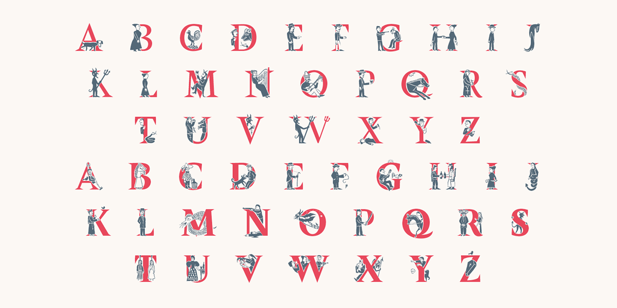
Amster is an energetic & refined type created by Francisco Gálvez, with a sharp concept on how refinement & austerity can meet harmoniously. Amster can build a text that is highly readable and friendly. It has five weights of roman & cursive both with smallcaps and fully equipped with all OT sorts, plus 2 kinds of swashes, smart ornaments, and a wonderful set of illuminated initials. Its style makes Amster very versatile, allowing for a wide range of uses: screen to print, small text to display, science to poetry. Read more at PampaType.com.