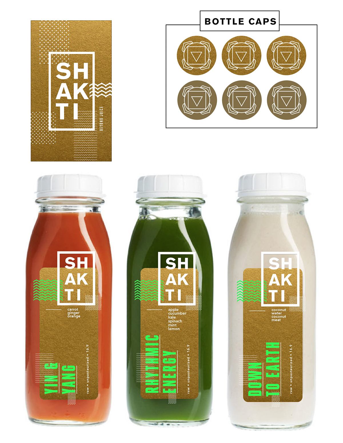
Shakti is a functional beverage company that started in Newport Beach, CA that currently produces and sells 4 flavors of cold-pressed juices in all Mother's Market locations in Orange County and other speciality health stores. They are a glass-bottled, proponent of no HPP, pure health-conscious beverage company that focuses on incorporating antioxidant fighting nutrients and really joining and supporting the raw food movement. I was hired to work with Shakti for the past 5 months to produce a series of new label designs, updated logomarks, a new identity system, food and production photography, and other marketing promotional materials.


Here are two different concepts I provided them for new labels and business cards. Both my efforts are opposite takes on dissecting the word "Shakti." Shakti literally means energy, power, movement, and change, and it is deeply intertwined with the 7 chakra energy channels. I wanted to really use this to our advantage and bring Shakti to its roots and utilize the colors and patterns associated with Hindu culture to differentiate our brand amongst our many competitors.
Au-Naturel Shakti
Target Market: affluent 20-45 year old health-motivated women who enjoy an active lifestyle, yoga, and have a strong tie to spirituality.
For these labels, we focused more on exposing the juice itself and maintaining a sense of purity with a minimalistic design. I thought we could use the different chakra patterned numbers to differentiate each juice flavor.
We also wanted consumers to know that we are proud of our glass-bottle packaging and our no-HPP policy. I thought it would be informative and cheap to produce a sticker that reinforced our logomark and exposed a little excerpt about why we are different from our competitors. When I saw our competition at Whole Foods and Mother's, I realized that most of their company and nutritional information was found on the bottle itself and most people never get around to reading it. So, I thought that by placing the sticker over the seal, it would force consumers to break through the sticker before consuming, and encourage them to read a little bit about Shakti's idealogy and truthful benefits.


Contemporary Shakti
Target Market: wealthy 18-30 year old men and women who care about their health, but also maintain a very social lifestyle and seek adventure.
I really focused on the deconstructed chakra patterns on this particular design and wanted them to act as textures that bled off the label to bring in a sense of movement and dynamism. I had fun with the neon green "earthy" names and contrasted them off of a deep, gold textured background in order to stand out on the shelf among competitors and really grasp the electric energy that these juices provide.
If we went along with this concept, I would either use the bottle cap labels as different chakra symbols or change out the pattern design next to our logomark to indicate the different juice flavors.

Shakti Food Photography

Green Juice (cucumbers, kale, spinach, apples, & lemon)

Orange Juice (carrots, oranges, & ginger)

Green Earth Juice (almonds, dates, kale, spinach, cinammon, & cashews)

