My concept and strategy was to take inspiration from public transportation, particularly that of the New York Subway system. I lived in New York last summer for a design internship, and the one thing I really loved was my ability to use the public transportation system everyday, whether it would be going to and from work or exploring parts of New York over the weekends. It was really a blessing considering Los Angeles is the exact opposite, and one will get nowhere taking public transportation to any given location. This intrigued me and made me really excited to create a typeface from scratch that embraced the usefulness of public transportation!
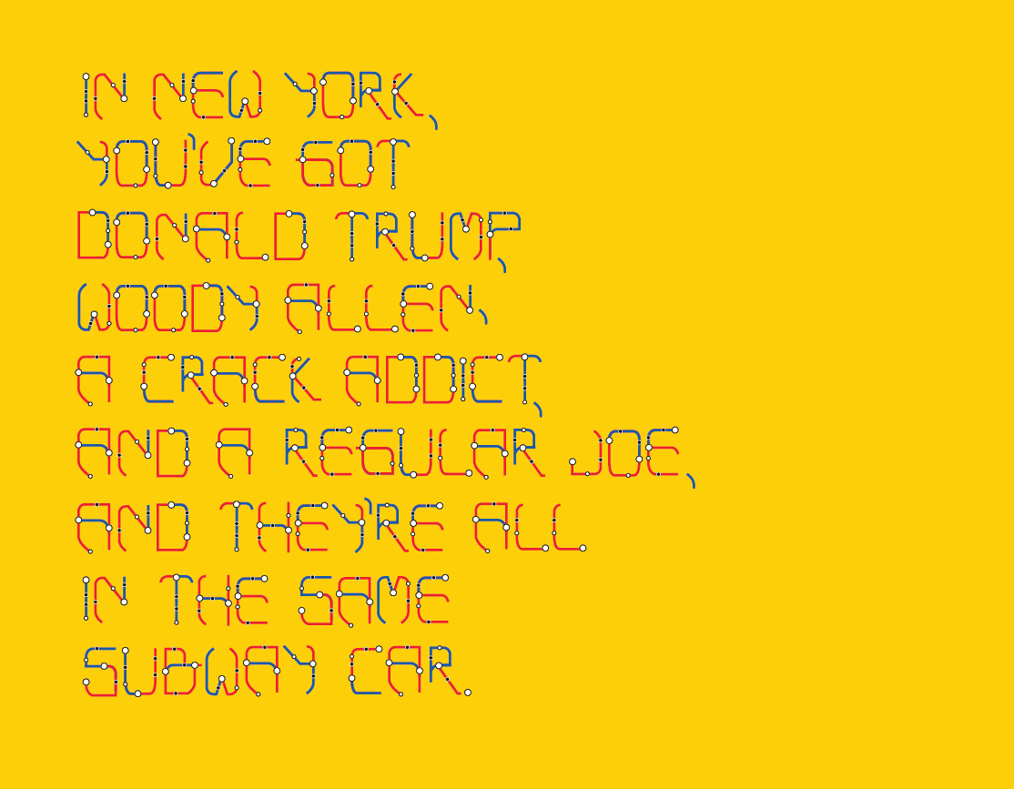
I particularly focused in on one part of the map that was flexible in terms of creating a lot of letters. This helped to keep the letters consistent width and height-wise. The New York subway map involves a lot of line stops and intersections where you can transfer onto different subways - being aware of this, I wanted to imitate this type of aesthetic in the line structure of my letters.
So, I formed smaller white circles and black circles indicating which locations the subway stops and which it passes over. And I also created larger white circles to indicate where the subway lines transfer, and at that intersection, I changed the color of the line. I chose the two colors blue and red because those are very common universal subway line colors. I feel all these details were necessary to make it clear that the letters were representing a subway map.


