2015 Editorial Design - Rochester Institute of Technology
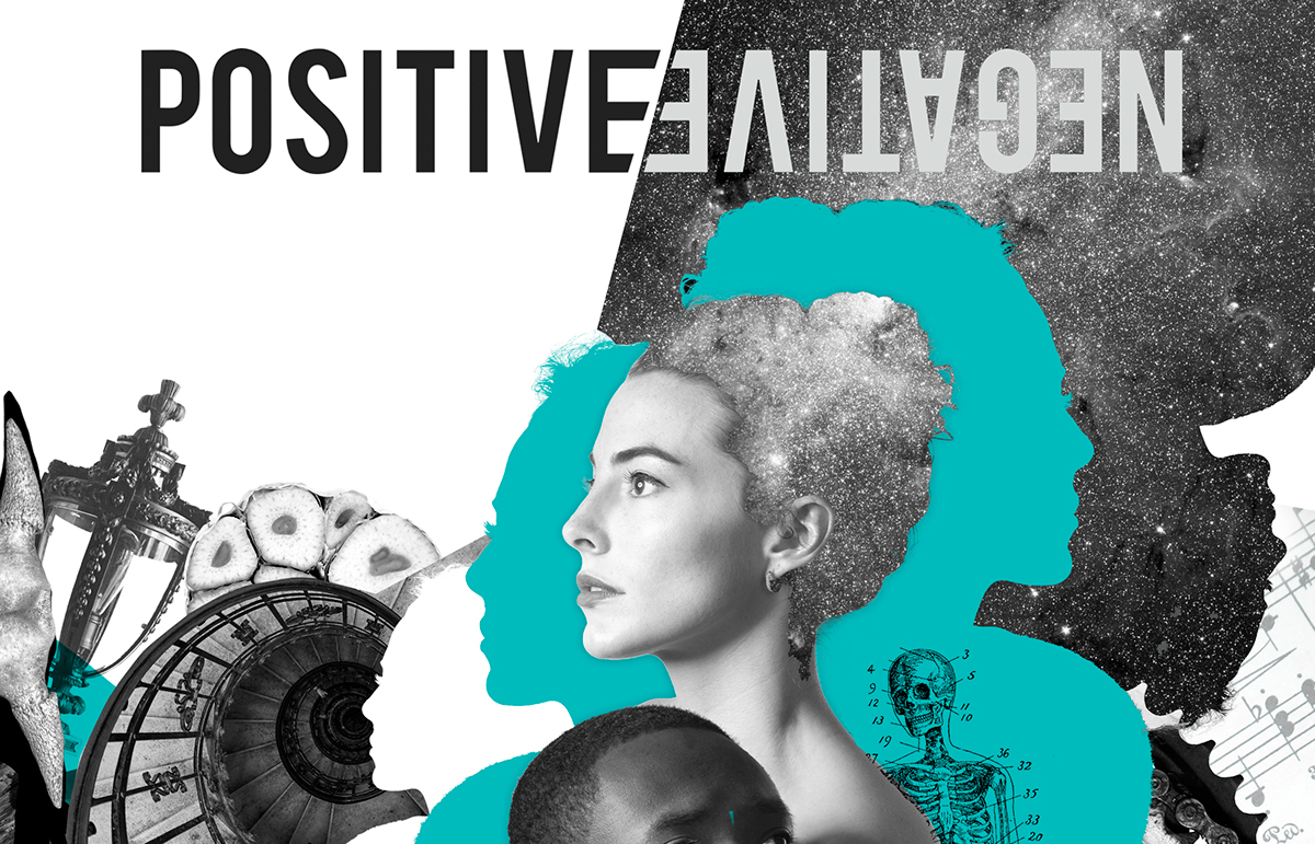
This was made as an option for the possible cover of PositiveNegative magazine. Though this cover was not chosen for the actual magazine, the concept still fallows the same idea. The collage was meant to give the feeling of a flow of consciousness, including objects that vaguely refer to every article in the magazine while not giving too much away. The black portions of the page were intended to be thermal coated and uncover textures beneath them to give a feeling of discovery while relating back to the five senses and psychology. The teal color was chosen because it psychologically refers back to emotion and empathy
The audience would be people who actively read PositiveNegative magazine. Most would be 20-30 years old and a significant chuck of them would be enrolled in college. The magazine is centered around Rochester and is produced by college students, so it is likely that most readers would live in Western New York or be related to someone in Western New York. The gender would lean more towards females though the magazine was kept neutral in style to appeal to all crowds.
The audience would be people who actively read PositiveNegative magazine. Most would be 20-30 years old and a significant chuck of them would be enrolled in college. The magazine is centered around Rochester and is produced by college students, so it is likely that most readers would live in Western New York or be related to someone in Western New York. The gender would lean more towards females though the magazine was kept neutral in style to appeal to all crowds.


Details

The idea of the thermall working, heating up the black areas on the magizine would reveal secret images.