Starting with the usual brain dump on a sketch pad.

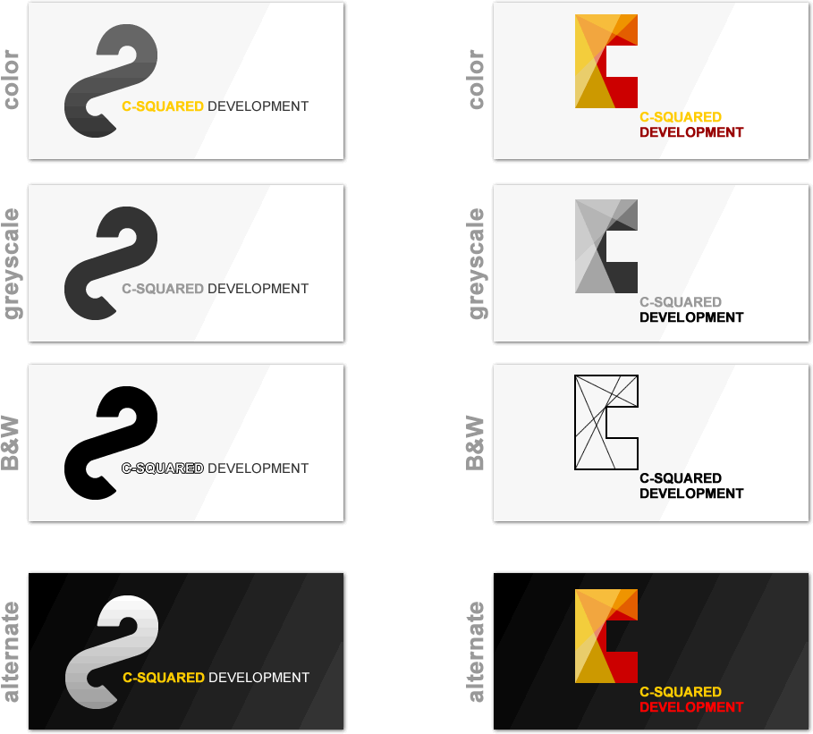
I really like these two. Both communicate exactly what the company is about. Energy, structure, form, and art.


Once colored, they become very different in personality. One is almost stoic, while the other is playful.

The colors for a dark background.

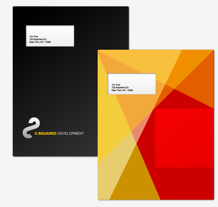
Since I couldn't decide which one I liked more, I made prototypes for both. After seeing the cards, this was the design that was chosen.

Frankly, I like this one more, though.

These were some early logos that I liked but didn't go anywhere. The red represents the C while the yellow represents the exponent 2.