
The requisite brain barf.

I pick out the logos I like. The one with the three smoke stacks is the one that I thought I would like the most but it ends up being a dud. For those who don't know Providence, a power station sits right by the river and is a dominating landmark for those entering the city from the south.


These are the logos that pass the sniff test, as it were. The first one is cool but I ended up dropping it for the purity of a single brand mark. The wave P is cute, but Providence and Rhode Island are different places. Rhode Island is the ocean state, not Providence. The Circle and Dot logo looks like it belongs on a drug company. It's very nice, just not right. The six squares is too... square. The P made with pages is very nice but it's too close to the logo for the Portland Art Museum and as such has to be trashed.

This one is so odd that I can't help but find the idea attractive. The point of the city's brand is to communicate energy and art. With a thriving social scene, gay scene, and one of the most famous art schools in the world, this is critical for any representation. Sadly, it's just too busy. One of the cardinal rules of a logo is to keep it simple. At smaller resolutions, the logo doesn't break down as badly as I expected, but it's still not good. A great logo is recognizable at favicon size.
These are the best to me, and I think they work well together.


Logos should be alive. A logo is a face. That's why they frequently don't need to communicate anything! All a logo must be is attractive and unique, so people can recognize its "face" in the sea of other "faces." And much like real faces, a logo can achieve greater recognizeability by changing with time. Not simply evolving, like the Pepso logo, though, but seasonally changing. I love seasons — the passage of time. Nearly every brand that I make has alternate versions for different seasons.

All of the logos are recognizable at favicon size. Excellent!

The logos work in both greyscale and flat. This is good because a good brand considers both the application and the viewer. Many viewers are colorblind and a logo that relies too strongly on color can be invisible to them!

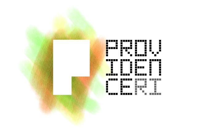
Just as with the seasons, I like logos that can change WILDLY and still maintain recognizeability. Especially for a logo that is trying to communicate energy and life, this is important. It's at this point where I realized that the PROVIDENCERI word mark was superfluous.

The bold shape I've chosen makes a perfect "container" or "window" logo, where Providence is visible through it.

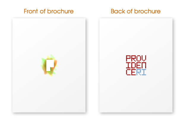
Fruther use of a container logo.

The logo also supports, really, anything behind it. Providence is a foodie city that punches well above its weight. I want that to be seen.

I also want to combine something logical with the image — a word or phrase. Providence's current slogan is "the creative capital," which is terrible. No it's not. New York is the creative capital. If not them, San Francisco. A slogan absolutely cannot lay claim to something that is patently untrue, otherwise it loses all impact. A slogan should communicate something, not make a claim. As such, I shorted it to simply "create." This says all we want to say about Providence. It is about creation. I tried a wild typeface, but it ended up looking too much like a Whatchmacallit commercial from the early 90's.

Combine the new slogan with the seasonal colors.

I frequently create logos that can be used to create repeating patterns.


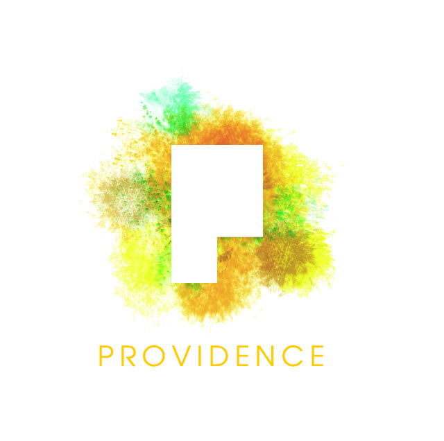

The slogan goes before the name of the city because I want it to imply that you are helping to create Providence. Providence isn't a thing that exists, it is a thing that is constantly being created.
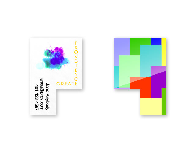
This business card design isn't terrible practical, but it's fun. It's doable if it's printed on transparent plastic.

The website allows us to make the brand design interactive, with layered P's.
