Jamieson-Hilts Insurance Identity
Well respected independent insurance brokers looking for a fresh new look including a new identity, website, print collateral, advertising and storefront signage.
Art Direction/Design: Chris Young
Jamieson-Hilts Insurance Brokers of Woodstock, Ontario were looking to update their aging identity including a complete overhaul of all their collateral, ads, storefront and website. Jamieson-Hilts is a well respected company with it’s roots going all the way back to 1865. The operation has always been a family business with the current owners taking over from their parents a few years ago. They are forward thinkers and took the opportunity to do evaluate current and future opportunities. The company has been around for a long time and their goal is to change with the times and keep the company current and relevant to today’s consumers.
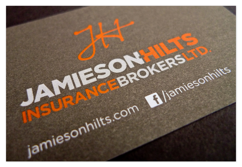
The reverse version of the logo on Warm Grey 11 appears on the back of the business card for more impact.

The redesign was a balancing act. They wanted to be sure that the redesign wouldn’t alienate their loyal and established customer base, yet would be modern enough to resonate with younger client prospects. Commercial Insurance is a large part of their business, so they wanted to ensure their modern look would also be strong enough to stand up to the larger, corporate insurance brokers in the competitive Southern Ontario market.
Jamieson-Hilts is looking forward to an office redesign that takes cues from the new look next Spring.
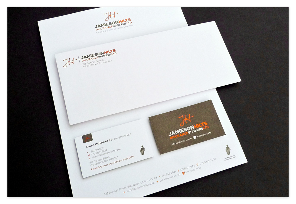
Jamieson-Hilts stationery package overview with the letterhead, envelope and business cards.
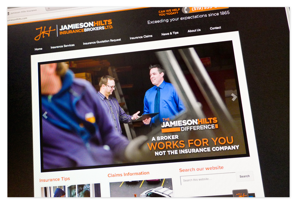
The logo as it appears on the brand new website. See below for a link to that project.
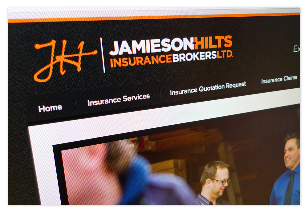
The logo as it appears on the brand new website. See below for a link to that project.
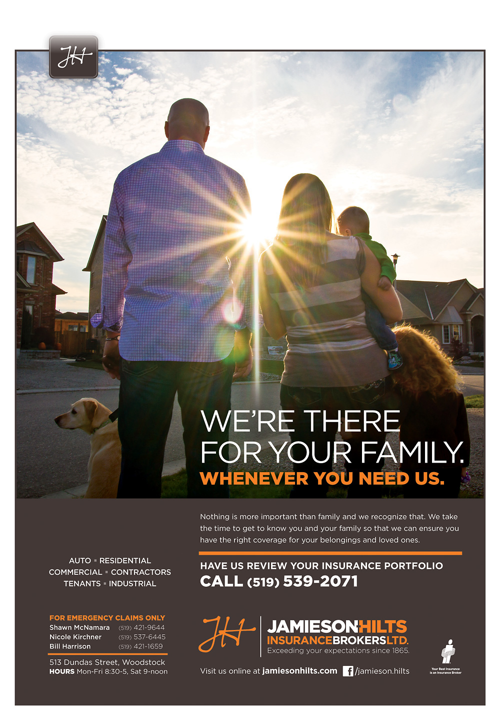
Jamieson-Hilts Insurance full page magazine ad.
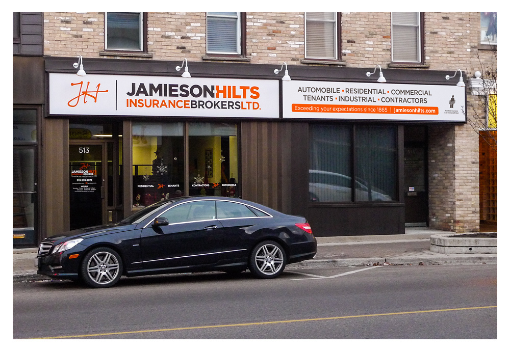
Jamieson-Hilts signage features overhead lighting with vinyl-cut artwork on the door and windows.
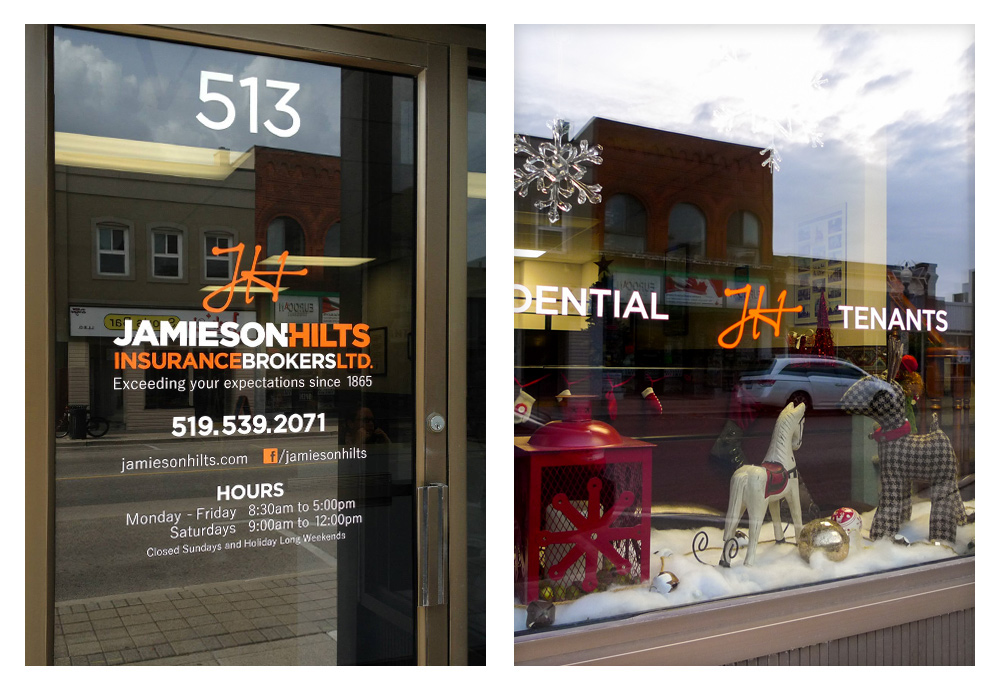
Front door and windows graphics.
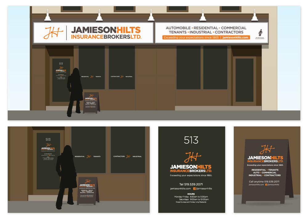
Concept renderings of the Jamieson-Hilts building signage; features overhead lighting instead of a backlit sign, and vinyl-cut artwork on the door and windows; and a sandwich board for street level awareness.

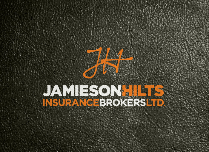
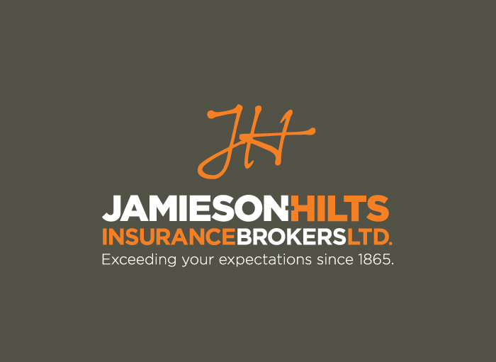
All the variations of the Jamieson-Hilts Insurance logo; vertical and horizontal, with and without taglines, and the positive and reversed out versions makes for a complete package.