

Windset Farms Packaging Design
Redesign of Windset Farms entire product line featuring new bolder colours and more retail friendly designer look; new bags, labels, header cards and cases spanning seven products and 28 sub-brands.
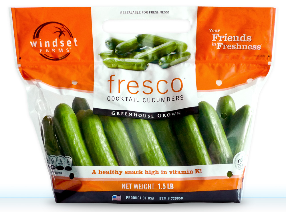
The final Fresco® Cocktail Cucumbers bag sample, shot for the launch the new bag designs.
Creative Direction: Tugboat Group
Art Direction/Design: Chris Young
Art Direction/Design: Chris Young
Windset Farms is one of North America’s premier greenhouse growers, based out of Delta, BC. Windset is known as a leader in designer product labels and bags. This next generation of products needed to continue the clean, slick look that has become synonymous with their premium products.
This redesign of Windset Farms’ entire product line was no small task — spanning seven products and 28 sub-brands, there was going to be endless combinations of these products in both English-only and Bilingual versions, and multiple weight/count versions.
Redesign considerations included different bag styles (resealable polycarbonate plastic bags, polyethylene bags), net-bag header cards, shipping cases and clamshell labels. All the packaging is designed with premium quality production in mind, and everything must look amazing on the shelf.
The old bag design had the label/print area right in the middle of the bag, making it difficult to showcase the product. You can see the new bag design side-by-side with the old bag below.
You can see more of the Windset Farms Packaging Design on my portfolio website here.
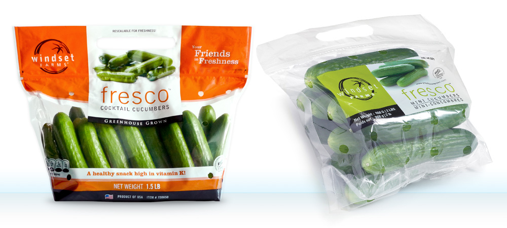
The new bag design on the left has more shelf presence, more vibrant complementary colours to make the produce stand out, and the ‘fresco’ sub-brand is brought up to the top front and centre. The introduction of health claims and nutrition barrels are also more retail-friendly components of the new design.
Package Design Concepts
I divided the bags into top and bottom fields, so the artwork could ‘slide’ up and down independently to allow maximum product show-through. By having the two artwork areas independent of each other helps the design department immensely once we get into the full roll-out of products because the top and bottom can slide into a comfortable position to contain all the artwork, and showcase the produce inside.

This is the first composite that I made of the new bag design for Fresco® Cocktail Cucumbers, Photoshopping on top of an existing bag that I shot.
The top dual-scoop design holds the key graphics in place, allowing the sub-brand area to be brought to the top; front and centre. This allows for optimum visibility on the shelf — think magazine cover. The graphics and information on the top of the bag are kept to a minimum to keep it clean and slick, the other information lives together in the bottom field. Secondary information such as the weight/count and country of origin are all together, and the introduction of retail-friendly health claims (backed up by nutritional information on the back of the bag) and nutritional barrels help consumers make quick and informed healthy decisions when grocery shopping.
The thick white stripes bookend the produce on the top and bottom of this design for maximum pop of the product against it’s complementing colour, and the rich black base of every bag reinforces that strong pop of colour, and finishing off the bottom of the bag where it won’t always sit up perfectly.
Polycarbonate Resealable Bags
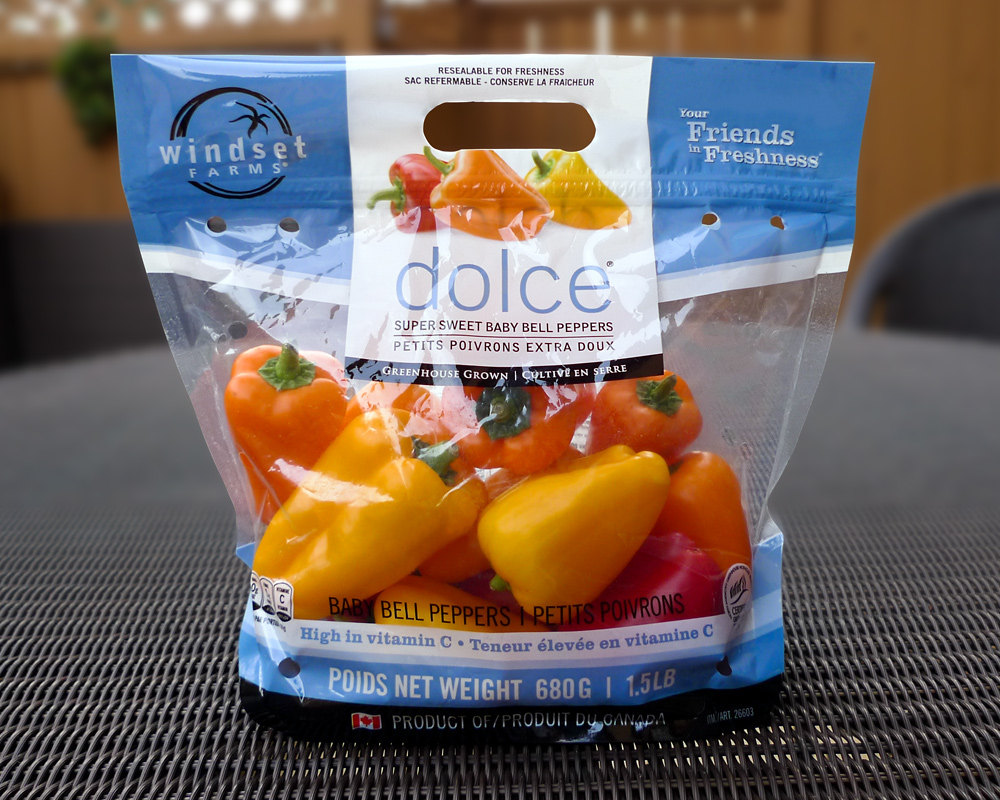
Dolce Super Sweet Baby Bell Peppers bag shot on the table on my deck.
Polyethylene Bags

Detail photo of the front of the Tomatoes on the Vine polyethylene bag.
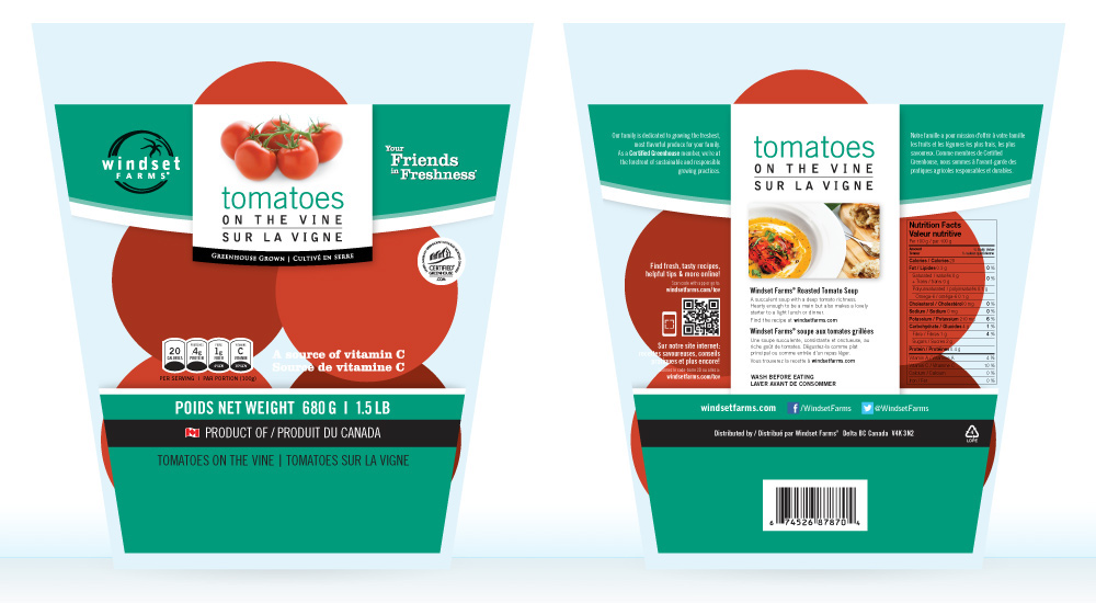
Tomatoes on the Vine polyethylene bag incorporates a very similar design for the front and back, but had to be customized to fit the bag which tapers from top to bottom.
Net-Bag Header Cards
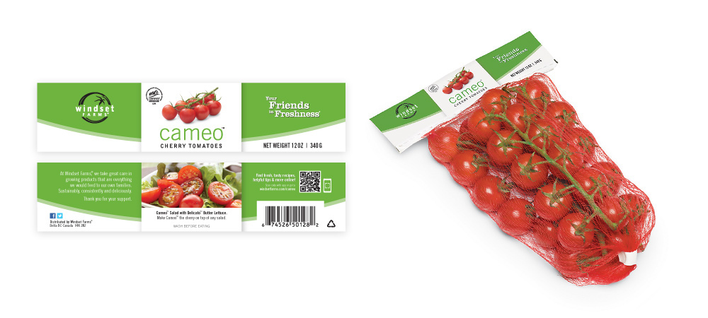
Front and back of the header card for the Cameo Cherry Tomatoes net-bag incorporates the same design as the plastic bags, made to fit the much smaller, longer format of the head card. On the right, I’ve mocked up the new header card design onto an existing photo of the net-bag.
Clamshell Labels

The Shanghai Baby Bok Choy label maintains a consistent design across Windset’s entire product line. Here’s the label by itself, and on the 2lb clamshell.

Windset Sweet Bell Peppers bags stacked in a bin at my local Marketplace IGA grocery store.
You can see more about the Windset Farms Packaging Design on my portfolio website here.


