


This project was awarded a Merit outcome during the 2023 ISTD Student Assessment Scheme.
03 | Typography
Dracula: a modern-day psychoanalysis
Project Brief
Within the framework of the ISTD 2023 Student Assessment Scheme, this project required the selection and execution of one of the five ISTD-issued student briefs. The final outcome allowed for flexibility in terms of the deliverable but mandated a robust focus on research, concept development, and the integration of typography into design at a high standard. The selected brief for this project was Brief 1, Open | Close, which required the radical reimagining of the opening and closing chapters of a chosen book through typography.
Design Strategy
Dracula, a modern-day phycoalanlisis, is a response to the Open | Close, ISTD brief that aims to radically reimagine the first and last chapter of the chosen text. Bram Stroker’s novel, Dracula, was published in 1897 and holds as much relevance to societal fears now as it did in the Victorian era.
The story of Dracula unfolds through chronological communications and accounts from various narrators. Dracula himself is never given a direct narrative voice but instead exists through the interpretations and perceptions of others. The novel, in its entirety, asks the reader to piece together the reality of events through the way truth is presented in their communication. Further research pointed out how the novel mirrors social fears and the distortion between fact and individual experience.
In light of this, I decided to radically reimagine the first and last chapter of Dracula as a printed novel, complete with therapist notes and text manipulation to show the inherent absurdity and distortion of reality in the text.

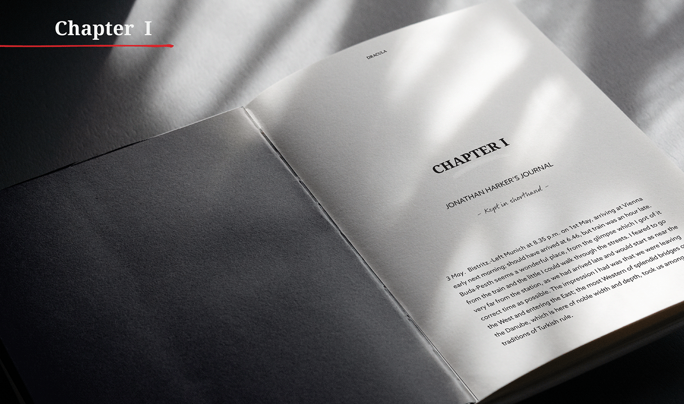
Chapter One can be seen as a decline of distortion. Chapter 27 is a reflection of it, where the question is asked on the last page
-can their account of what they experienced and recorded in their communication be seen as truth? The chosen typographical approach lends itself to be either distorted or kept intact to demonstrate where reality remains intact or becomes distorted. The limited colour pallet, red, white, and back, not only links to the iconic figure, Dracula, but allows the reimagined structure of the two chapters to focus on the aspect of distortion and the notes that try to figure out the fundamental aspects of the chaos and its deeper meaning.

Research and development
The following provides an overview of some of the key research and development points that contributed to the final concept for the final outcome. The full scope of the research and development process can be seen in the research and design development document.
Research Phase 1
Initial research was conducted into books that are no longer under copyright. This was done to explore each book's potential conceptual space. The books I researched included Dracula, Alice Through the Looking Glass, and The Great Gatsby.
The decision was then made to develop Dracula further as the chosen book for the ISTD project, as the initial concepts had the most potential.
The decision was then made to develop Dracula further as the chosen book for the ISTD project, as the initial concepts had the most potential.

The research included general author information and summaries of the first and last chapters to identify the exciting aspects of each book.
Research Phase 2
The next phase of research focused on the novel Dracula.
Firstly, I concentrated on the author's history, background, writing style and handwriting. I also focused on the period in which the novel was written, historical events, and the various ways Dracula has been presented in film from 1997 to 2021. This analysis encompassed not only visual aspects but also how the different adaptations of the novel to film provided unique insights into the character and the narrative etch film adaption portrys.
Subsequently, I set out to identify the key events in the first and last chapters to determine the narrative arch and progression between the two chapters.

Further exploration and research also led me to consider the ideas of madness and how the novel not only reflected Victorian society in 1897 but can also be seen as a reflection of society today.
Typography Exploration
A lot of type distortion exploration was done by hand to find interesting and unique solutions for the typographical approach.

The main approach to exploration was to convey the concept of a boundary being blurred/interweaved into a reality where one no longer knows what is real and what is not.
Layout imagery exploration
Numerous explorations were done with a specific focus on how typography could be used to convey a distortion of reality. Although some approaches were not used, these explorations heavily inspired the layout approach and typography distortion for the final outcome.

Exploration was done with printed-out A5 pages of body copy that were distorted by either cutting the pages up and putting them back together, writing over the text, or moving the pages as they were being scanned.
Layout development
The initial layouts started with a very aggressive approach, using scratch line making to depict the distortion of reality. The layouts were refined and crafted to align more with the concept to explore the fine line between reality and distortion thereof.

The above are examples of layouts that had the most development through the planning and final execution stage. More of the development process can be seen in the research and design development document.

Specifications
One of the deliverables for this project was a detailed specifications document. Below is a scaled-back version of the specifications for Dracula: A Modern-Day Psychoanalysis. The full scope of specifications can be viewed in the strategy and specification document.
Typography
The final design needed to emulate the original feeling of the typographic style of the novel but needed to bring it into the 20th century. Therefore, a collection of modern Serif, Sans Serif, and Script typefaces were selected to be used in the final design.

More on the specific purpose of each chosen typeface can be seen in the strategy and specification document.
Colour
As the publication deals with the line between reality and distortion, the colour pallet needed to be kept minimal in order to emphasise the design. White, black, and grey are mainly used for the general layout and type distortion. The red was extended to two shades that add depth to the design and are used for notes and text. Texture is also used to show the active distortion of reality and to give the design life.

The many visual representations of Dracula throughout the years inspired the colour palette. The notable black, red, and white. This links the design visually to the original novel and provides a modern aesthetic to the overall design.
Bookbinding
The publication uses Coptic Stitch Binding that binds a book block with a hardcover on the outsides to form a sturdy book with an open spine. The publication is further concealed in a hard slipcase that adds a conceptual layer to the overall theme of the distortion of reality and the difficulties of navigating it. The open spine reflects the fragile line between fact and fiction.

Size specifications for the book cover and slip casting.
Paper stock and sizing
Paper stock from Fedrigoni was selected for the publication. As the publication needed to combine a traditional A5 printed book and a journal, the final sizing was taken from a sketch journal.

Paper stock was specifically chosen for its textural qualities, which gives the publication a personal journal aesthetic.
Grid system
The publication made use of a manuscript baseline grid. This choice is appropriate because the design is based on the layout of a traditional A5 novel. Using a manuscript grid allows the design, especially in Chapter 1, to look like a printed novel in which someone added notes afterwards. Using a baseline grid further helps to create visual rhythm and harmony within the design, especially where the design becomes more chaotic.

Example of the grid layout system used.

The final outcome
Cover


Title and content page


View all the pages as a pdf here.


