


Fusebox: Capturing the power of unforgettable live experiences
Fusebox curates daring, unforgettable live experiences. Since its inception in 2005, Fusebox has grown from an Austin, Texas-based festival to a global organization producing quarterly and annual events, commissioned shows, and collaborative projects with artists, organizations, and businesses all over the world. But while Fusebox has long been admired among its peers, it remained relatively unknown to the general public in Austin.
This project started as brand realignment project for Fusebox: how do they improve their communications to connect people, ideas, and artists through electrifying experiences in the here and now.
Soon, though, research insights revealed immense opportunity for Fusebox to truly cement its place as an iconic Austin institution of the sort that no one wants to miss out on. This new brand was built back up by identifying what makes it tick, and designing an identity that everyone can feel excited by.

"Working with In-House has been an extraordinary experience with truly remarkable results. They guided us through every step of their deep, insightful, comprehensive process. Our new brand captures our essence, speaks to our 20-year history and positions us for an ambitious future. At every turn the In-House team has been rigorous, inventive, and created design and strategy that over-delivers on all fronts. I highly recommend In-House to anyone and everyone."
Ron Berry
Founder & Executive Director, Fusebox

Process
The Fusebox brand project started with a research phase. We looked into their engagement metrics and use of language. Sourced media and interviewed dozens of individuals, pored through artists and looked into their external communications. Fusebox Festival was, at the time, the main brand, and each program its own name and design. It was impossible to know they were all part of the same organization. A new naming system standardized how all programs show up. The main organization was renamed Fusebox. Fusebox Festival became one of its programs and sub-brands. Four other sub-brands were developed to round out the set.
We then worked with Fusebox to articulate their brand values and make sure they resonate deeply. Their values defined how positioning, brand identity and all creative work unfolded.


For the brand identity design, we anchored on recurring impressions from audience members and artists: that Fusebox is better experienced than explained. That there’s something about Fusebox events that feel like they connect with people’s humanity, that makes it possible to be in the present moment, feel human, and connect.
At the core of the new brand is Fusebox as both a symbol of intersection and as
a frame for bringing together, creating open spaces for people to explore but not constraining the possibilities of what each experience can be.
The custom-drawn logotype bends into a corner making Fusebox an open framing element that shows how it operates: by bringing together, by creating open spaces for people to explore but not constraining the possibilities of what each experience can be. The corner intersection is about the creative power of bringing together; people and imagination, expression and senses, time and place.
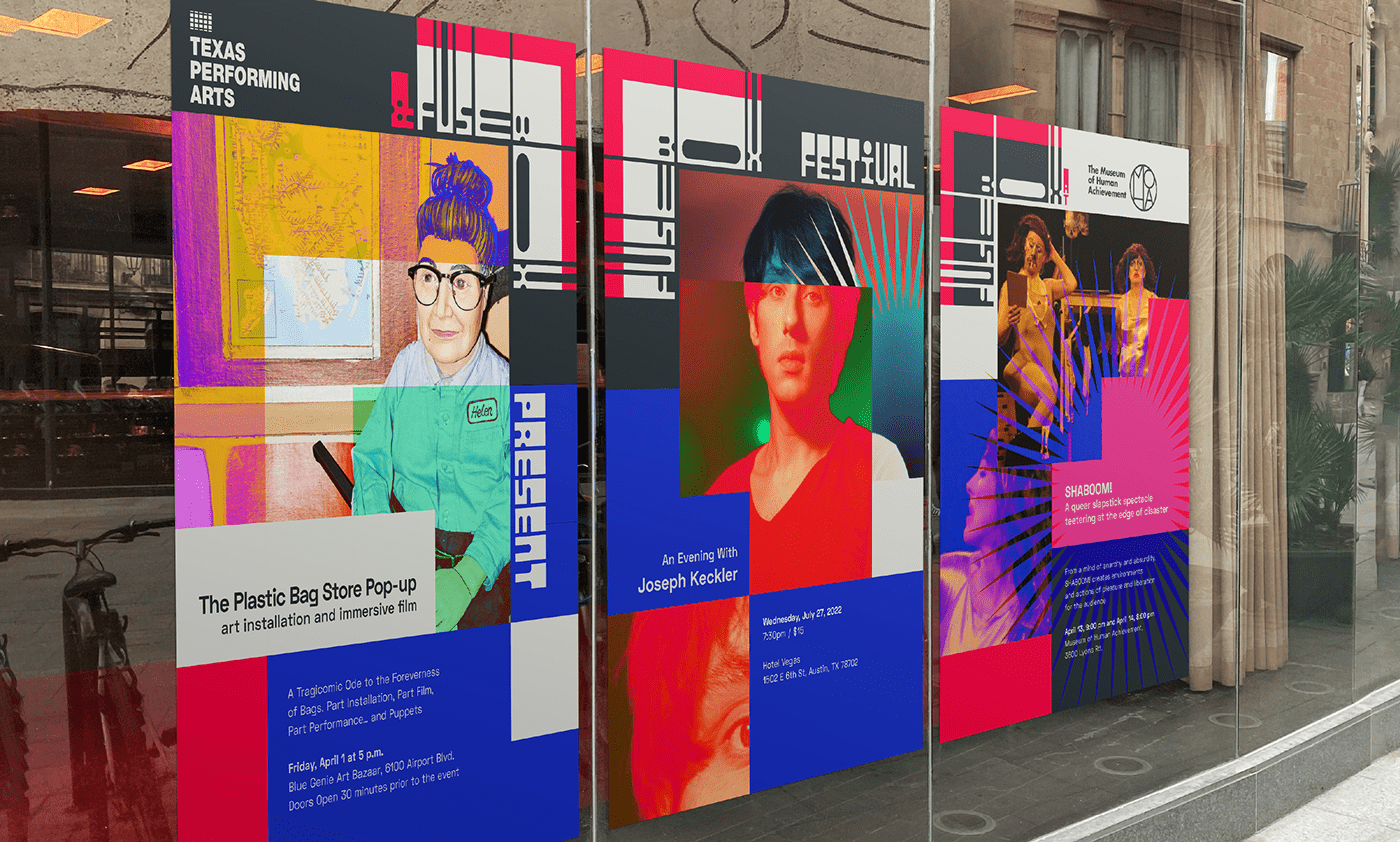
Th custom type treatment for the logo has a uniquely Fusebox vibe, and references Austin’s fearless style in signage. The corner-set logo is made for layouts. It also adapts to the framed element. It can stretch in two directions to center whatever the programming requires, Sub-brands benefit from the possibilities created by a multidirectional approach to layouts - where text can come from different directions.
The brand expression uses layering, to create overlapping frames, photos, filters, type, color, patterns and shapes. The layout system for the fusebox brand derives from a grid and overlaps of the corner shape the logo creates. The highly structured modular grid enables easy updating and template reusing without ever being boring. The system here accommodates frequent updates to images, while keeping evergreen elements like patterns and big color blocks to keep the burden of use low.


Results
Insights from researching into local audiences, peer brands, and Fusebox’s broad range of public facing communications showed that Fusebox brand comms lacked much in common. Articulating the organizations core values unlocked what the brand needed to feel like, and set the brief for the brand identity. We also aligned its brand architecture through renaming all programs using a common rubric, and developed modular brand system to ensure they all clearly derive from the main brand.

The new Fusebox brand identity features logos for the main brand and five sub-brands. Easy to use templates for posters, ads, flyers, festival programs, presentations, letterhead, invoices, and tax letters. Social media templates and materials were created for main and all sub-brands, making it easy for Fusebox to keep up their post schedule and stream with a distinct, professional looking brand that builds recognition.
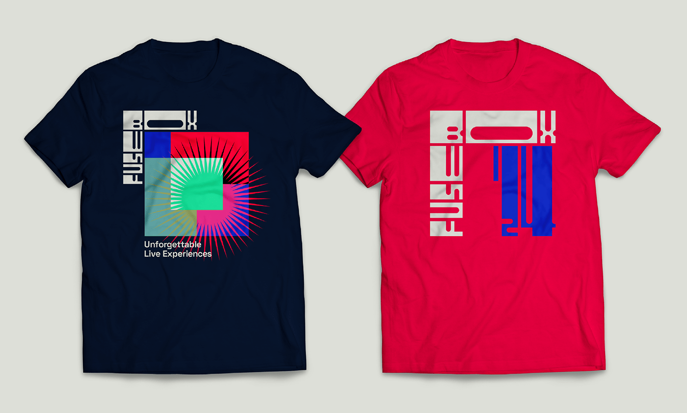
The full brand includes motion logo, a set of custom icons for each sub-brand, motion video assets (lower thirds), ready to use newsletter templates for all sub-brands, production-ready t-shirts, tote bags, stickers, pins, and the unique identity for their 2024 festival. Content pillars and voice and tone were also delivered.
To launch the new brand, we also produced a campaign that can be endlessly added where people attempt to explain their most meaningful Fusebox memory.


