
One essential aspect of the Motif concept is what
we call the sixth sense: We have transformed
taste, which is perceived through the nose and palate,
into a graphic, or a motif. Motif consciously
rejects the exclusive wine culture that is reserved
for only a few people. Our goal is to facilitate
an enjoyment of wine that is free from pre-
conceptions, extremely personal, and, above all,
conscious and aware.
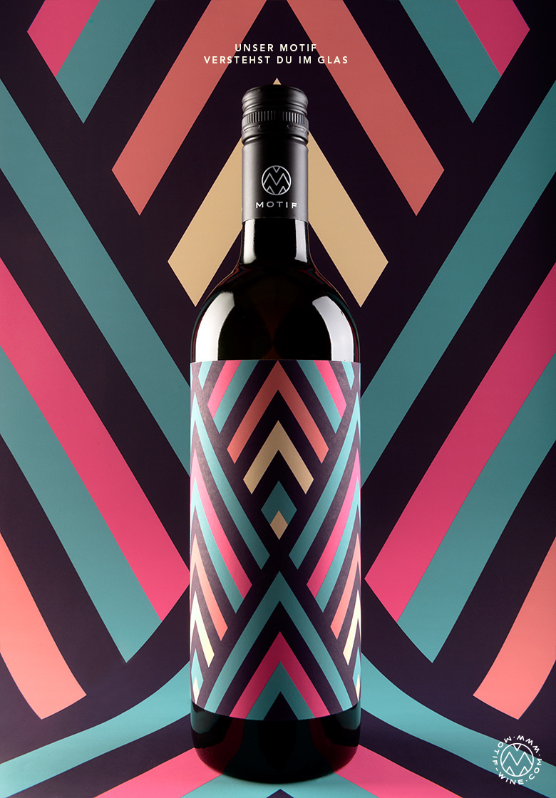


Our original vision was to reconceptualize
the world of wine through a new product. We wanted
to use a graphic pattern to visualize the taste and character
of six different wines. This was how Motif came into
being. The German word Motif means pattern,
and we consciously refrain from using information about
the variety of grape or other specifications on the label.
Using no significant text, the individual patterns
provide a subtle, tasteful indication of whether
the wine is semi-sweet, full-bodied
or effervescent.


The Collection

One of the challenges was the design of the
labels, since they had to communicate the corporate
design of Motif both individually and as a collective. The
letter M, with lines placed at a 60-degree angle, serves
as a key visual that unites all of the bottles under
one corporate design. To enhance the visualization
of the wine character, we chose earth tones and fresh
warm colors: soft yellow or green tones for the white
wines and powerful red and blue tones
for the rosé.


Client — Motif Wine
Studio — EN GARDE
Concept — Mario Rampitsch, Franz Lammer
Graphic Design and Art Direction — Kristina Bartosova
Graphic Design and Art Direction — Kristina Bartosova
Photography — Stefan Leitner
Web Design — Kristina Bartosova, Markus Sworcik
Web Development — Alexander Winkler, Georg Knabl
Web Design — Kristina Bartosova, Markus Sworcik
Web Development — Alexander Winkler, Georg Knabl
Featured on The Dieline


