Photo-Brutalism
Jenny Sinclair UWE

Prologue: Preparation for extended study in photography
The idea for this project initially came to me in the summer. I had not considered photographing architecture at all before, but after a bit of research and taking some photos I realised that it is something I really enjoy and can see myself carrying on in the future.
I worked on this project for the first term of this year, shooting lots of locations in various formats and after in depth research I decided that I wanted to conduct a more extended study, and so I have chosen to continue the project for the rest of the year. The more information I found and locations I visited, the more I realised I could do with the project, the idea could be taken a lot further. Now I have done the ground work, with new locations and formats I can reshoot the project to its full potential.
The first section of this blog is my initial research and it will then lead on to my extended study.
What is Brutalism and why do I want to photograph it?

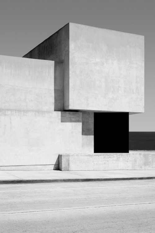
Brutalist Architecture
Brutalist architecture is a fragmented movement in architecture that flourished from the 1950s to the mid-1970s, descended from the modernist architectural movement of the 1930s. Examples are typically massive in character (even when not large), fortresslike, with a predominance of exposed concrete construction. There is often an emphasis on graphically expressing in the external elevations and in the whole-site plan the main functions and people-flows of the buildings. Brutalism became popular for educational buildings, but was relatively rare for corporate projects. Brutalism became favoured for many government projects, high-rise housing, and shopping centres to create an architectural image that communicated strength, functionality, and frank expression of materiality.

The above photograph is an example of some Brutalist architecture. I find Brutalism to be a very photogenic subject. The blocky, linear, concrete structures create an array of interesting compositions for the camera to capture.

I found that a lot of Brutalist structures have been demolished and more are in the process. I wanted to try and photograph them before there are none left. I know that brutalism in architecture has been covered a lot through photography projects recently but I feel I could add my own touch to the project and make it a bit different. I would like to photograph the buildings more close up and personal rather than just stand back and try and get the entire structure in one frame. I want to show what it feels like to be inside these buildings, the dark stairwells and big chunky walkways in the sky, the streets off the ground. I want to try and show off the ideas and feelings the Architects tried to represent through their work. I know that the majority of Brutalist structures, especially those built as social housing, failed in their ideas and didn't turn out how the architects intended. The general public have linked these big brutal structures to things like crime and I want to remind people of what they were supposed to represent and show them that that still could be the case and that it is a huge shame to be demolishing these parts of our urban landscape and history.
I did a lot of research into Brutalism and what it meant and what the architects intended with their buildings. They wanted to create a kid of urban utopia, a futuristic ideal. The more I looked into it, the more I found that I was especially interested in where Brutalism has been used within social housing. I loved the ideology behind the designs of the buildings, the idea of mass. futuristic social living and community, an urban utopia. I think it is a shame that it didn’t work and through this project I would like to explore and find out why this was, and if there are any exceptions, is there anywhere where this plan has really worked?
As this is going to be the final project of my degree, I wanted to study and explore something that not only am I extremely interested in, but also something that I know I will be able to keep working on for a long time, something that has a lot of scope. I think exploring Brutalist architecture has the potential to be a large and interesting project with a lot of different angles to consider.


LEWIS BALTZ and the new topographics
Lewis Baltz
large format
linear
correct perspective
not too contrasty
simple but shapes so interesting
'New Topographics: Photographs of a Man-Altered Landscape' was an exhibition that epitomized a key moment in American landscape photography. The show was curated by William Jenkins in 1975.
"They all depicted urban or suburban realities under changes in an allegedly detached approach"
"Their stark, beautifully printed images of this mundane but oddly fascinating topography was both a reflection of the increasingly suburbanised world around them, and a reaction to the tyranny of idealised landscape photography that elevated the natural and the elemental. In one way, they were photographing against the tradition of nature photography that the likes of Ansel Adams and Edward Weston had created."
Using the natural angles of the architecture to create linear compositions.
Black and white makes you focus more on the composition, the shapes and lines rather than unimportant details.
Continuing to look at the New Topographics and Lewis Baltz especially. Using existing lines, shapes and angles to create compositions. Clinical and straight but also paying attention to, and bringing out details.
I looked at the New Topographics exhibition and I think this really helped me define what I was doing. The photographers show us the beauty in the mundane/banal, they show us that things we probably would never otherwise look at, can make really incredible images. I like that a lot of the artists shot black and white, I think it really makes you focus on the shapes in the image. I especially liked the work of Lewis Baltz, his work has had a big influence on my photographs. I like the high contrast monochrome images, he said in an interview that he wasn’t trying to make beautiful images but I think his photographs are definitely beautiful.

Albert Regner Patzsch
Very blocky and bold. I like the lines and simplicity.

bernd and hilla becher
"They were fascinated by the similar shapes in which certain buildings were designed. In addition, they were intrigued by the fact that so many of these industrial buildings seemed to have been built with a great deal of attention toward design."
"These are intimate images, a personal reaction to space and place, to being. They make my heart ache for their stillness and ethereal beauty. - Dr Marcus Bunyan
“The pictures were stripped of any artistic frills and reduced to an essentially topographic state, conveying substantial amounts of visual information but eschewing entirely the aspects of beauty, emotion and opinion.”
.---William Jenkins, Curator of the ‘New Topographics’ exhibition, 1975
The topographical nature of the Bechers work and everything in the New Topographics has really inspired me. I love the idea of documenting things in this way, it's very clinical but at the same time brings life into these objects that we otherwise wouldn't look at, kind of gives them a story. The fact that they have been photographed at all makes them important.
I want to do something similar with my photographs, I am making a document of the Brutalist structures because I think it's important that they are remembered. I feel like the raw concrete and plain walls of Brutalist architecture is something that a lot of people generally walk straight past and I want to show them in a way that makes you look again. Every line, groove, angle was put there on purpose, and I want to show how beautiful this is, make it stand out.
I want to do something similar with my photographs, I am making a document of the Brutalist structures because I think it's important that they are remembered. I feel like the raw concrete and plain walls of Brutalist architecture is something that a lot of people generally walk straight past and I want to show them in a way that makes you look again. Every line, groove, angle was put there on purpose, and I want to show how beautiful this is, make it stand out.

JASPER FRY
Goetheanum
find out what they were shot on
uses angles and shapes of the structure to create interesting and unique compositions
i like how it is not quite completely desaturated, a tiny bit of warmth
Monochrome
I have chosen to make black and white photographs for a few reasons. I think monochrome is timeless, my photographs could have been taken last week or 50 years ago and you couldn’t tell. I also think that sometimes colour can distract from what is going on in the photograph, you focus more on the bright colours and less on the details. With black and white photographs, I find that shapes and lines are more defined and easier to look at. As my work is very linear and shape orientated, I think black and white is a perfect medium for this project.


The images above are my favorites from last terms project.
You can see the style I was going for but there is definetely a lot of room for improvement in terms of composing and technical issues.
At the end of last term, I handed in some colour prints made from 35mm film and I also made a zine featuring all my photographs. At this point I felt like there was a lot more I could do with the project. I had realised a few things:
¬ I definately wanted to shoot black and white, I think monochrome suits my project much better than colour.
¬ I wanted to should shoot the project in large format. As my subject is large, solid and stationary, with the use of a tripod, a very high f stop and a long shutter speed I could get a massive amount of detail. Large format cameras also offer an incredible amount of lens movement, which is great for architectural photography.
Extended Study in Photography 2014
v
Proposal
This project is a continuation of the work I was making last term. I am going to photographically explore the space brutalist architecture holds within our social landscape in England. I am especially interested in the ideology behind Brutalism and how I can show this through my photographs. I am also interested in the recent decline in Brutalist architecture in our country and through my work will explore the reasons for this as well as trying to show the beauty of these structures that the architects intended.
Last year I traveled to five different structures within England, these were; the Park Hill Estate in Sheffield, Clifton Cathedral in Bristol, the Alexandra Road Estate in North London and Robin Hood Gardens and Balfron Tower in East London.
My plan is to revisit all of these sites and rephotograph using large format mediums as well as hopefully some new locations. I believe my project will benefit from me shooting with 5”4” film because this format offers a massive amount of detail and information within images as well as the lens being able to shift meaning with architectural photography, the proportions of buildings remain as the eye sees.
Previously I shot with both colour and black and white film and through evaluating last years work I have decided that my project is much better suited to black and white alone. This is because I believe the shapes of the buildings and my linear compositions are seen better when colour is taken away, I also think black and white goes well with the brutal simplicity of the architecture and suggests something of the time it was built.
I expect the outcomes of my project to be some large hand made prints of the most successful photographs as well as a photobook documenting my best images.
Large Format

I had not ever used a 5”4” camera before so I thought a good idea would be to do some practicing and get used to the camera before I traveled to any proper location.
After a few workshops and some online tutorials I finally felt ready to give the camera a go. I found the level of control you have is incredible compared to that of 35mm or even 120. I really enjoyed the slow way of working and found that it made me focus much more on things like composition and the actual machinery and the process of how the camera works.
Clifton Cathedral

Last year one of my favourite locations to shoot was Clifton Cathedral. The unusual architecture was really enjoyable to photograph and made for some interesting compositions. I decided to use this location to practice using the 5”4” camera as it was close to home.
After developing my negatives I made some small prints to get a closer look at what I’d taken. Definitely still getting the hang of the camera, one photograph had a light leak and none were very straight. However I was pleased to discover that all the photographs were correctly focused and exposed.

A large print I made from my first set of photographs. I’m impressed with the level of detail a 5”4” negative can provide but I think I still have a lot of work to do before I get the perfect image. The lines in this are not straight and the print needs some touching up as there are marks.

John Cyr
http://www.johncyrphotography.com/page5/texturalcompositions.html
Developer Trays, 2010-2012
archival pigment prints, 28” x 24”
Ansel Adams’ Developer Tray, 2011
Andrea Modica’s Developer Tray, 2011
Lillian Bassman’s Developer Tray, 2010
Eileen Travell’s Developer Tray, 2010
Andreas Feininger’s Developer Tray, 2010
Joni Sternbach’s Developer Tray, 2011
Sally Mann’s Developer Tray, 2011
Wynn Bullock’s Developer Tray, 2011
O. Winston Link’s Developer Tray, 2011
Tom Baril’s Developer Tray, 2012
From the mid nineteenth century until today, silver gelatin printing has been one of the most utilized photographic processes. From classic reportage to fine art photography, the majority of it was performed in a black and white darkroom until the mid-1970’s. As recently as 2000, black and white darkroom classes still served as the location for introduction to photography courses. The digital advances in photography over the past ten years have been remarkable. I am photographing available developer trays so that the photography community will remember specific, tangible printing tools that have been a seminal part of the photographic experience for the past hundred years. By titling each tray with its owner’s name, I reference the historical significance of these objects in a minimal manner that evokes thought and introspection about what images have passed through each individual tray.
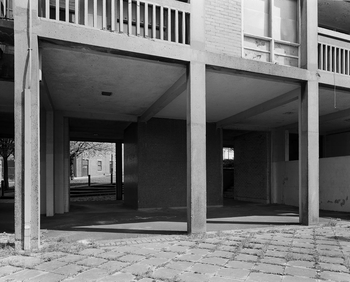
Robin Hood Gardens

I went to the Robin Hood Gardens estate in Poplar. I have visited this location several times before and shot using 35 and 120 film so I felt like by now I knew the buildings quite well and knew what angles worked as photographs.
This meant that I was quite picky about what I was shooting and didn’t end up taking very many photographs.
Alison and Peter Smithson
Access

Last year when I visited Balfron Tower in Poplar I was approached by an unhappy tenant who told me that I needed a permit to photograph the building as it was private property. I was sure that this wasn’t true but felt uncomfortable continuing taking photographs after that.
To avoid this happening again, I contacted Bree Sims from the Poplar Harca Housing Association who told me that I do not need a permit to photograph the exteriors of the buildings. She gave me her contact details and told me to direct anyone with any questions to her. This made me feel much more comfortable and confident taking photographs in the area now that I had definite permission.
Balfron Tower

I visited Balfron Tower and took a couple of photographs but I was still not really confident enough with the camera and was rushing things and not taking enough photographs. I need to slow down and think about what I want to photograph.
Alexandra Road Estate

I went to Alexandra Road and again, didn't take enough images or spend enough time there. Need to practice more with the camera and take my time.

I developed my images from all the locations from my visit to London, and made scans from the negatives. I wont make any more print now until I know I am getting the compositions correct.
Whitewash by Nicholas Alan Cope
Scans from Robin Hood Gardens


Definetely not taken enough images. Need to get more confident. Time is not an issue, take as many as I want/can. Get closer up, more walls, corners, angles.
Scans from Balfron Tower

Perspective not quite right, also a bit of a light leak. need to get used to the camera more. do more practicing.
do some research about large format and architecture.
Scans from Alexandra Road

I think this image could have been composed better, if I had come from a bit more of an angle you would be able to see more of the architecture.

Cable in the way, stupid mistake
Need to consider composition more. straight lines, symmetry.
Need to take more time to compose and set up, be patient.
Keystoning
Photographing architecture is difficult because you need to get the perspective right. One o the main reasons I chose to shoot this project using large format was because of its ability to correct the perspective.
"In photography, keystoning occurs whenever you tilt your camera up or down. When photographing a tall building, you'll often tilt the camera upward both in order for the building to fit into the frame and in order for you to get rid of any unwanted foreground. This is when the vertical lines of the building converge towards the top in the photo. "


This is a photograph I took at Park Hill in Sheffield last term using a 35mm camera. You can see straight away that it doesn't look right. The lines are not straight, the perspective is wrong. Before I'd learned about keystoning and how much difference large format can make, I might not have even noticed how bad this image looked but now I know to make sure all lines are straight.
Correct perspective in large format architectural photography
"The main effect of rise is to eliminate converging parallels when photographing tall buildings. If a camera without movements is pointed at a tall building, the top is off. If the camera is tilted upwards to get it all in, the film plane is not parallel to the building, and the building seems narrower at the top than the bottom: lines that are parallel in the object converge in the image.
To avoid this apparent distortion, a wide-angle lens gets more of the building in, but includes more of the foreground and alters the perspective. A camera with rising front lets a normal lens be raised to include the top of the building without tilting the camera.
With fronts and backs called “standards” that allow the photographer to better control rendering of perspective and increase apparent depth of field. Architectural and close-up photographers in particular benefit greatly from this ability. These allow the front and back of the camera to be shifted up/down and left/right (useful for architectural images where the scene is higher than the camera, and product images where the scene is lower than the camera), and tilted out of parallel with each other left/right, up/down, or both; based on the Scheimpflug principle. The shift and tilt movements make it possible to solve otherwise impossible depth-of-field problems, and to change perspective rendering, and create special effects that would be impossible with a conventional fixed-plane fixed-lens camera.
Ansel Adams' photographs, and those of the other Group f/64 photographers, demonstrate how the use of front (lens plane) and back (film plane) adjustments can secure great apparent depth of field when using the movements available on large-format view cameras."
Robin Hood & Balfron - Second visit

Second attempt at Robin Hood Gardens and Balfron Tower. Tried to use the lens to get correct perspective.

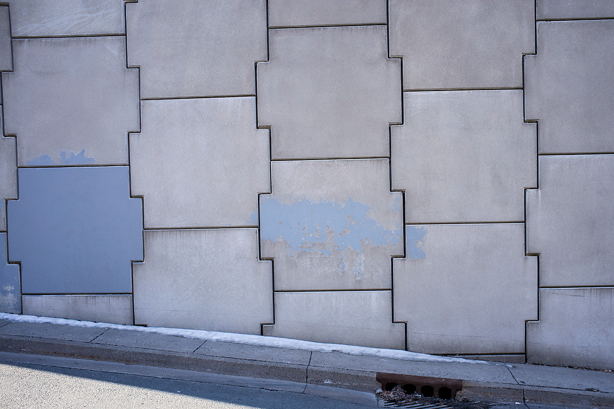
In the style of Lewis Baltz's work I tried to get some detail images, like the texture and pattern of this wall. Hopefully the detail of the concrete will look really good when blown up.
Scans from second visit to Robin Hood and Balfron

Lines look wonky and distorted. was attempting to get some interesting corners and angles with the shadows.


Still not getting it quite right, perspective is all wrong, one image is double exposed. Getting bored of this location.
More detailed shots too: I like these a bit more. The second one is a nice juxtaposition of concrete and nature.


Lucien Wester
Large format images. He photographs where nature and man made meet. Simple compositions, just one or two shapes in an image, sky and wall.
For the Love of Concrete: What Happens When You Heart Brutalism Not Trash It
By Christine Madrid French
"I admit that a Brutalist building doesn’t shout out "hug me" to the casual passerby. The raised, rough-edged corduroy pattern would scrape the skin off your elbows. But, there is a material sensitivity if one looks intimately. Seriously, get close—really close—to your neighborhood concrete. You will see striations, stripes, swirls, wood grain, and even splinters embedded in the textural crevices. Take some time and observe how the sun and resulting shadows change the façade’s character, or how the light penetrates the interior in tightly controlled, meaningful ways"
I have tried to capture these details in my photographs. This is how I want to show the architecture, not just as big, grey, heavy structures, but how they are works of art. The tiny details that we wouldn't think about unless showed.
Cambo Camera
The solution to my problem with the perspective of the architecture is to try a new camera. The Toyo that I was using before was a compact camera, it did have some lens movement but nowhere near as much as the Cambo. I am going to take it to Sheffield and try it out on Park Hill.

Park Hill

I visited Park Hill with the new camera, immediately found the movement in the lens was really effective. I was happy to get to a new location other than Robin Hood Gardens again, the shapes of the structures are really interesting and I managed to take quite a few photographs. It was very sunny which meant there were a lot of shadows,which created interesting bold lines but might interrupt symmetrical compositions.
I need to make the most of the format I am using. Large Format offers so much detail, I should take more shots of small details and textures and images with near and far things in focus to show how good the format is.

The bag bellows are slightly in most frames. Really annoyed as I think the images are quite good compositionally, and would otherwise definitely be used. I can crop the corners out but I think I would rather re-shoot. I suppose its all part of the learning, I am just worried about time. I want to understand the camera completely and spend some time getting lots of good photographs rather than still practicing.


Some good shapes and angles but some aren't really symmetrical. Still need to work on my composing. Spend more time making sure it's perfect.
I cropped the above images but really I think they would look better with a fuller frame.
I cropped the above images but really I think they would look better with a fuller frame.
The last two images are examples of how much better architecture looks with correct perspecive, I finally managed to use the lens standards properly and get all the lines straight and I think they look so much better.
Robin Hood Gardens - Third Visit

I decided that even though I'm fed up with visiting the location, I needed to go back one last time and just make sure I really had every angle at its best. Finally feeling like I had the hang of the camera, the trip went quite well. The weather was really interesting, a huge thunder storm so I hope I got some interesting skies. I made sure to check the bag bellows each time I took a photo to make sure they were definitely not in the photos.
As it was stormy, there was not a lot of light and I found it difficult to see what I was photographing through the glass.
As it was stormy, there was not a lot of light and I found it difficult to see what I was photographing through the glass.
Scans


I am really pleased with this set. I feel like I've finally got the hang of the camera. I started to spend more time thinking about compositions and I got the perspective right. The straight angular lines are really effective, especially in the second photograph. I took a step back in the first image and captured the architecture in its surroundings and I think it has worked quite well, showing the nature surrounding it as well as the skyscrapers behind.

Finally getting correct perspective in my images. There was a lot of trial and error but I have managed to get the lines straight. The first image was from the first time I visited Robin Hood Gardens and the second from the most recent time. The image was taken from the same place and you can straight away see how much better it looks and makes more sense as an image. I'm really glad that I've finally managed to do this succesfully because now I can concentrate more on whats in the images rather than just the technique.
I think an important part of my project is that I really want my work to have a style or theme. I don't want just a loose collection of images documenting these locations, I want a serious body of work. I want all my images to have something about them, you can tell they are mine, or you can tell they are part of the same collection. I am going to work really hard to compose these images properly, use the lines and shapes of the buildings in similar ways so even though you are seeing different buildings you can tell they are from the same series.

Matthias Heiderich
http://www.matthias-heiderich.de/
Matthias Heiderich is a German Architecture photographer. I think his work is beautiful. He uses the natural shapes of the environment, the architecture and the natural land to create these incredible compositions. There is a lot of symmetry and use of lines and shapes in his work that draws the viewers eye around the image. I think the use of colour in these photographs works really well and kind of proves me wrong about my black and white theory.
This extremely composition orientated feel is what I want my work to have.

http://www.tate.org.uk/whats-on/tate-britain/exhibition/ruin-lust
Jane and Louise Wilson
Azeville
Azeville
Keith Coventry’s Heygate Estate 1995
http://www.tate.org.uk/art/images/work/P/P77/P77870_10.jpg
Rachel Whiteread’s Demolished – B: Clapton Park Estate 1996
Plan for Easter holidays
Back in London, going to try and get everything I need before the holidays are over so I can spend the rest of the time editing and printing. I am going to stay and keep photographing every day until I feel confident that I definitely have everything I need. At the end of the holidays when I feel like I've completely got the hang of the camera I'm going to go back to Park Hill in Sheffield and re-shoot.
Andreas Levers

http://www.andreas-levers.de/modern-world
Andreas Levers is another German photographer who focuses on architecture and man made shapes as his main photographic subject.
I am interested in his use of negative space, I think the images where there is something in the corner and then the rest is sky, are really interesting to look at. I am going to try to take a few of my own in this style. I feel like I’ve been spending so much time trying to get correct perspective in my images of buildings I have forgotten that they don’t all have to be perfectly straight and grid - like.
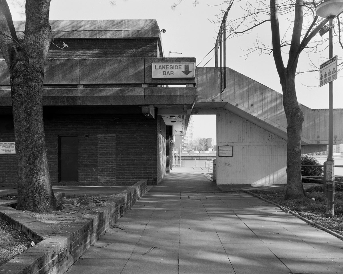
Thamesmead
"Thamesmead was built at the end of the 1960s. Efforts were made to solve the social problems that had already started to affect earlier estates. These were believed to be the result of people being uprooted from close-knit working-class communities and sent to estates many miles away, where they knew nobody. The design of the estates meant that people would see their neighbours more rarely than they would have done in the terraced housing that had been typical in working-class areas. The solution proposed was that once the initial residents had moved in, their families would be given priority for new housing when it became available.
Another radical idea of the GLC division architect Robert Rigg was taken from housing complexes in Sweden, where it was believed that lakes and canals reduced vandalism and other crime, mainly among the young. He used water as a calming influence on the residents."

"Thamesmead was designed around futuristic ideas, and indeed, looked impressive at first from a distance. It provided walkways between its blocks of housing and later between sections in North Thamesmead. The walkways quickly became littered and abused. They were not considered safe places to walk. Pathways set out for people to walk on were put in without regard to how people would wish to get about, so some were ignored in favour of more direct routes over grassed areas."
I went to Thamesmead yesterday and immediately regretted not going there sooner, the location is perfect for my project. The entire area is made up of Brutalist style architecture, It was built in the late 60’s to be a place for the overcrowded people of Central London to live. The architects tried to use the earlier mistakes from previous estate building as learning opportunities. They put lots of canals and lakes around, hoping this would lead to a more calm atmosphere as well as making the whole area more open with paths and walkways and more space in between buildings.
Despite all the efforts to make this area work, it still had many problems. It is very cut off from everything else, making it very difficult to get into London or across the river. There was also a lack of shops and the nearest shopping town was the other side of a railway with no bridge. A bridge was finally built several years later.
I found this to be a really good location to shoot at, there was so much architecture and the backdrop of lakes and canals and wildlife adds a really interesting dimension. I wish that I had visited this location sooner as I feel there is still a lot I could get from here. I hope I have time for one more visit.


For most of this project, my final plan was to show a couple of big prints but also to make a photobook of all my best images. I feel idea made me focus too much on getting good images from each location so I kept going back to the old ones 5 or 6 times when I could have been visiting new ones.
I have decided to scrap the idea of making a book and am going to just show some of my best photographs as my final piece. This allows me to keep visiting new places and find new and interesting angles to photograph and this has already made the project much more exciting for me.
The Barbican


I had put off visiting the Barbican for a while because I was worried about having too many people around and I definitely don't want any people in my photographs. I decided to go on a bank holiday morning and so there was barely anyone around and I managed to get quite a lot of photographs. I was restricted a bit because I had only bought one box of film and was going to Sheffield to shoot Park Hill the next day.
Next time I will remember that it's better to have more film than not enough. I think I got a few decent ones though.
http://dylanchewphoto.tumblr.com/post/77949919697/north-st
I like the attention to detail here, I want to take some images like this. I think there is something interesting about photographing and bringing attention to patterns and shapes that normally you would not notice.
Park Hill Second Visit
I returned to Park Hill for the third and hopefully last time. Learning from all my mistakes I made sure to check the bag bellows before taking each image. This was the first time I went on a shoot alone, previously I had always taken someone with me to help carry kit and also just make me feel a bit more comfortable and safer while my head was under the blanket etc. This time however I went alone and found I worked a lot better. As I had been to the location a few times before I felt confident in my surroundings. I felt much more relaxed and not time restricted, I didn't feel like anybody was waiting on me so I could take as long as I wanted to compose and re-compose images to get exactly what I wanted.


Now I have decided to not make a book and have a series of single images as my final piece, I feel like am able to have a much looser selection of photographs. I took this on 35mm last year and really like the composition so I might go back and re-take with 5” 4”.

My plan was that after I went to Park Hill, the photo taking part of the project would be over and from here I would start editing and narrowing down my selection and then begin printing. However there are still a few days left of the Easter holidays and I have decided to spend them taking more photographs. Looking through what I have so far, I feel like I should take the opportunity to take the time to get as many images as I can. I want to go back to Alexandra Road because I feel there are quite a few shots I still don't have from there as well as Clifton Cathedral and some places in Hotwells if there is time. I know that I need to use all available time constructively.

This was taken on my phone at Alexandra road but | think it would make a beautiful detail shot in large format. I am going to buy some more film and go here to shoot things like this again.


https://www.behance.net/gallery/Geometry-Geology/7299757
"Geometry + Geology is an exploration of the formal and expressive affinities between Brutalist architecture and glaciated rock formations. The particular similarities I want to depict are the sense of sublime scale and monolithic bleakness. The rough, weather-stained face of the shuttered concrete resembles the irregularities found in the erosion-scarred terrain of mountain rock. The darkness of the material in wet and grey weather matches that of the frequently dour conditions of the mountains. The shadowy nooks and crevices inspire trepidation and invite exploration. In The Seven Lamps of Architecture, Ruskin writes of the significance of ‘power’ (or the sublime) in architecture, citing the epic, uninterrupted wall, the ‘precipice’, as the archetypal expression of abstract power. The effect of severe, unyielding nobility also carries with it a sense of melancholy in its solitude. The Brutalist buildings photographed exemplify this sense of imperviousness: solitary, stark, with intersecting planes conveying a sense of geological force and weight. The geometric compositions add to a sense of abstraction. There are no obvious symbolic forms introduced by the architects. The geometry is strong, but irregular. The buildings, considered as wholes, do not have lines of symmetry; again, suggesting a comparison with mountain rock."
There are many similarities between natural objects and Brutalism. Grey concrete, massive, imposing.

A tennant interested in my work gave me this.
Visiting Alexandra Road is different to the other Brutalist social housing estates. Even though they are all council owned there is something different about this location. You immediately notice the hundreds of plants the tennants have on their balconies, they obviously care about their homes. There were children playing in the walkways and loads of cats everywhere, it just felt a lot more welcoming and "happier" than the other locations. It was nice to see somewhere where the original ideals of Brutalism had survived.


Developed the photos I took over the Easter holidays. Out of 31 images only 1 is not useable. A few are a bit wonky but can easily be cropped. I am very pleased with all the photos I took, I am glad that I spent so much time going to all the different locations, I think this has made my project much more substantial. I made a consious effort to get as many different angles as possible and make the most of each location and I think this has paid off.
Mobility
Using the large format cameras has been a really great experience for me, I've learned a lot about how the cameras work and found that this format is much better suited to my work than the 35mm I was previously using. I think using this format has really helped my understanding of the methodology as well as suiting my style. It makes me really consider composition, angles, lighting etc which is a great skill to have.
I have found the lack of mobility frustrating though. Packing and unpacking the kit takes a long time and although the slow process of the camera has been very good for me as a photographer, it has sometimes meant that I miss certain moments like placement of people or clouds etc, or angles that the big camera can't access, that I probably would if I was just carrying a small hand held camera. It's not as easy to snap little things that catch your eye.
More Mattias Heidrich again, I found this set on his behance and was relieved. I was worried that his work worked so well because of the use of colour but actually it looks great black and white too. The compositions are what stand out.


http://www.le-blanc.com/
Another example where the photographer uses the existing shapes of the architecture to create really visually interesting compositions. Square format works really well here.

"Large-scale photos of the broken and decayed World War Two bunkers that litter the Normandy coastline of northern France form the basis of a new exhibition at the New Art Gallery in Walsall.
The black and white photographs are monumental and compelling.
They also occupy a space between land and sea, carrying the very real scars of the battle to rid Europe of fascism, and for the artists they now seem to defy any sense of time and place."
I want to make large compelling images, to show off the format I am using, to use the existing angles of the structures to create interesting and beautiful compositions to show off the architects original intentions.
I have been doing a lot of research into photographers and artists that make pictures of architecture in styles that I like, but with almost all of them, it is difficult to tell how they are making these photographs, what techniques they use to create them.
Group F/64 is an example where I know for sure the format they used. They all used large fomat, and f/64. The images they were making were incredibly detailed. I think they are such powerful images, there is something about large format that takes everything in and makes really imposing, "big" images that draw you in and make you keep looking.
I want my work to have this feel, it's important, it isn't just a photo of a wall, I want it to be more than that but I am worried that might not be so obvious.
Group f/64 Manifesto
"The name of this Group is derived from a diaphragm number of the photographic lens. It signifies to a large extent the qualities of clearness and definition of the photographic image which is an important element in the work of members of this Group.
The chief object of the Group is to present in frequent shows what it considers the best contemporary photography of the West; in addition to the showing of the work of its members, it will include prints from other photographers who evidence tendencies in their work similar to that of the Group.
Group f/64 is not pretending to cover the entire of photography or to indicate through its selection of members any deprecating opinion of the photographers who are not included in its shows. There are great number of serious workers in photography whose style and technique does not relate to the metier of the Group.
Group f/64 limits its members and invitational names to those workers who are striving to define photography as an art form by simple and direct presentation through purely photographic methods. The Group will show no work at any time that does not conform to its standards of pure photography. Pure photography is defined as possessing no qualities of technique, composition or idea, derivative of any other art form. The production of the "Pictorialist," on the other hand, indicates a devotion to principles of art which are directly related to painting and the graphic arts.
The members of Group f/64 believe that photography, as an art form, must develop along lines defined by the actualities and limitations of the photographic medium, and must always remain independent of ideological conventions of art and aesthetics that are reminiscent of a period and culture antedating the growth of the medium itself.
The Group will appreciate information regarding any serious work in photography that has escaped its attention, and is favorable towards establishing itself as a Forum of Modern Photography."

Ansel Adams

Dorothea Lange

William Van Dyke
Group F/64
Group f/64 was a group of photographers working at the beginning of the 20th century that shared a common interest of working with a specific f-stop. Their sharp focused images contrasted strongly against the current pictorialist style that was extremely common in the 1900’s.
The term f/64 comes from the name of the smallest aperture setting on a camera which creates the maximum and biggest depth of field, meaning everything in the photograph will be sharp and in focus. The group rejected the soft focused method and instead took ‘pure photography’. the group wanted to show things as true to life as possible, “to photograph a rock,” Ansel Adams famously said, “have it look like a rock, but be more than a rock.”
The term f/64 comes from the name of the smallest aperture setting on a camera which creates the maximum and biggest depth of field, meaning everything in the photograph will be sharp and in focus. The group rejected the soft focused method and instead took ‘pure photography’. the group wanted to show things as true to life as possible, “to photograph a rock,” Ansel Adams famously said, “have it look like a rock, but be more than a rock.”
I think Adams was trying to say here that his photographs are not just a document of the subject but a document of everything it means, and how he feels about the subject. This is what I am trying to do with my photographs. They are documenting the brutalist structures before none are left. But they also hopefully capture the "feeling" of the buildings. I want them to show how I feel about the architecture too, I hope my compositions show the beauty in the angles of the buildings. I want to try and show the beauty that the architects and designers originally intended with these magnificent structures.
Making a Book
A month ago I decided to scrap my plan of making a book out of my photographs as I didn't feel I had anywhere enough images and also didn't feel too confident with the ones I had. However since then I have managed to visit a lot of locations and take a lot more photos. I had a tutorial and decided there were definitely enough images to fill a photo book and it would be a great way to showcase my work along side a few prints still.
I am going to scan the negatives into the computer and re-touch them there and then put them into an indesign file. I think this will be much more time efficient than making prints to scan and by using photoshop to get rid of dust and scratches rather than spotting the prints, it is much easier to get close up.
Craig Atkinson - zines
http://www.craigatkinson.co.uk/index.php/architecture/barbican/
Craig Atkinson photographs Brutalist and Modernist architecture in black and white and makes these really interesting zines/books.I also really like the full page double spread photographs in his zines, I think it works really well with this style of architectural photography and is something I am seriously considering for my own book. Atkinson's work is digital and I think using large format film, I can get better quality images.

Thamesmead
Over the Easter holidays I visited four locations. I went to Thamesmead first and these are my best images.
Although I really enjoyed shooting at this location, looking back over the images I made, I don't think a lot of them are good enough to fit into a final selection of work. I like the first photograph a lot, the lines, sections and contrast of tones make an interesting composition. The second image could also make a nice break in the mostly concrete photographs. I feel like if I had enough time to return to the location a few more times I could get some better photos.


I'm not sure about the rest of the images, I think they would look better a bit closer in. The third photograph is okay but I think it could have been better composed, for example I think it would look better if the camera was lower and the two white walls leading down the path were in the middle of the photograph rather than closer to the bottom. I'm not sure how many images from this set will go into my book which is a shame.
The Barbican
I am finding it really interesting how Brutalism has certain rules that all these structures stick to but that also each different building has it's own personality with little differences like tiles on some walls, or painted walls in a colour theme, some have lots of thick concrete beams while some are thinner. Some structures like Park Hill, have more smooth concrete but the Barbican has very rough walls.

I like this image a lot, I had been focusing so much on getting the perspective right and lines straight in my photographs I had forgotten that other angles can look good too. The different textures and angles in this are really effective. This is the sort of image I have been trying to make, I'm glad I've finally started getting these shots.

I had been meaning to make more images like this, simple but bold details, showing off the style of Brutalism. This image also reminds me of Lewis Baltz's work, the plain walls with one bold subject. I am looking forward to print this photograph as I think the detail of the concrete will be incredible.


Throughout the project I have taken a step back and taken a more landscape style photograph of the buildings. It is interesting to see the setting and environment of these structures occasionally as most of my work focuses on close up details and the more inside feeling of the structures.
Park Hill

I like these angles I think this will mix the album up a bit with interesting perspective rather than just straight on.

I also managed to re-take a lot of the images that were spoiled by the bag bellows being in the way. I really like the symmetry in this photograph, when I took the same image last time I visited, the sun was at a different angle and there were big dark shadows ruining the symmetry of the angles.


Alexandra Road Estate / Rowley Way
I returned to Alexandra Road and I think a lot of these photographs are really successful. There were a few images that I had taken on my phone last time that I shot with the large format camera where the detail is incredible. Very pleased with this visit.


I rephotographed this image without the cable in the way and I made sure to position the camera at the very middle to make it completely symmetrical.


Re-touching
I have re-scanned all the images I've taken in this project to the highest quality and gathered them all together. I now need to re-touch and edit the photographs as even though I made sure the negatives were as clean as possible, there are still a lot of scratches and dust that need to be removed. I've not done much of this kind of editing on the computer before and It's turned out to be a much ore time consuming task than I imagined. However I do feel I got pretty good at it and have learned a valuable skill whilst doing this.
Correct Perspective
A few examples of images I took last term and this term. The images on the left were taken using a 35mm camera and the ones of the right, the same location shot with large format. You can see the incredible improvement, the perspective is correct, the lines are straight, the images make much more sense as it is how our eye sees the building. I am pleased with how my skills have improved and how this has made my project better. I think I have got a lot better at composing my images, the first ones are not very thought through, all on strange angles, the second ones are straight and symmetrical and look much better.


I am worried that my photos just look like anyone could have taken them. I really want them to have a style, a theme running through. I want them to have something about them that is better and different to what anyone else could take. I've shot large format so that the detail and depth of field will be incredible in the prints, and because I could get all the shapes and angles to look right and the perspective to be right. I am just worried that people wont be able to tell that I’ve gone to all that hard work.
Final Book Edit

When looking through my photos and deciding what ones to go in the final book edit I ended up almost halving the amount I already had because I wanted the series to really fit together. I felt like even though some of the other images were sometimes interesting and nice to look at, they took away from the project by being a bit different. I chose only the most angular, symmetrical and interesting compositions to go into the book. It makes it quite graphical and more of a fine art book than a classic documentary photo-book and I really like the final order. It meant that some good images didn't end up going into the final selection but they just didn't fit into the project properly and I can still show them on my website as personal work.


Craig Atkinson's Instagram account. The artist who makes the black and white Brutalism zines.
He also collects old second hand books about all things architecture related, I love the vintage feel of the old style soft covers and interesting cover designs. It links back to the time when Brutslism was current and being built and talked about.
Cover Ideas
I don't know what would be best for the cover of my book, either text and a small image on a white or grey background, or a full page image going over both front and back of the cover... It is important what image I choose because It has to give an impression of what is inside the book. It can't just be an interesting composition it has to explain that the book is about Brutalism. It also has to look good as just half an image. Unless I use separate portrait images on either half...

After speaking to the book makers, they explained that as my cover is so big they are going to print it on two separate pages and bind it with binding tape. This means that there will be a strip of black tape running up the spine, splitting whatever image would be on the cover in half. Because of this I have to consider that a big line through most of the images would mean they stop making sense. I decided to use the image of the door on the plain concrete wall at the Barbican. I cut theimage in half and then put the door on the front cover and the plain concrete on the back. I think it works well because it is simple but gives a good impression of whats inside. I think having a door on the front cover is quite nice because it's like opening the door into the book.
I was debating whether to have the project title and my name on the book cover but I've decided against it. I tried a few different fonts and styles but I think it just looked messy. Having just an image on the cover is interesting enough and hopefully you don't need to see the title of the project to understand what it is.
Final cover design

Information page

I had originally imagined that I would write some sort of introduction to my book, explaining my project and why I had taken these photos, and also to show the photographs in some sort of order of location. But when it came to laying it out I realised that it was much more about the shapes in the architecture, the images that I ended up choosing flowed really well and I think text would just distract from that. I decided having chapters for each location wasn't really what I was going for, the compositions decided the order for themselves and most worked much better being next to different textures and shapes rather than ones from the same building etc.
The book is quite intense with its big double page images full of bold lines and black and white and I think its turned into a sort of graphical document, I decided to have the text at the back of the book so the reader can get straight into the images and find out about them after, sort of make their own mind up of whether they like the architecture or not, hopefully my photographs shed a good light on it. I wrote just a sentence of information about the project and my contact details as I decided I wanted my book to be more of a visual experience.
Getting the book together was a much bigger job than I had expected but luckily I had given myself enough time. Resizing images was very frustrating and there was a lot more to Indesign than I thought. I got some help and advice from some graphic designer friends as well help from the the company I chose to make my books website.
Last term, to show off my final images I created a zine using indesign and printed it off at uni, I knew that I wasn't finished with the project and wanted to continue if through to the next term so I didn't want to make a whole book just yet. I had a few problems and the final piece was very pixelated. There was no time to remake the zine so I had to submit it like that but I was very dissapointed. I have done some research and found that the problem was that I had been placing the images into the indesign document and then stretching them to the size of the page, this was the reason they were pixalated. The files needed to be rezised on photoshop to the size of the page and then placed exactly within the lines. I made sure to do this so that all my images would be perfect.
The size of the book was a tricky decision, I didn't want to have to crop the images at all to fit any normal conventions so I had to find a company that would make weird sizes. As the original negatives are 5 by 4 inches, I needed to scale this number up to a size good enough for a book. I decided to go for 20 by 16 inches and then half the width as this will be the size of each page and the double page spread will be one image.
Another issue I had was how to place the portrait images. I knew from the beginnning that I wanted my book to have full bleed, double page spread, landscape images to give a big impact and to show off the detail that large format offers. Almost all my photographs were landscape but there were a few portrait ones that needed placing. Due to the format of the image, the height of a portrait image wasn't the same height as a landscape so unless I cropped the portraits, they wouldn't fit perfectly on a page and would have to have some white borders. This also meant that the images would be a lot smaller than the landscape ones and I didn't like this at all. The point of making such a big book and having big full page spreads was to show off the detail in the photographs and if they are very small then that won't be noticable. To solve this I decided to stretch the portrait images to their full height, which meant they spread over to some of the allining page.
I initially planned to get my book printed at a company called Ex Why Zed who specialise in students final major projects, I had heard good things and after checking out their website I had decided they were right for my book. I contacted them about my project and it turned out they were unable to make my book as it was too big for their printers.
After this I was a bit worried about where I could send my book and how much it would cost. I asked around and almost everyone reccomended a company in Bath called Ripe Digital. I had a look at some books they have made for friends and was very impressed with the quality and variations. I contacted them with my book details and they gave me a rough time and price estimate that suited me so I decided to go with Ripe.
I had a look at a book of paper stocks and chose one that I thought would best fit my images. I wanted a slight gloss but not too shiny and not matt either so I chose a silk paper.
I am not sure how the binding tape will look on my book, it isn't the design I was imagining but hopefully It will look just as professional and a big black spine could potentially go really well with the theme of bold lines running through the project. I am also worried about the style of the binding. I chose perfect binding because I believed it would be best suited to my double page images but after reading what Ripe say on their site about not putting text too close to the middle I am worried that my photographs might be distorted by being sucked in to the middle.

I am looking forward to starting to make some prints tomorrow, I know I’ve scanned all the images and worked closely with them on the computer but I think looking at big prints will let me see them in another light. Throughout the project my main aim was that the images would look great when printed big so I’m excited to finally see my photographs blown up in real life.

Started printing today. Glad I left myself a bit of time because this is going to take a while. I am a bit worried about the amount of paper I have but there isn't a lot I can do, there isn't enough time to get more delivered or pick it up so I will have to just be very wise with tests etc.
I chose a resin coated paper because I like how crisp and sharp photographs look and that is something I want to show off about mine. I wanted to blow up my images as big as possible so I chose 20 by 24 inch paper. This is the biggest that I can possibly print in the darkroom. If I were to print my photographs digitally I would be able to print much larger. As much as I would like to show bigger prints, I think 20 by 24 is big enough to see the detail in the photographs and printing analogue is something I really enjoy and was always going to be my final outcome.
I think the fact that I have hand printed the photographs myself in the darkroom adds something to the work, I feel like I have built a relationship with the images, really studying them and making sure they were all perfect. I also like the fact that a hand made print has more of a sense of value and is seen as more of an object in own right compared to a digital print.
I have decided to show 6 prints for the final show. If I had all the space in the world I could show lots more but due to space I will chose my 6 best images. Hopefully there will be enough space to show them in a row next to each other but if not, and in the case of the Bristol show, I will hang them in rows of 3, in a typological way like the Bechers exhibited their work.
Book arrived! Looks quite a strange shape until you open it and it makes sense, that is just the shape of the photos. The images look really nice, the paper is nice and seeing them blown up so big is great, they are all really sharp and clean and I'm glad I spent all that time getting rid of the dust marks etc because they would definitely show up. After looking at Craig Atkinsons vintage book collection I'm much happier with the black fabric binding tape. I do wonder if some text on the cover would have looked okay as there is so much space but the title is on the inside front page so It doesn't matter too much. One thing I would change is that the cover pages are not as thick as I would like them. I think it would be more book-like and sturdy with thicker cover pages, at the moment it feels a bit like a magazine. If I have any time after I finish printing I might look into making another cover, like a slip or wrap around with thicker paper.

Dust and Marks

When I was scanning my negatives into the computer I noticed that several images had these marks on and I just assumed it was dust on the negs. I gave them a clean and carried on scanning but the marks were still there. As I was digitally re-touching the photographs in photoshop, it was easy to get rid of these marks using the clone stamp and although it was quite time consuming, it wasn't a big problem as I was able to remove them completely. Stupidly I forgot about all the marks and when it came to printing it became a problem again.
I washed all the negatives again and then looked through them to find which ones had the marks. Most had a few spots here and there which are easily tidied up with spotting inks later, but quite a lot had these large black marks that look like dust or little hairs. They weren't dust on the negative though they were bits of dust on the actual photograph. There must have been dust inside the dark slides which created a photogram like effect where the light couldn't reach the negative.
This is very frustrating and annoying because there is not a lot I can do to solve the problem at this stage. If I had put two and two together earlier on I could have possibly tried to re-shoot the last few visits, or even just re-shoot the final 6 images I wanted to show.
This error is my fault because the dust inside the dark slides could have been removed. I didn't know to check for dust as this problem had never happened to me before. This was a stupid mistake and I will always make sure to check from now on. I am very disapointed because I feel these marks ruin some perfectly good photographs.
The paper I am printing on is resin coated and the resin coating makes it very difficult paper to spot. It would be very hard to alter because the lines are black on top of light backgrounds so I would have to use some sort of bleach. This close to deadline I think this is impossible.
My only options are to carry on printing anyway, so that I can at least show my printing ability. For the show I am going to print the edited digital copies. The marks are completely gone and this also gives me the option to possibly print larger. I am also going to look into getting some fiber based paper and attempting to spot out the marks and if that can be done in time, show them in London.
Another option is to chose my final six from earlier shoots as these don't have the marks but I feel my work improved a lot over time and my best images are the later ones.
This is very dissapointing, one of the main aims of this project was to show some big hand made prints and now I am going to have to print digitally.
Critical Evaluation
Photo-Brutalism
This project is a continuation from the work I was making last term. The idea was to photograph Brutalist Architecture and explore the space it holds in our urban landscape. Previously I visited a number of Brutalist structures around Britain and photographed them using colour and black and white film in various formats. The preparatory research and photographic work I made during the first module lead me to want to complete a more extended study of the subject.
I wanted to photograph Brutalist Architecture for a number of reasons. I think Brutalism is an extremely photogenic subject, the architects created very angular and linear arrangements of shapes that can be photographed in a an infinite number of ways to create incredibly interesting compositions. After realising I was interested in Brutalism I went on to do some research and the more I found out about the history of the subject, the ideology behind the architecture and what the designers intended these structures to be and represent, the more I wanted to study and photograph Brutalism.
Through my images I wanted to convey a sense of what the architects intended with the buildings. Brutalism became popular after the second world war, cities needed a cheap and easy solution to house the growing population. Brutalism was the answer, it offered logical designs, streets in the sky, the new way of social living. It was going to be an urban utopia, places for the next generations to grow up in mass community environments. This idea however didn't last and many problems arose, the dark shadowy walkways were ideal crime spots and throwing masses of people together who probably didn't want to live like that made for a sometimes hostile environment. This has lead to a general belief that Brutalist structures are “ugly” and “eye sores” and recently a lot of these structures have been demolished or are in plans to be. I find the ideas behind Brutalism fascinating and although I can see why in a lot of cases it didn't work, I think if it was attempted again, learning from it's mistakes, it could. I love the idea of communal living and especially in Brutalist buildings. Using photography I wanted to explore where these ideas have and haven't worked in Britain by visiting as many locations as possible and trying to show how beautiful and important I think these structures are.
To best portray the gravitas and incredible design of the architecture, I chose to shoot this project using large format film cameras. During the first term I shot several locations with 35mm and 120mm film and found it restricting in terms of detail and information in the images. Large format cameras also offer a large amount of lens movement which gives them the ability to show correct perspective in images which is ideal for architectural photography. Another stylistic choice I made was to shoot the project completely using black and white film. I believe monochrome suits the project well, it makes you focus more on the basic shapes and composition of the image rather than colour details and has a timeless quality that I think works well with this old style of architecture.
The biggest influence on my work at this stage was Lewis Baltz. His very clinical, typological style was something I wanted to capture through my own photographs. Brutalism is very linear and symmetrical and I thought shot with Baltz's deadpan straight style it could bring out and draw attention to the aesthetics the architects put so much thought into. I was also interested in his attention to details like surface texture and patterns and made an effort to try and document some of these aspects of the architecture in my photographs.
I was initially quite intimidated by the thought of using a large format camera. It was something I had never done but as soon as I had a tutorial I knew I was going to enjoy it. I loved having that level of complete control over my images and although it was frustrating at times and took a long time to really get used to the camera and way of working, I am extremely glad I made the effort because I think it has added an immeasurable dimension to my project as well as providing me with an incredibly valuable set of skills.
It took several attempts in the first few locations before I was confident with the camera, I made a lot of mistakes and errors, and this was very frustrating. Over the course of the project however I feel that my skills with large format have dramatically improved, it took some proper research into the mechanics of the cameras but after I had got my head around that and relentlessly practised, I feel I really did get the hang of large format. I really enjoy the slow pace way of working with large format photography and the massive amounts of thought and attention that goes into each shot. I think knowing how to use a large format camera properly will be an extremely valuable skill in the professional world and I have bought my own camera so I can continue shooting in this style.
Something I did differently this term that paid off was getting access to shoot in some of the locations. I knew already that it was legal for me to photograph the outsides of the buildings as they were council housing it meant they were public areas. However I still felt a bit uncomfortable turning up with a huge set of kit outside peoples homes. Last term I was approached when taking pictures by an angry tenant who said it was illegal to take photographs here and that I needed a permit. To avoid anything like this happening again I contacted the housing association and explained what I was doing, they said I did not need a permit to photograph the exteriors of the buildings and to direct anybody with questions directly to them. This made me feel a lot more comfortable photographing in these areas because I knew for sure that I was allowed and had a response for anybody who asked. Other than this I generally found that I got a better reaction from strangers when shooting large format than I do with 35mm, I found that people took me a bit more seriously and would come and ask me about my project whereas when I’m shooting 35mm I feel like people are not happy with me taking photographs.
As I gained confidence with the camera I started looking at more architecture photographers, someone who caught my attention immediately was Matthias Heiderich, a German photographer. He uses the natural shapes of the environment, the architecture and the natural land to create these incredible compositions. There is a lot of symmetry and use of lines and shapes in his work that draws the viewers eye around the image. This extremely compositionally orientated feel is what I wanted my work to have.
Originally my plan for the project was to shoot as many different locations as possible and then put all my best photographs into a book and print a few big images to show at the exhibitions. However after a few months it became clear that I wasn't getting enough 'good' photographs and I got worried about being able to fill up a book. I think the project finally came into its own over the Easter holidays, I took out the camera and bought a lot of film and returned to all the previous locations as well as a lot of new ones. I made an effort to just keep shooting until I knew I had enough and it paid off. At this point I had a tutorial and we decided I definitely had enough images to make a book.
I knew that a big part of my project was going to be spent printing and book making so made sure to leave some time to fit all of this in. The first job was to scan all of my images to the highest standard and then edit and retouch them in post production. I hadn't done a lot of this previously and found it to be a bigger task than I had expected, however I feel I gained a very valuable skill in using things like the clone stamp in photoshop. Once the photos were all made perfect It was time to start making the book.
My main source of inspiration came from photographer, book-maker and collector, Craig Atkinson. Atkinson makes zines, creating double page spreads from his own black and white images. I think double page, full bleed spreads are a great way to show architectural photography. As I had gone to all the effort of shooting large format photographs I wanted to be able to show them at their full potential, I wanted my book to be big and also to keep in with the proportions of 5x4. This meant that the book when closed was going to be quite an odd shape.
Last term my final outcome was a zine of my best work, I put it together using InDesign and was very disappointed when the images were all pixelated even though I had used high resolution images. This time round I made sure to find out what had gone wrong, I needed to resize the images to the exact size of the page instead of stretching them across. I decided to use a printers called Ripe Digital in Bath because I had heard a lot of good things about them and they were able to print the funny size of my book.
I am not completely happy with my book now I've had a proper look at it printed. The cover is far too thin, it feels like more of a magazine than a book to me and not sturdy enough. This is something I could have altered by going in to the shop and picking a paper but I was unable to travel. I am also not happy with the shape and dimensions of the book, I know that it has to be that shape if I want to keep the images at a 5x4 ratio but I just feel like its an awkward shape and doesn't work as well as it could. Another thing that wasn't perfect was the colouring in the images, the photographs are all black and white but in the book its a strange greeny digitalised version of black and white. I do not have time to change any of this before submission but I will definitely be editing and redesigning the book for exhibiting at the London show. I think if I used a white border around the landscape images the book would be more in proportion, I will also get a much thicker cover and make sure the colours are correct. Although there were quite a few problems with the book, I was really happy with how the images looked. The quality of the prints are fantastic and I think the photographs look great on full page spreads, I'm glad I chose to have such a big book as the detail in the images is really clear and nice to look at.
As well as the book I also wanted to make a series of prints for my final outcome. From the beginning of the project I knew that I wanted to hand print these myself in the darkroom. Printing in the darkroom has always been an important part of my work, I feel like it is another part of the process that I would miss out on if printing digitally. I really enjoy that extra level of involvement with the images, things like burning in darker skies. I also think that it would be a shame to print digitally when I have been using analogue methods the whole way through the project. Printing from 5x4 negatives creates a massive amount of detail that I think looks really beautiful on a hand print. The paper I chose to print on was a resin coated gloss paper. I chose this because I love how the gloss makes details stand out and makes things look really sharp, my images are very detailed so I wanted to show this off.
When I began printing I came across a big problem, when the images were being blown up so big, all the little marks and scratches were extremely visible. When editing the images digitally it was so easy to just get rid of little marks that I didn't even think about how they would affect my prints. The marks came from dust that was inside the dark slides when I was taking the photographs, this was my mistake and although it could have been prevented, I had never even known this was an issue to watch out for. I will definitely learn from this mistake and always make sure to clean out the slides. With traditional printing on fibre papers you can spot out little marks but it is more difficult with resin coated paper, it would also be very difficult because spotting inks are generally for filling in white marks rather than the black ones in my photographs.
I am extremely disappointed about this, it is such a shame because the images are so detailed and sharp and I think they look great when printed big but are ruined by the ugly dust marks all over them. With such limited time there is nothing I can do but even if I was to re-print using a fibre paper the task would still be incredibly difficult and might not even work. My only option now is to print the photographs digitally for the final exhibition. This is not at all what I wanted for my final piece but it is the only way I can show my images to their best potential, printing digitally also means I could print bigger than 20x24 so that is a plus. I will be submitting the hand made prints as I think they still show my printing abilities and if you ignore the marks the photos still look good. They are not at all the quality I would like to show to the public and I am unhappy that I don't have time to make digital copies to submit for the examination but hopefully the retouched images in the book will give an example of how the digital prints will look.
Overall I think this has been a very successful and fulfilling project for me. The idea was something I was really interested in and so I was always looking forward to the next stage. I think I have come out of this year with some incredibly valuable skills, being able to correctly and confidently use a large format camera is something I will definitely value in the future, as well as strongly improving my skills in photoshop and my printmaking skills. I really feel that I have shot this project to its full potential and not cut any corners in trying to get the best quality of images. I encountered some problems and frustrations as well as some big mistakes throughout the project but I feel confident that I have used these experiences to learn and improve rather than give up.
Completing a lot of research into Brutalist architecture helped me understand what the architects intended with their designs and this in turn helped me understand what I was trying to convey with my project. I hope that my photographs fully represent how majestic, beautiful and important I think these structures are and possible help to sway other people towards my way of thinking.
I feel like a much more confident and experienced photographer after completing this project and although my final images are not exactly what I intended, I don't think I would have done a lot differently with this project, I feel I worked hard and it has paid off. I think although I have completed this part of the project, It has a lot of potential and I am seriously considering taking it further post graduation.


