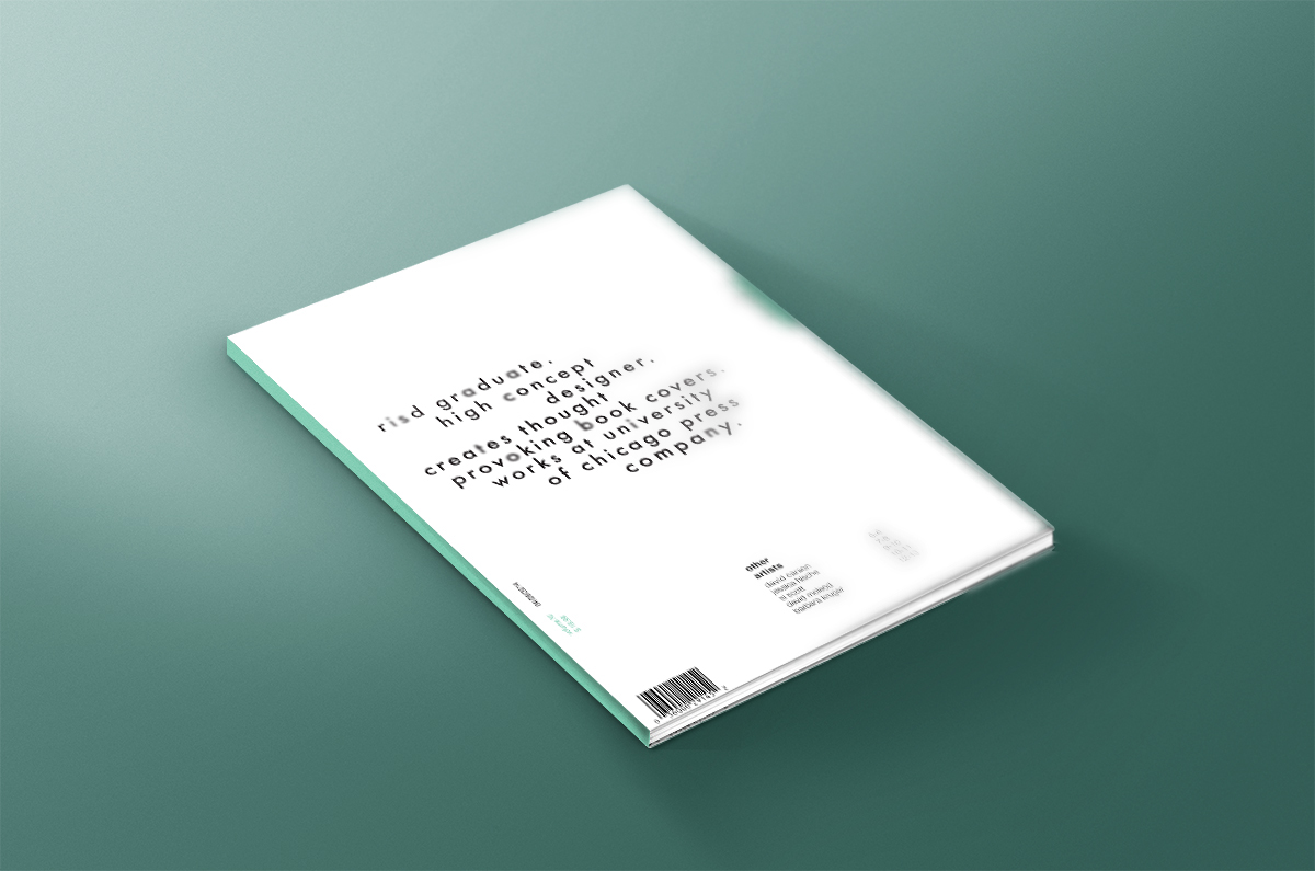
The concept for this design is to bring out the artistic style of Isaac Tobin through detailed typography treatments and structured grid layouts in "exposed" magazine's new issue. Isaac Tobin is known for creating minimalistic book covers through a combination of simple graphics, colors, and sophisticated typography that enhance the core theme of each book he designs.
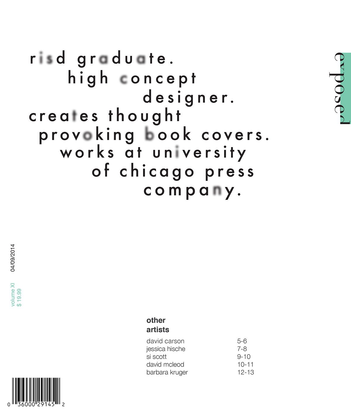
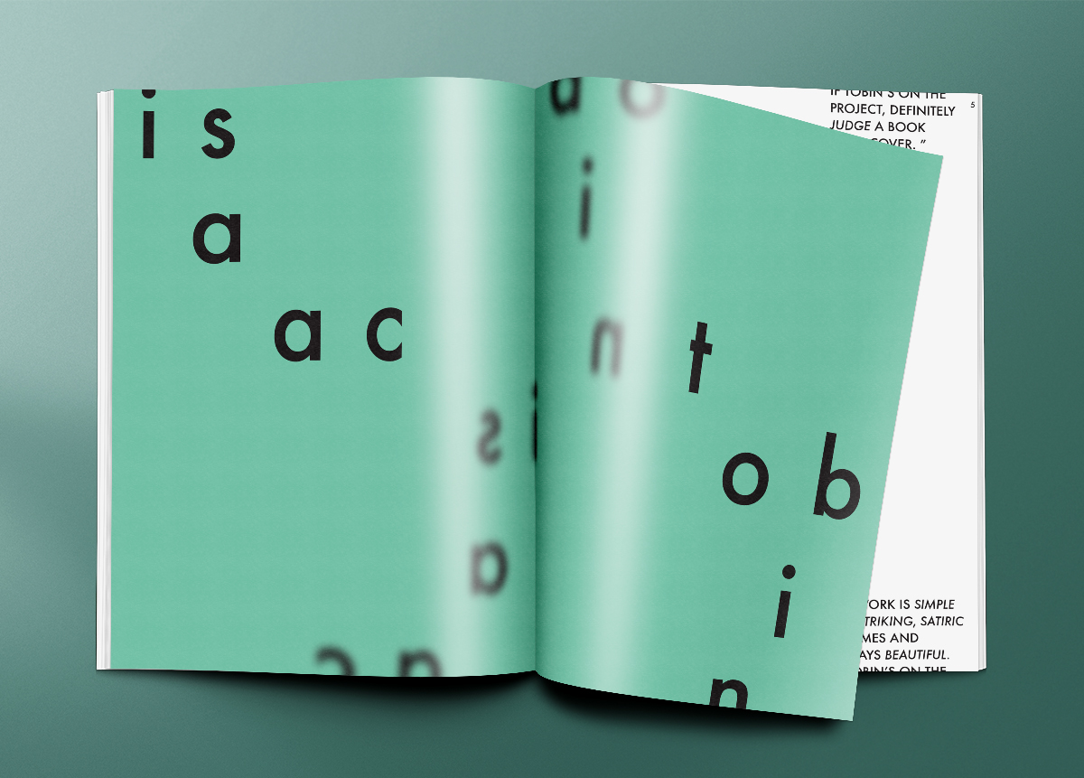
My magazine cover uses futura to describe a mini biography of Isaac Tobin, and the letters of his name are sporadically blurred out within the description. If the viewer does not pick up on the name immediately, the first spread inside is dedicated to inverting his name in clear letterforms to “reveal” that these first couple spreads will be about Isaac Tobin and his work. I came up with this idea because our magazine’s theme is to expose artists, and I liked the idea of creating these subtle changes in my typography to imitate that process of exposure of this particular designer.