


A new brand that empowers creativity
One of our first challenges as a team was to evolve Moises' visual language and reimagine its brand positioning entirely. We dived into an extensive exploration phase while defining the core identity principles to help guide our decision-making process on redesigning our brand.
One of our first challenges as a team was to evolve Moises' visual language and reimagine its brand positioning entirely. We dived into an extensive exploration phase while defining the core identity principles to help guide our decision-making process on redesigning our brand.
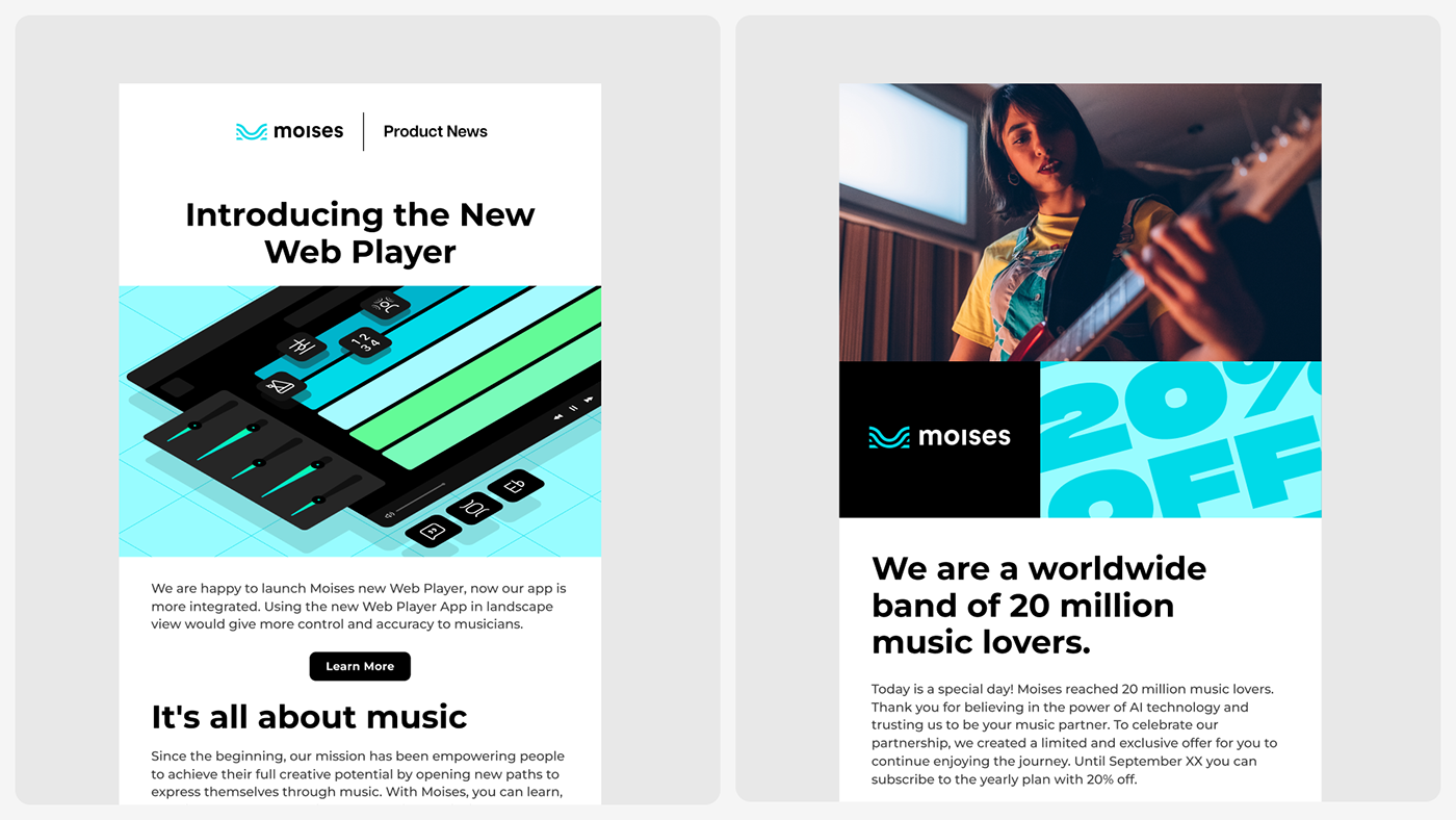
This process took months, and after many iterations, we developed a refreshing look and feel that cascaded to our design system, product interfaces, and all brand applications across many channels. This project helped us strengthen the relationship with our users, improve our communication, and, ultimately, our products.
We know this is an ever-evolving project, but we are very proud of our work so far, so we decided to share the creative process behind this team effort. We hope you enjoy it!
Born in the intersection of music and technology
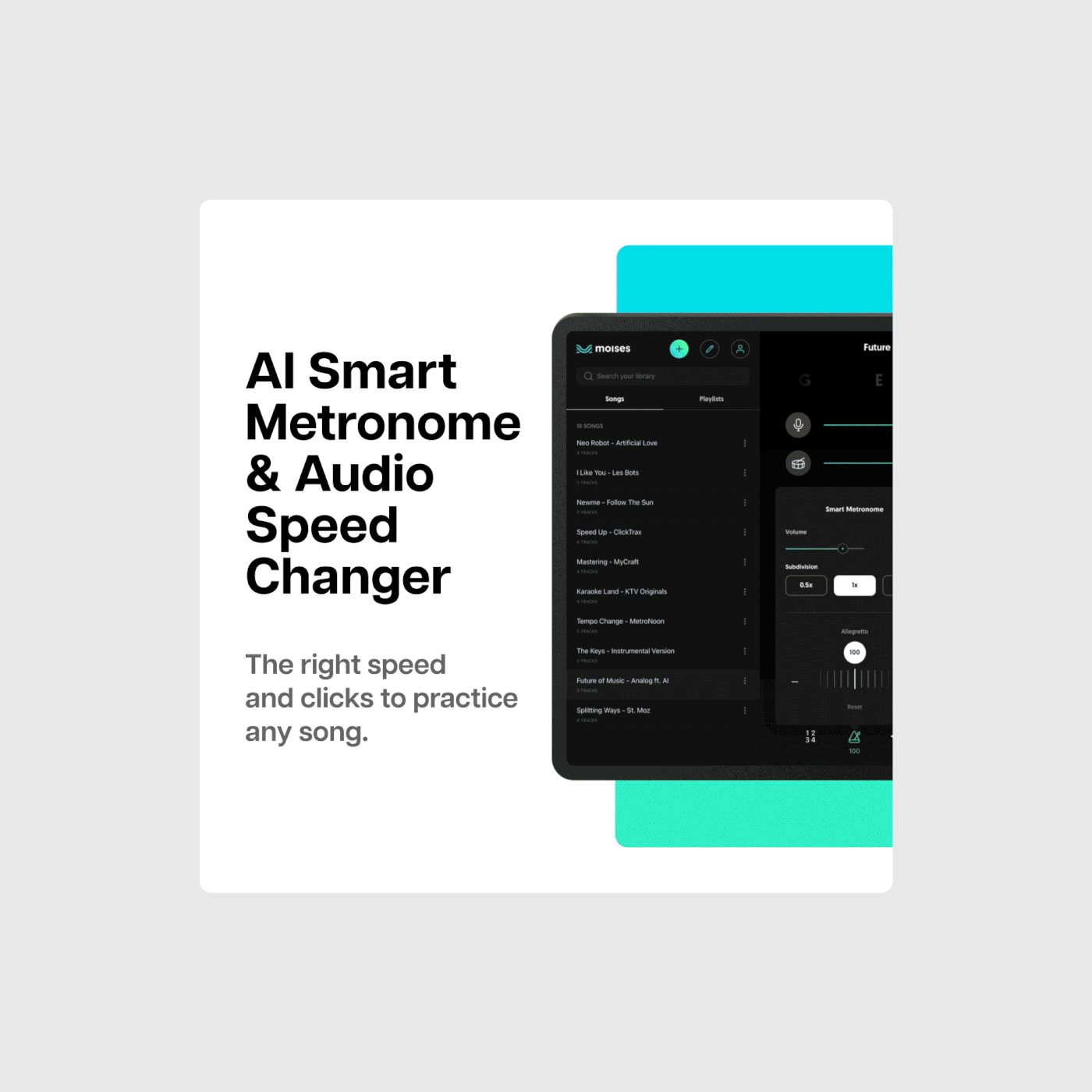
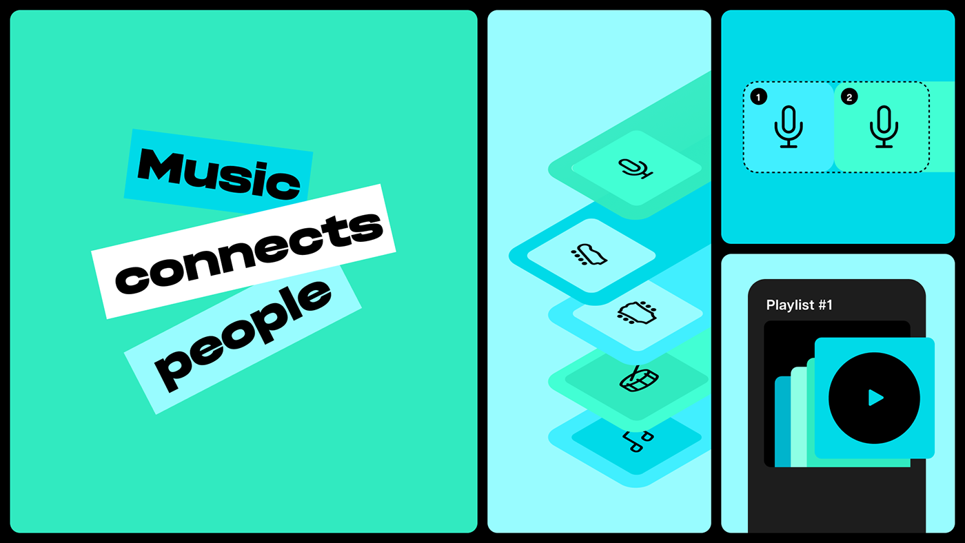
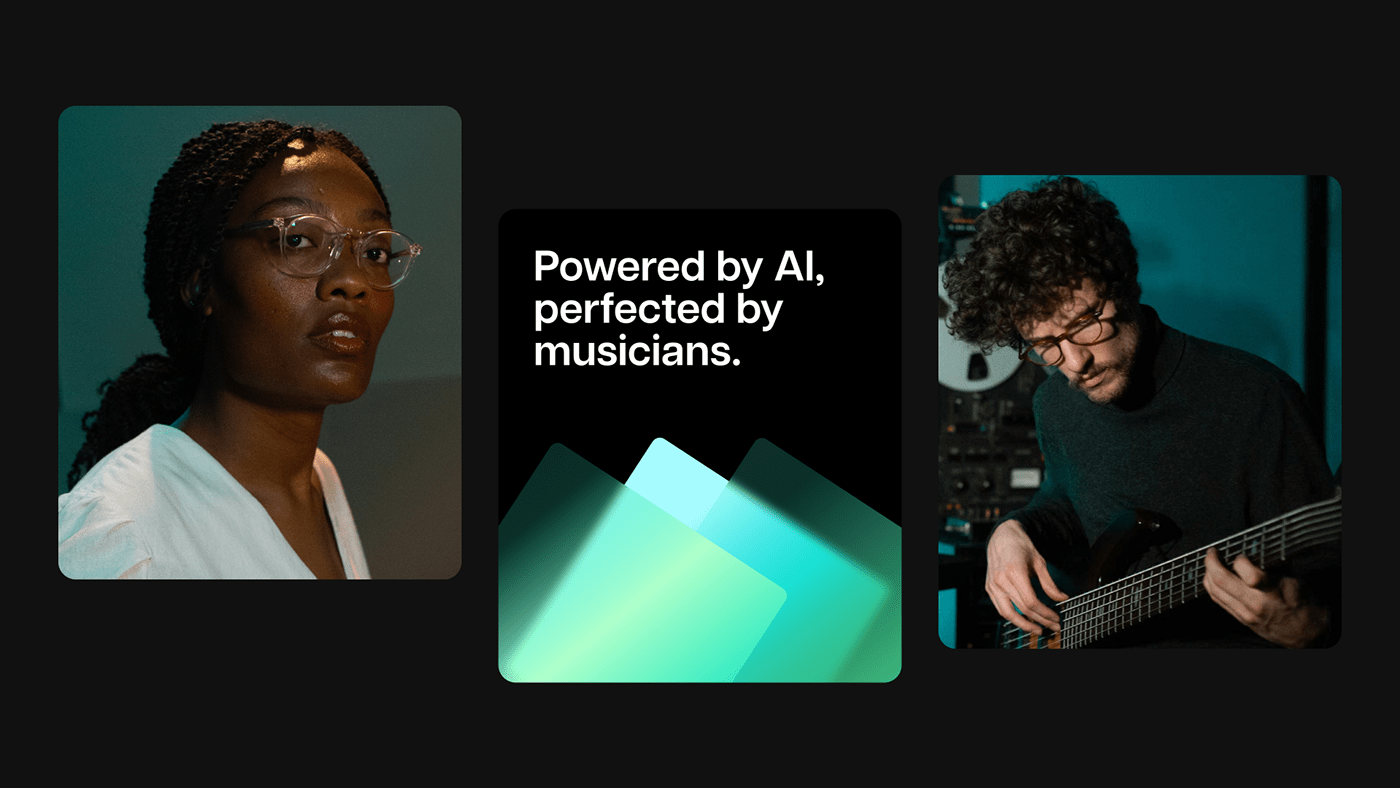
Moises is an AI technology company that aims to empower and inspire individual creators and businesses with cutting-edge music tools and services, such as stem creation, songwriting assistants, lyric transcription, spatial audio mastering, pitch shifting, and more.
Moises is an AI technology company that aims to empower and inspire individual creators and businesses with cutting-edge music tools and services, such as stem creation, songwriting assistants, lyric transcription, spatial audio mastering, pitch shifting, and more.
The Moises app enables unique experiences for users to practice, create and learn music by making the super technical super approachable while democratizing access to cutting-edge audio technology.
Our music-tech platform offers creative control and convenience by creating room for self-expression for millions of musicians, enthusiasts, and developers worldwide.
Focusing on simplicity
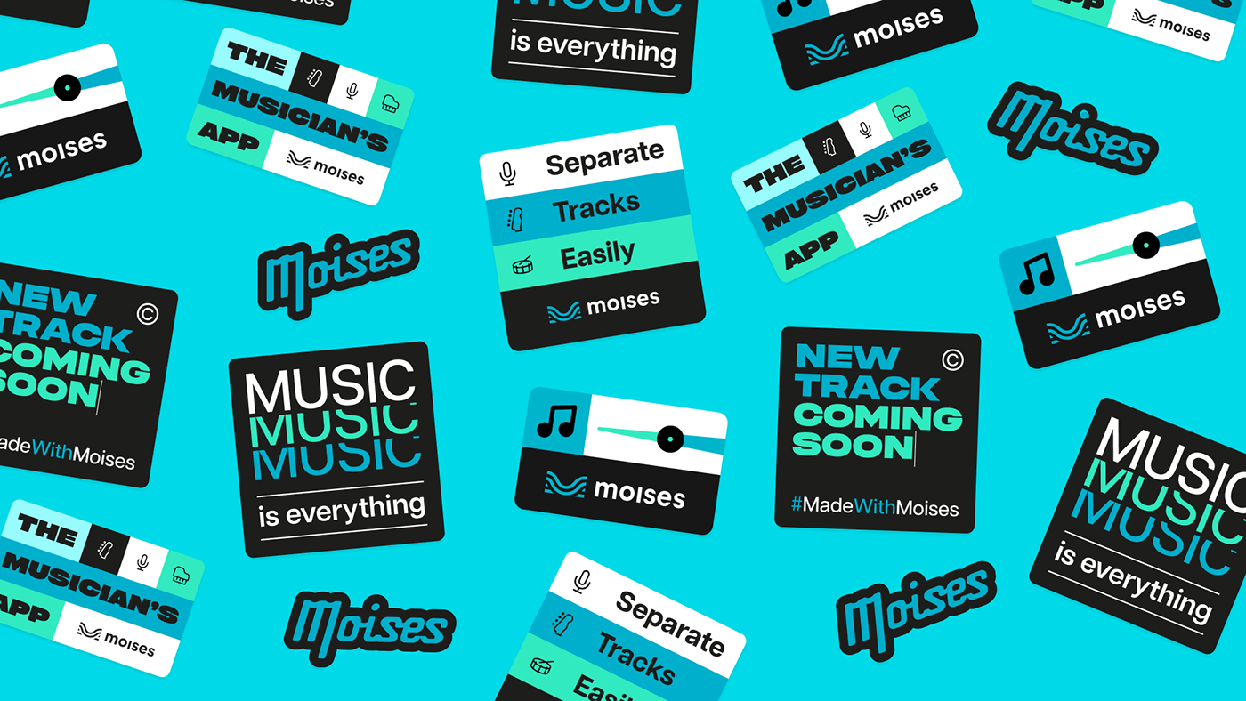
We understand how fundamental design elements help build impactful brand experiences. Therefore, we aimed to strengthen the relationship with our audience by creating simple design solutions that empower their dreams as part of our messaging. All the visual elements were developed to help increase clarity and build connections by bringing our product closer to our users.
We understand how fundamental design elements help build impactful brand experiences. Therefore, we aimed to strengthen the relationship with our audience by creating simple design solutions that empower their dreams as part of our messaging. All the visual elements were developed to help increase clarity and build connections by bringing our product closer to our users.
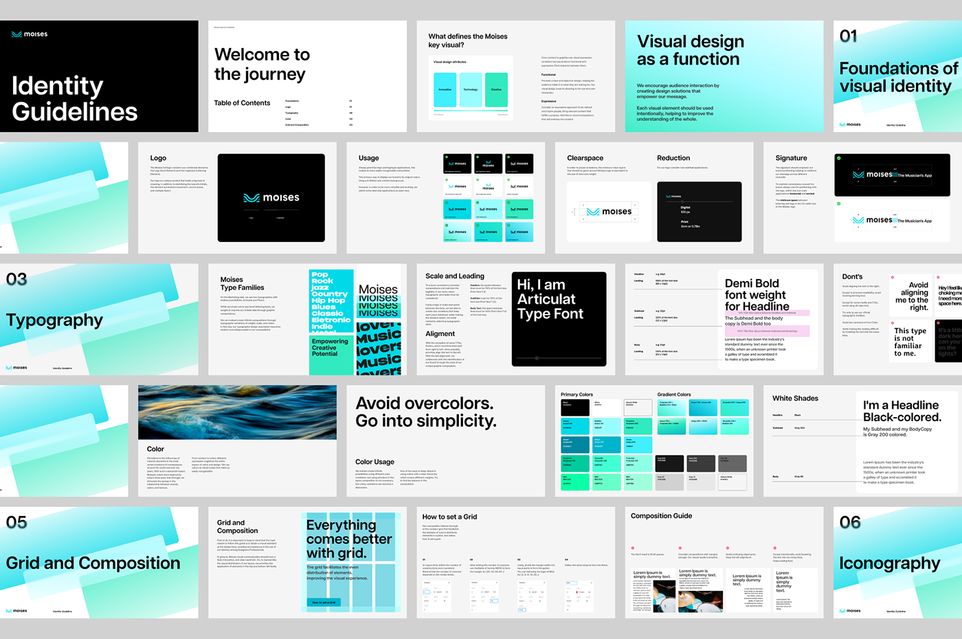
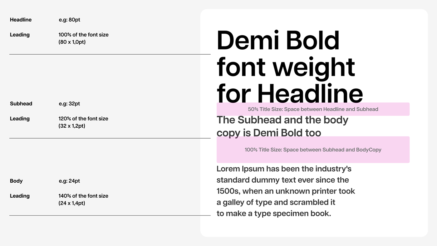
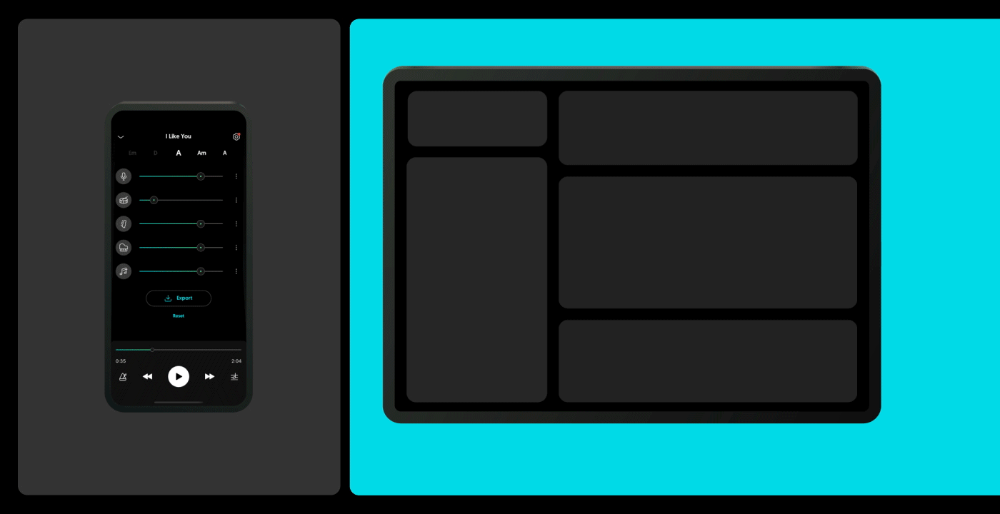
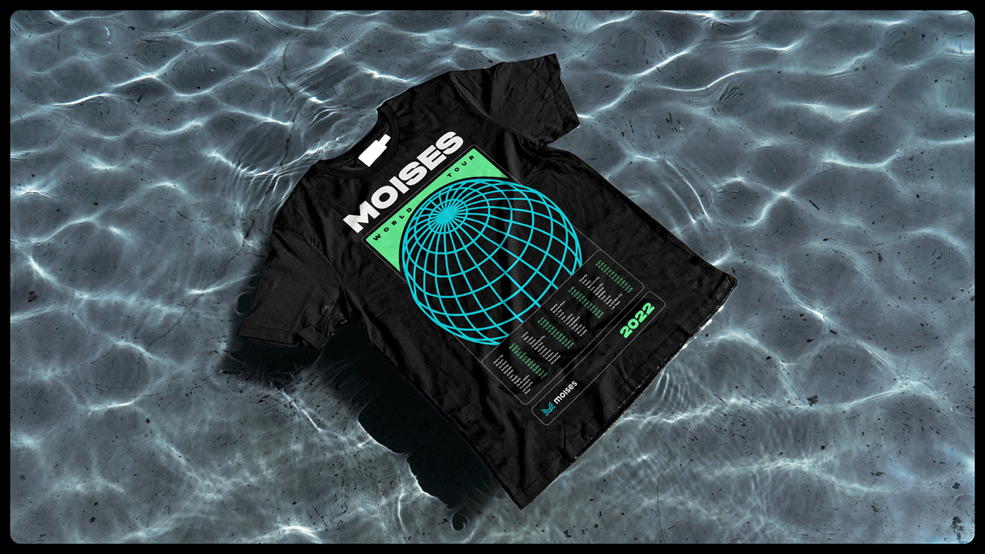
The brand system
One of the essential parts of our brand system is the use of colors, typography, and grid composition. Combined, they build the key visual elements in our communication materials and digital interfaces.
One of the essential parts of our brand system is the use of colors, typography, and grid composition. Combined, they build the key visual elements in our communication materials and digital interfaces.
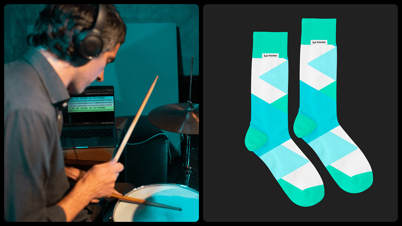
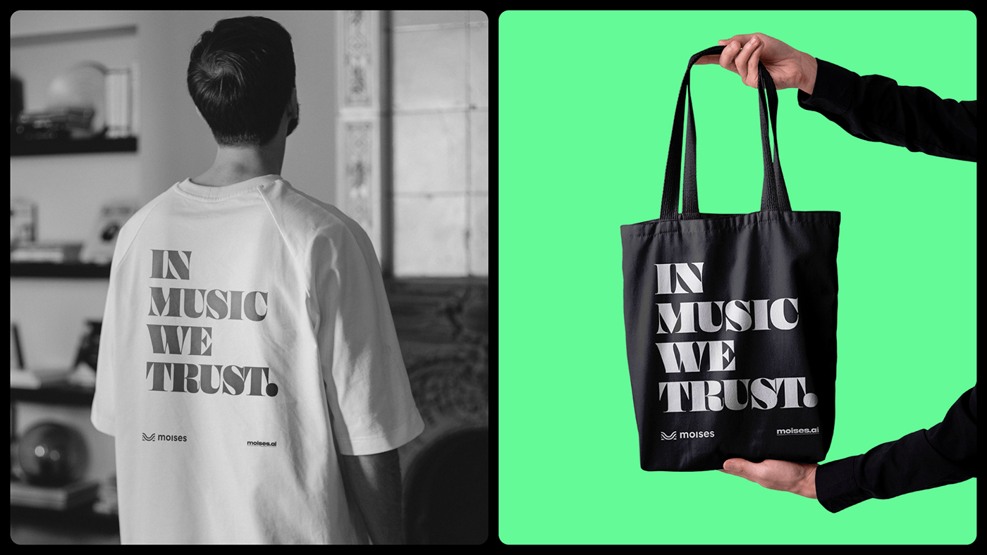
We intentionally chose our colors to enhance our brand's expressiveness. Our typography is a combination of bold creativity and function. And our grid composition was designed to create consistency and scalability of the visual elements, allowing maximum adaptation and digital performance optimization.

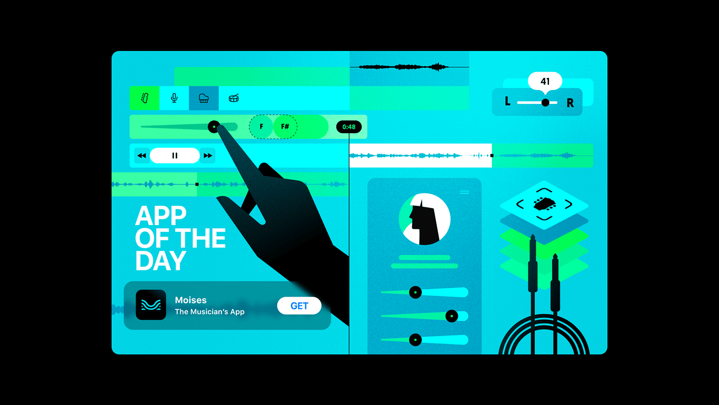
Featured by Apple
In 2022, Moises was featured by Apple as App Of The Day in more than +165 countries worldwide! On October 3rd alone, we were featured in 157 countries, including Brazil, Italy, France, Spain, Mexico, and many other nations, where we have a large part of our audience – all of this in a single day. Wow!
We chose "Creative Control" as the theme for our illustration for the App Of The Day feature. Our goal was to represent how our users interact with the Moises app by showing that they have complete control at their fingertips and the power to decide how to consume their favorite music.
It was a super exciting project to work on. We knew it was an excellent opportunity to show the world how combining AI and technology can make learning and practicing our simply listening to music much more fun!
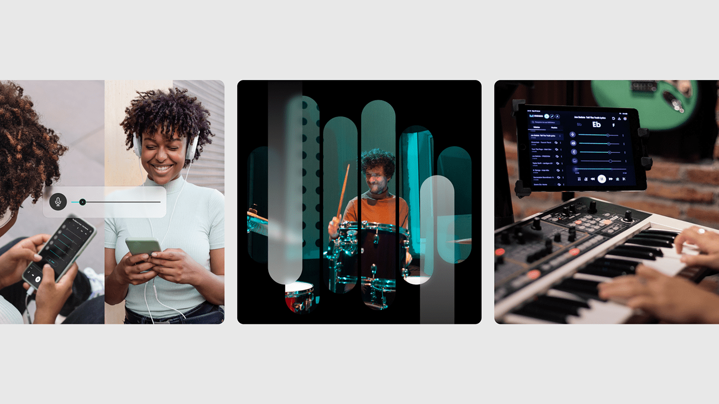
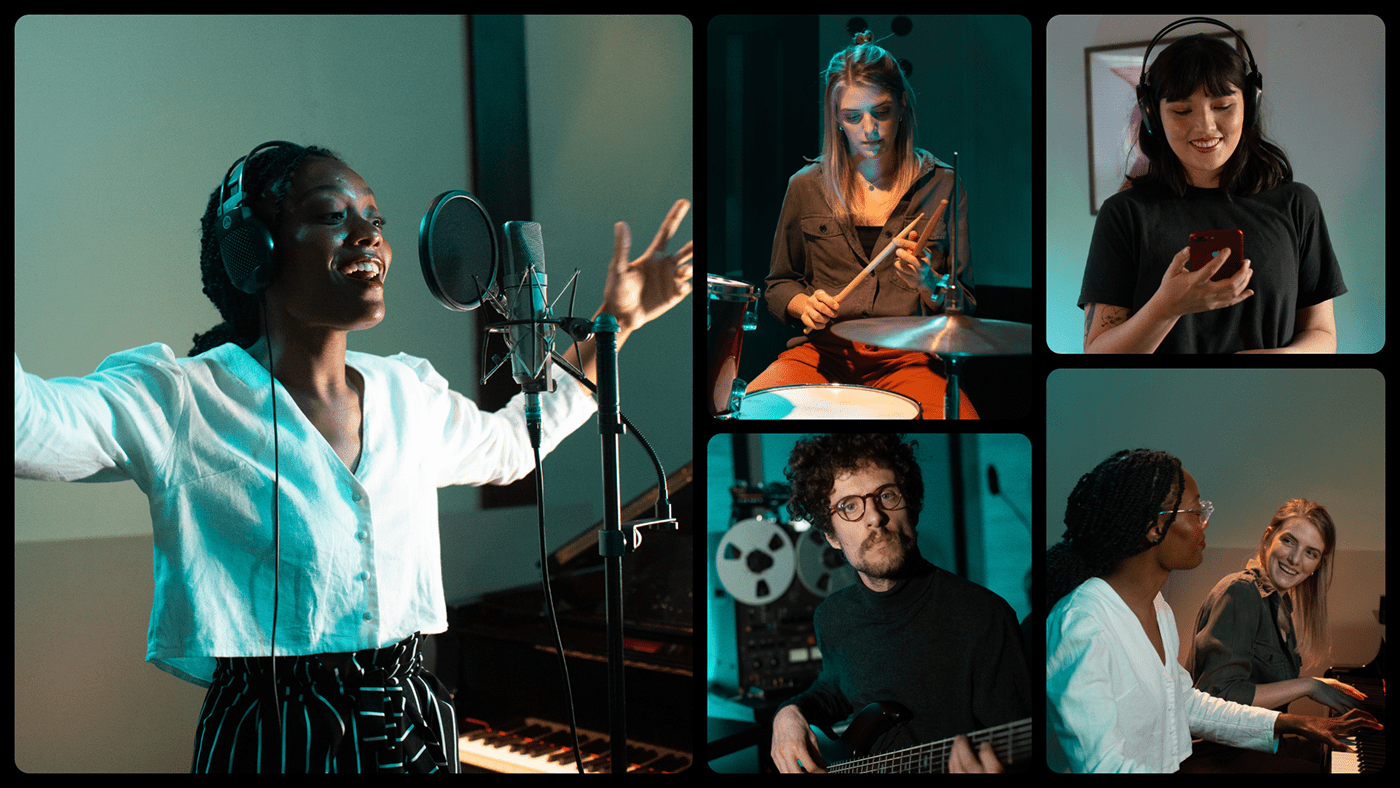
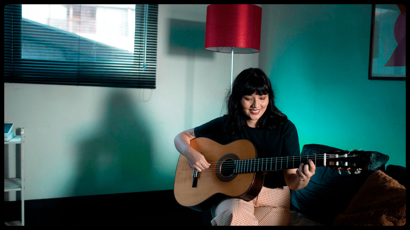
The Photography
We had to enter the musician's universe to capture the magic of creativity and musical performance. We focused on the practice activity and facial expressions to reproduce the musician's intimate creative process and personal space.
The overall creative direction of our photos represents the personification of our brand. The blue spotlight was intentionally chosen to reinforce our primary color, introducing an exclusive aesthetic to our images.
Thank you for watching!
Beth Brands
Designer & Creative Director
Rodrigo Lins
Designer & Art Director
Jardson Almeida
Co-founder & Chief Design Officer
Thiago Mendes
Product Designer
Diego Naive
Product Designer
Edi Rodrigues
Motion Designer
Fernanda Pompermayer
Photographer
Moises Systems Inc © 2022


