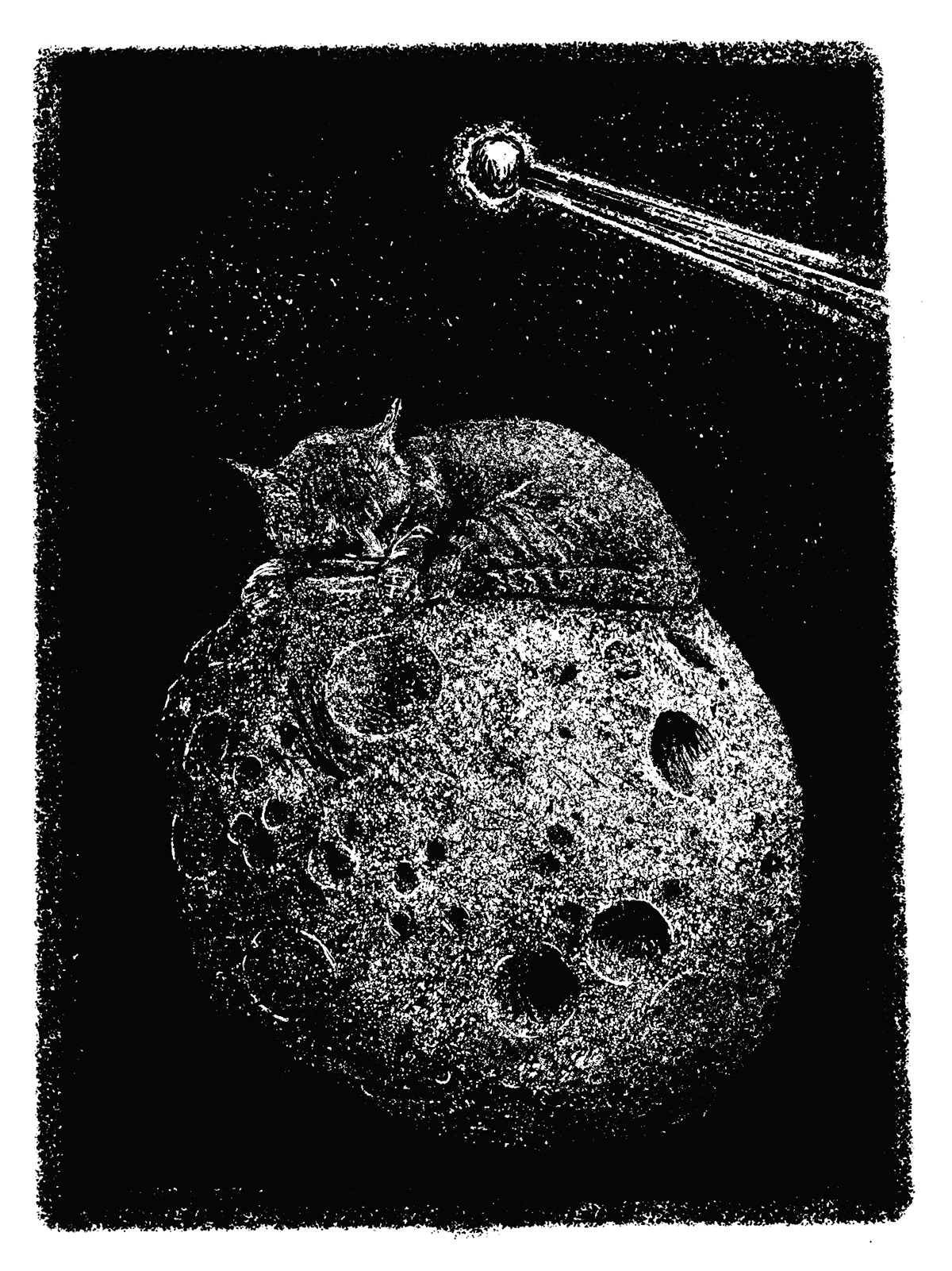
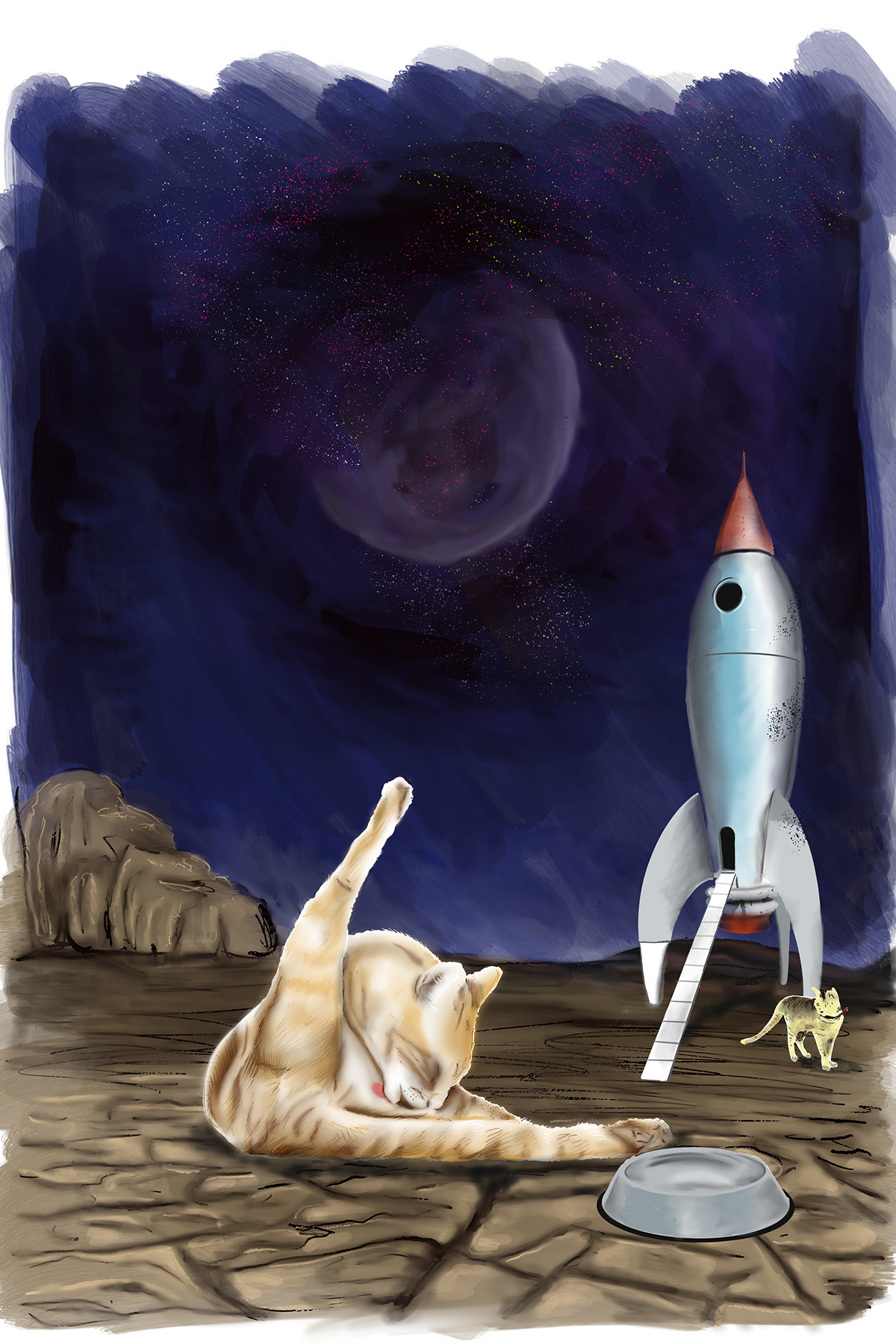
My self-directed "Cats in Space" project emerged from my experiences as a reluctant cat owner as well as my growing interest in the pulp magazines of the middle of the last century. I have been concerned with both the art itself and the varied ways text and image could come together on pages. Despite technical and thematic limitations, art—in all pulps but particularly in science fiction titles—was often delightfully inventive. The limitations artists and designers faced (no, or limited color, no bleeds or mechanical screening) gave the magazines their distinctive look. The limitations of our age (the need to repurpose art for CMS web sites—perhaps even the need to animate the static version of illustrations for online delivery—as well as changing tastes) make the sort of pages that were common then rare today.
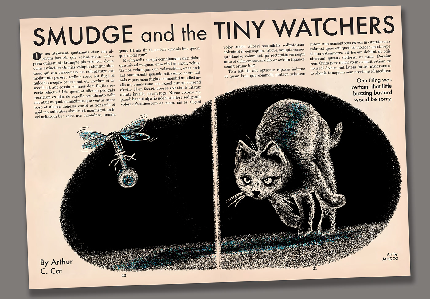
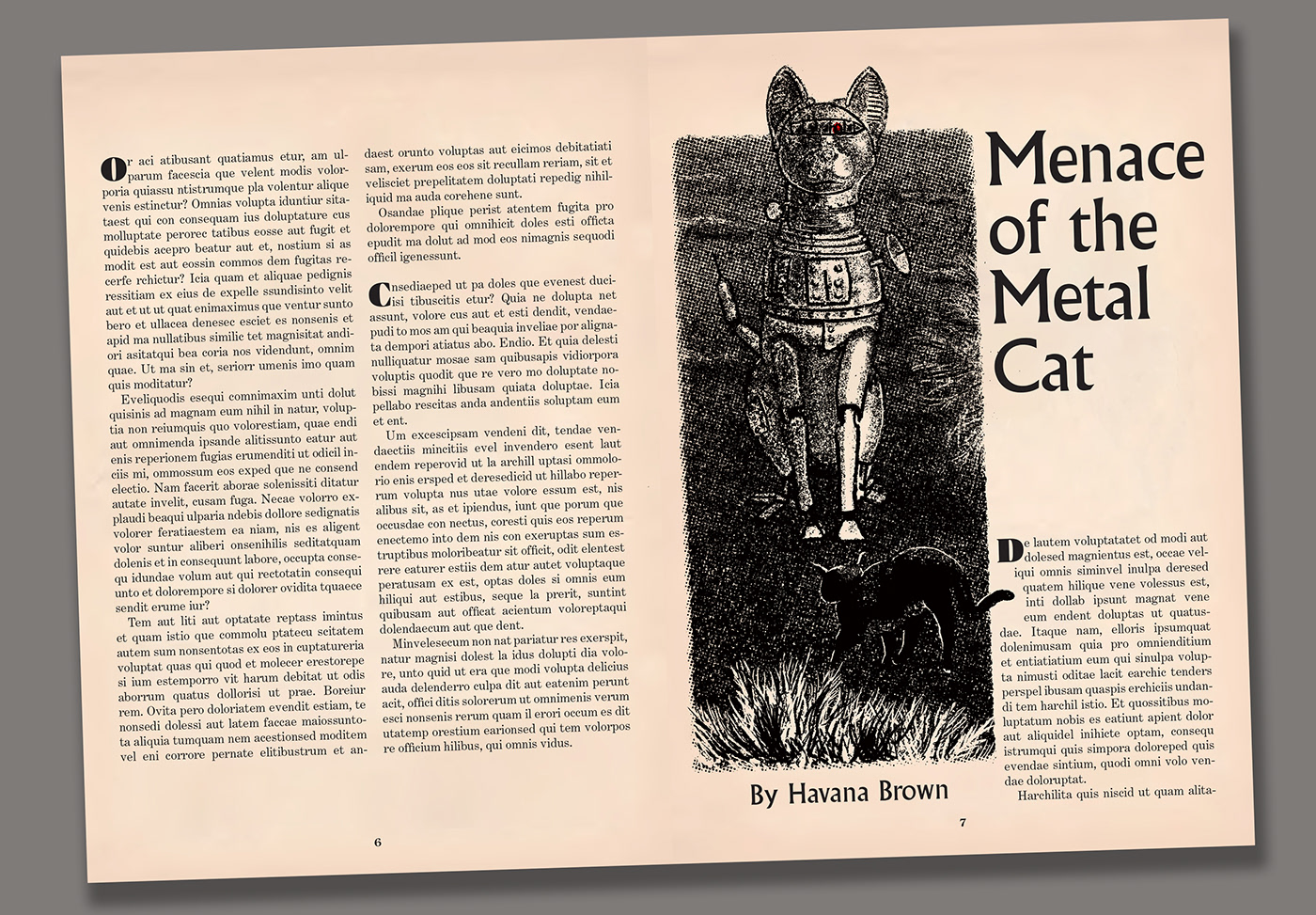
Focusing on art and layout, my text is "FPO"—alas there are no real stories for my illustrations.
Focusing on art and layout, my text is "FPO"—alas there are no real stories for my illustrations.


My illustrations are digitally created, but mimic the look of coquille board, a thick drawing paper with a pebbled texture once popular with pulp illustrators, editorial cartoonists and artists working for newspapers. While coquille board could be inked like any paper, when a litho crayon or similar marker was dragged over the rough surface at varying pressure, the paper's texture would be "caught" as darker and lighter tones (similar to how a rubbing is imaged). There would then be no need to "screen" the art for printing as there would be if the artist used paints or ink washes. In the case of illustrations for pulp (and to a lesser extent, higher-end magazines of the same era), the drawings often look unfinished or at least strangely shaped until they are combined with type on the printed pages.