[PT-BR]
Sobre a marca
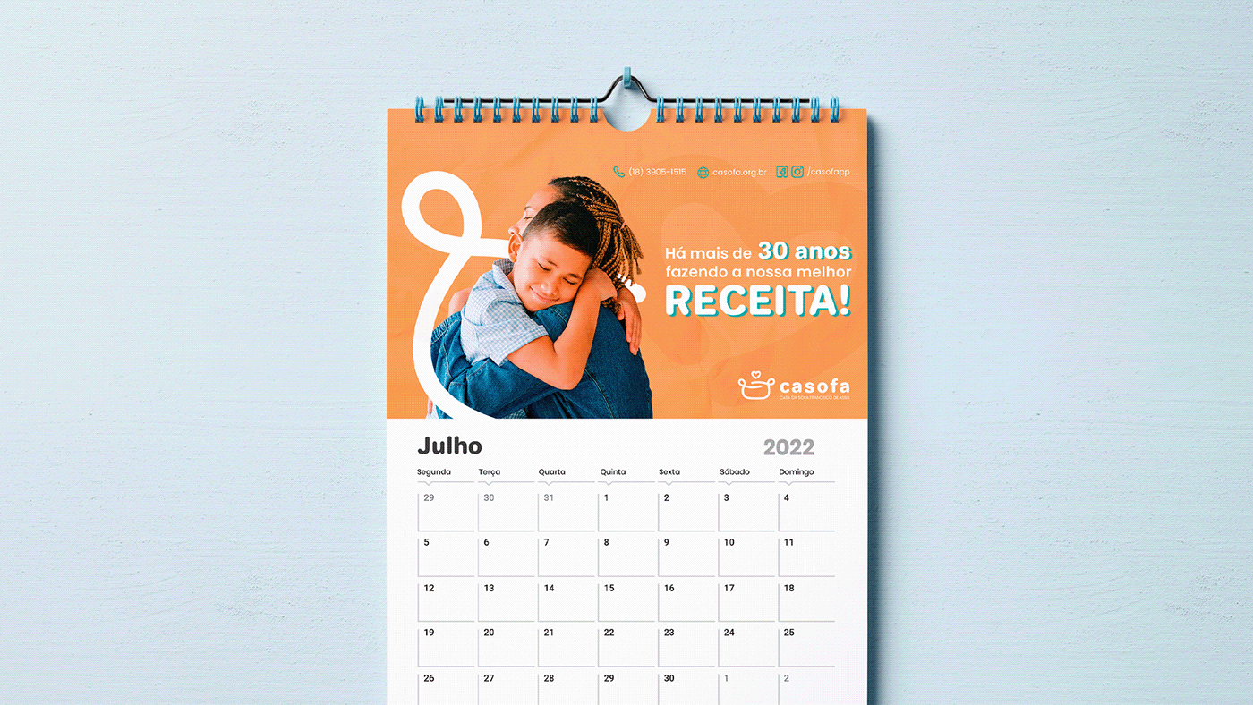
Fundada em 1991, a Casa da Sopa Francisco de Assis (CASOFA) se iniciou com um grupo de pessoas generosas que fazia a distribuição de sopa nas periferias de Presidente Prudente - SP. Com o passar dos anos e a evolução da comunidade em todos os níveis, a proposta inicial, que era oferecer aos moradores o alimento físico, se transformou em também oferecer ações que buscavam promover o cidadão.
aproximadamente 100 crianças assistidas, com idades entre 06 e 15 anos, através de diversos projetos com atividades voltadas ao atendimento de pessoas necessitadas, na área de saúde e também assistencial. Além disso, ela acompanha o desenvolvimento sócio educacional das crianças e dos adolescentes e oferece suporte especial à família e aos idosos.
[EN-US]
About the brand
Founded in 1991, the Casa da Sopa Francisco de Assis (CASOFA) started with a group of generous people who distributed soup in the slums of Presidente Prudente - SP. As the years went by and the community evolved on all levels, the initial proposal, which was to offer physical food to the residents, was transformed into also offering actions that sought to promote citizenship.
Currently CASOFA has approximately 100 children assisted, with ages between 6 and 15 years old, through diverse projects with activities directed to the assistance of people in need, in the health area and also in assistance. Besides this, it follows the children and teenagers' socio-educational development and offers special support to the family and to the elderly.


[PT-BR]
logo
Seguindo o posicionamento definido baseado em “compromisso”, a ideia do logo foi ligar traços que formassem duas pessoas nas extremidades de forma que estivessem se abraçando: de um lado a entidade e do outro as famílias, formando assim o desenho de uma panela referente ao nome. Além disto, o coração colocado refere-se ao amor que a entidade possui com o seu próximo em sempre se colocar do outro lado e abraçar causas de ajuda.
[EN-US]
logo
Following the positioning defined based on "commitment", the idea of the logo was to connect traces that form two people on the extremities so that they were embracing: on one side the entity and on the other the families, thus forming the drawing of a pot referring to the name. In addition, the placed heart refers to the love that the entity has with its neighbor, always putting itself on the other side and embracing helping causes.


[PT-BR]
Cores
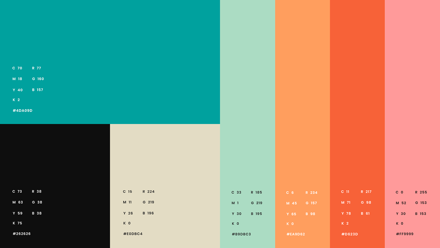
A paleta de cor foi baseada no conceito de acolhimento que a marca transmite. Por isso, foi utilizado tons terrosos e pastéis que levassem a ideia de calma e aconchego.
Foi definido duas cores principais: rosa e laranja, que juntas funcionam bem para alcançar o objetivo. Em um segundo momento, o preto acinzentado e o branco se apresentam na função de compor os textos e outros elementos que necessitam de contraste.
Complementando, a identidade visual permite o uso de mais 3 cores, na qual foi optado por dois tons de azul e um amarelo que servem para compor melhor eventuais situações.
[EN-US]
colors
The color palette was based on the concept of hospitality that the brand transmits. For this reason, earthy and pastel tones were used to convey the idea of calm and coziness.
Two main colors were defined: pink and orange, which together work well to achieve the goal. In a second moment, the grayish black and white colors were used to compose the texts and other elements that need contrast.
Complementing this, the visual identity allows the use of 3 more colors, in which two shades of blue and one yellow were chosen to better compose eventual situations.

[PT-BR]
Tipografia
Seguindo os atributos da marca em ser conceitual e simples, a família tipográfica escolhida como principal foi a Jellee. Ela transmite confiança através dos seus traços grossos e arredondados.
Como fonte secundária, foi optado pela Poppins Bold e Poppins Regular. Ambas variam de acordo com a decisão da proposta, mas a escolha dela foi devido a sua funcionalidade e estética.
Como fonte secundária, foi optado pela Poppins Bold e Poppins Regular. Ambas variam de acordo com a decisão da proposta, mas a escolha dela foi devido a sua funcionalidade e estética.
[EN-US]
typography
Following the brand's attributes of being conceptual and simple, the typographic family chosen as the main one was Jellee. It transmits confidence through its thick and rounded lines.
As secondary font, it was chosen Poppins Bold and Poppins Regular. Both vary according to the decision of the proposal, but the choice was due to its functionality and aesthetics.
As secondary font, it was chosen Poppins Bold and Poppins Regular. Both vary according to the decision of the proposal, but the choice was due to its functionality and aesthetics.