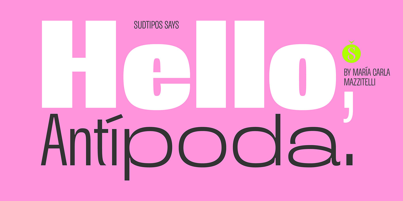
Antípoda.
—
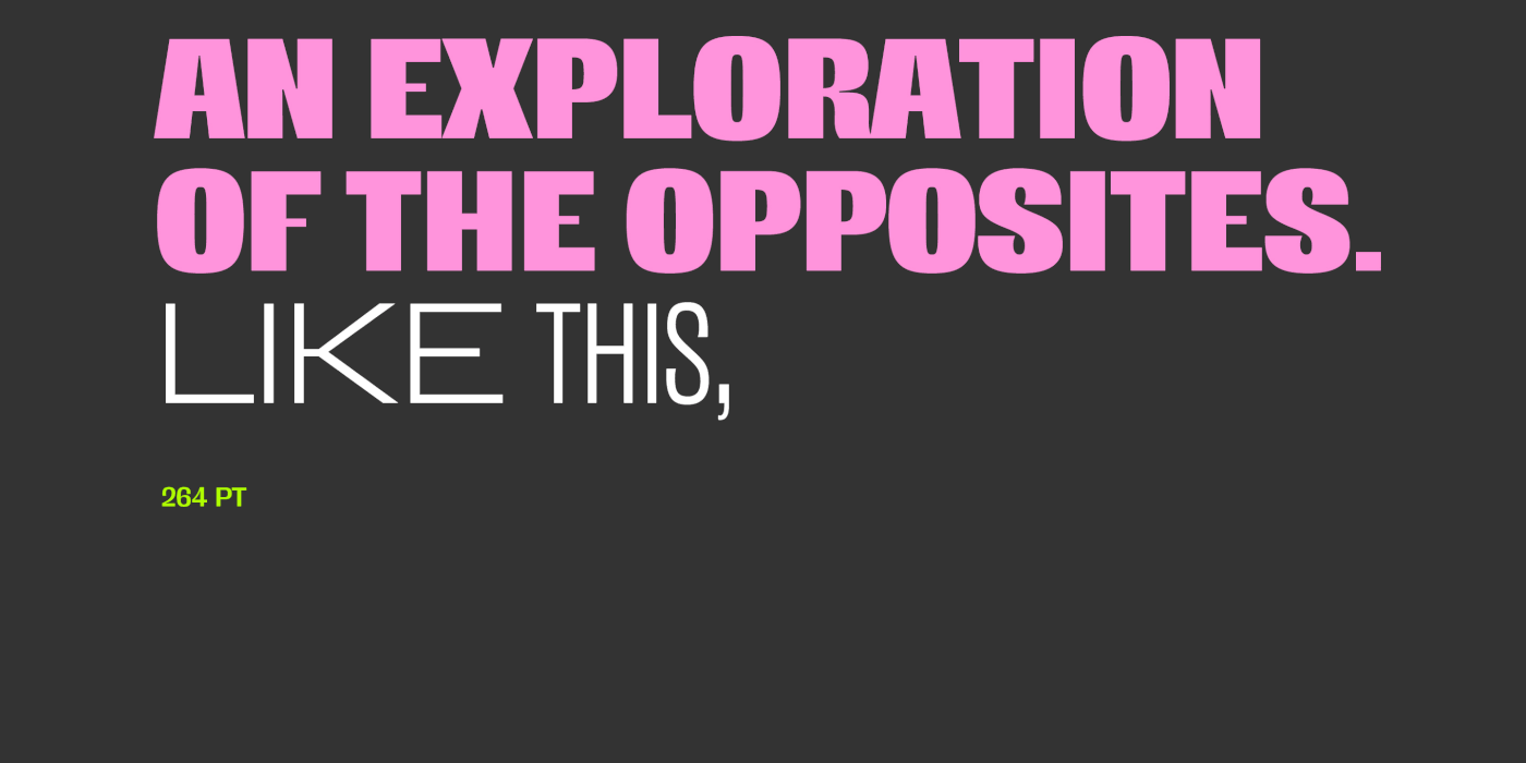
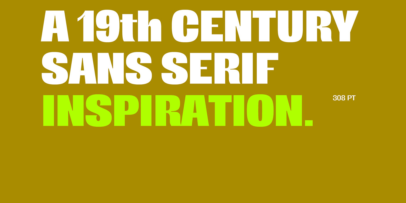
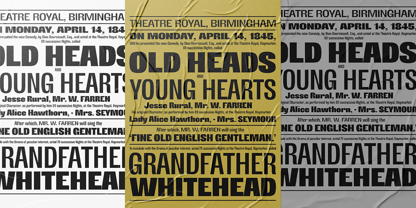
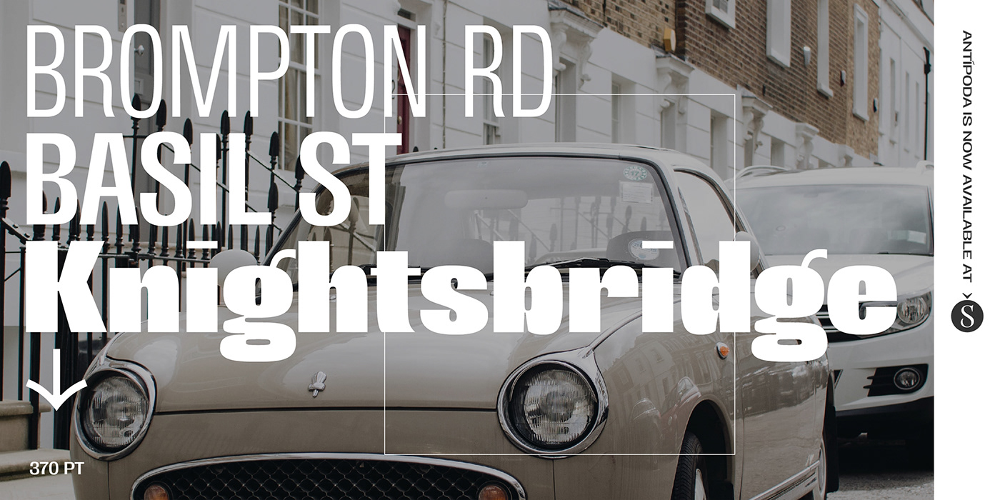
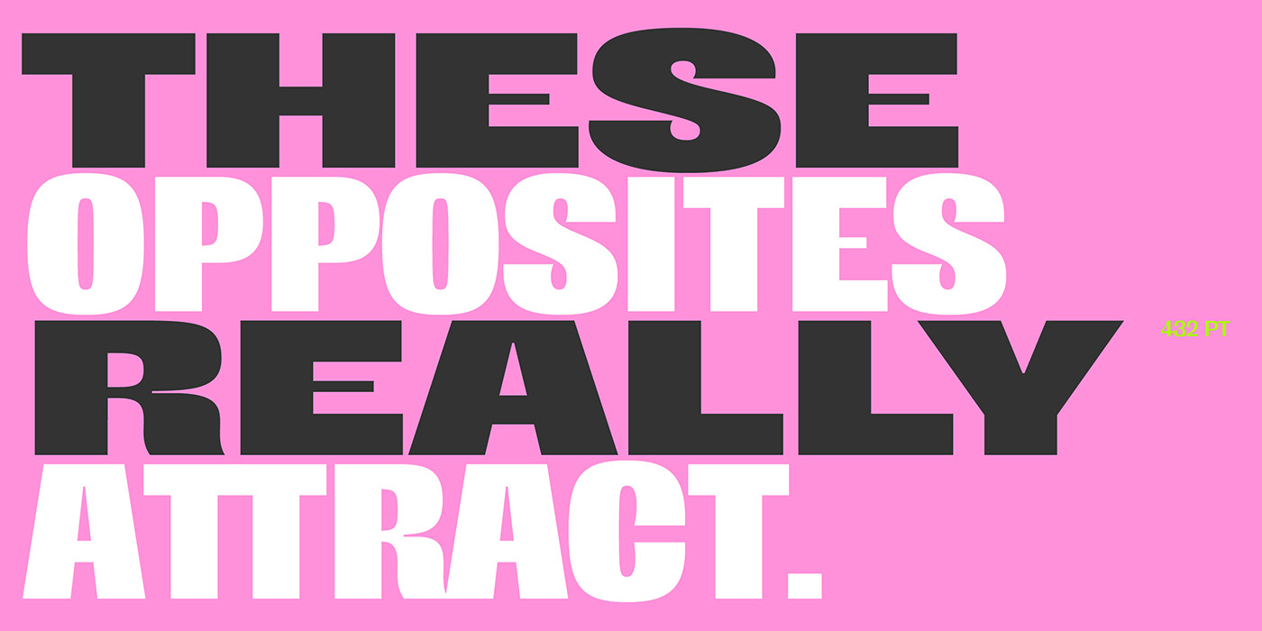
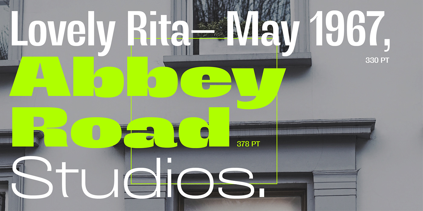
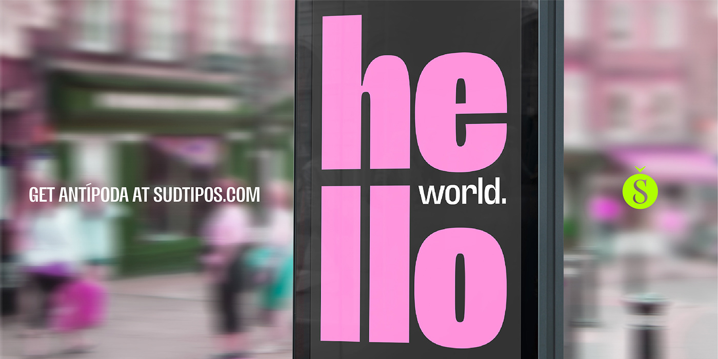
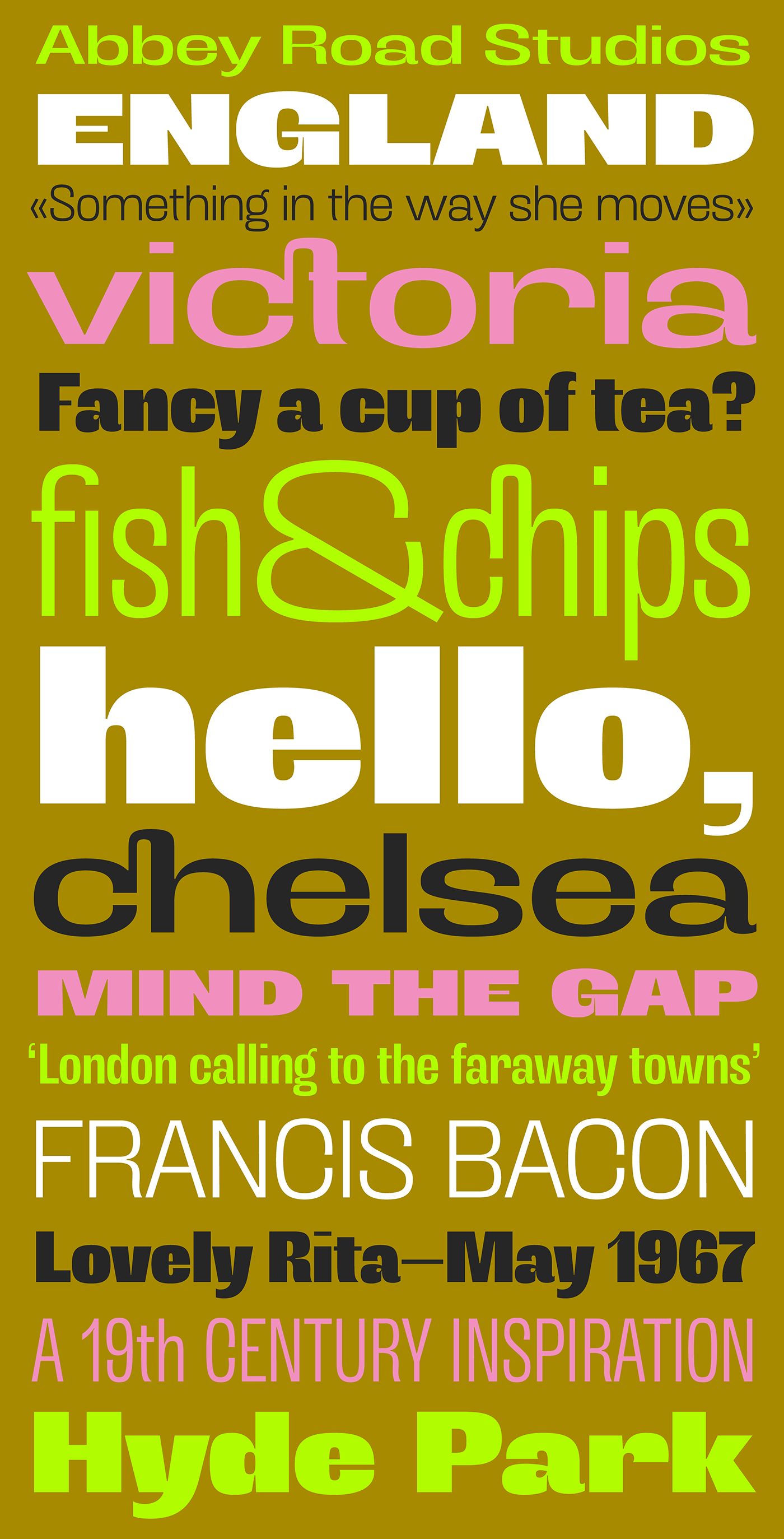
We are proud to announce the release of Antípoda, a grotesque sans serif display family designed by María Carla Mazzitelli and published by Sudtipos that explores the opposites, obtaining very extreme weights and widths as a result. The program rehearses contrasting letterforms that are inspired by the origins of sans serif typefaces from the late 19th century.
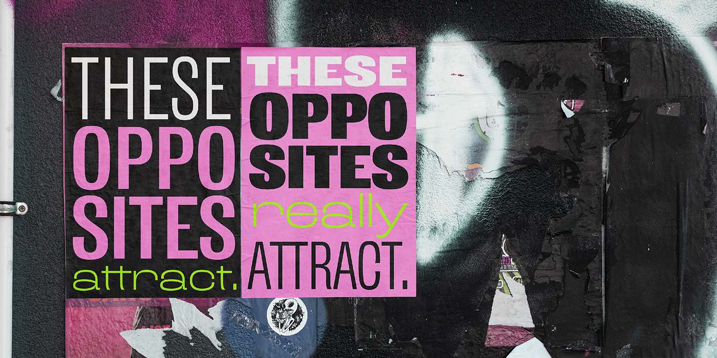
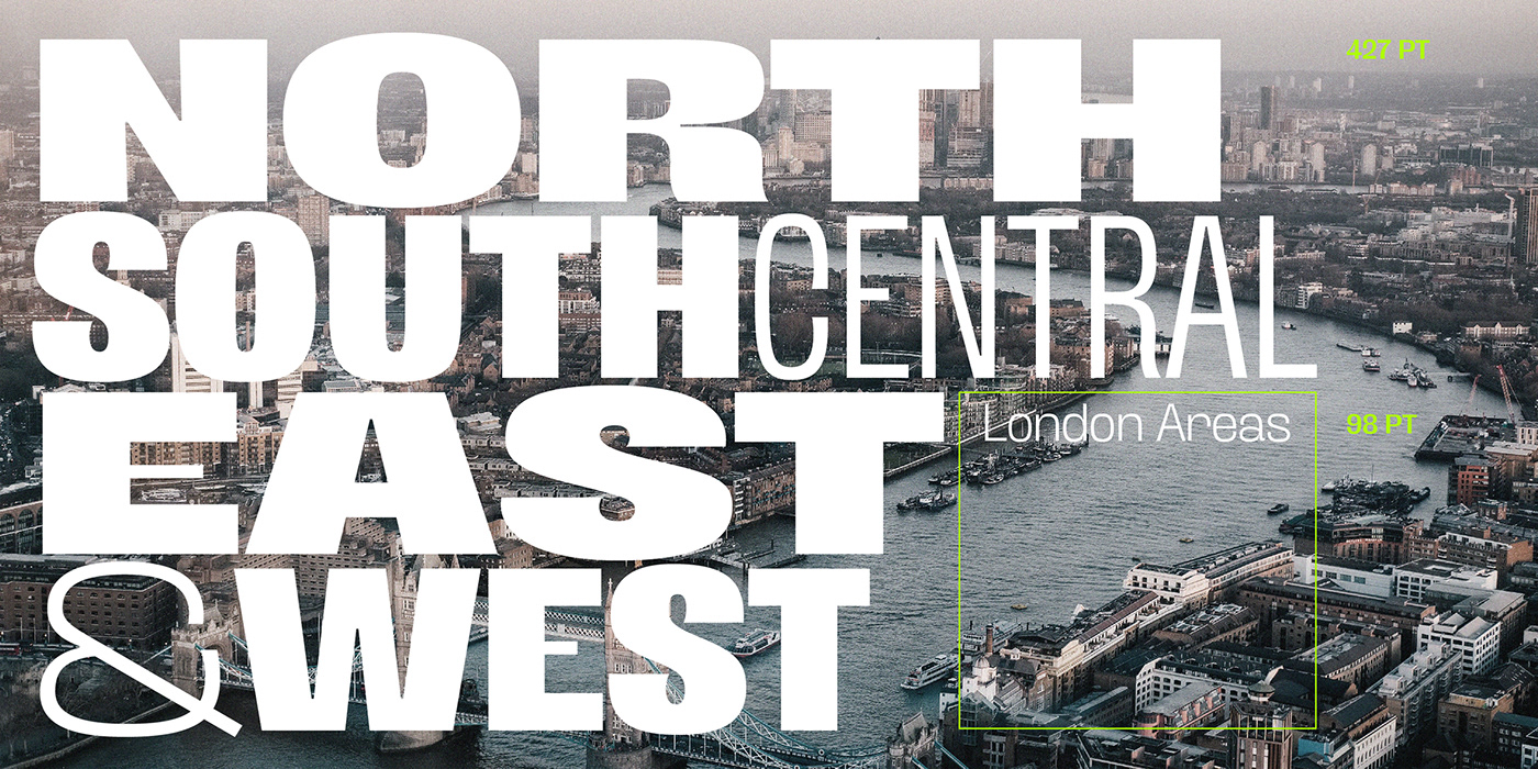
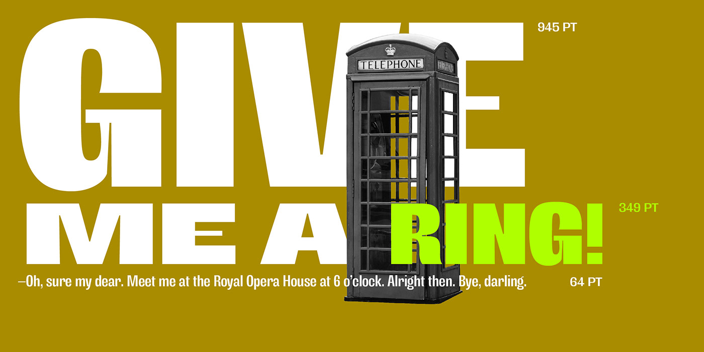
Ideally intended for large sizes and short reading, Antípoda provokes, proposes strong visual impact and power, seeks to captivate with its strength and forcefulness. Ultimately, it celebrates the attraction of the opposites.
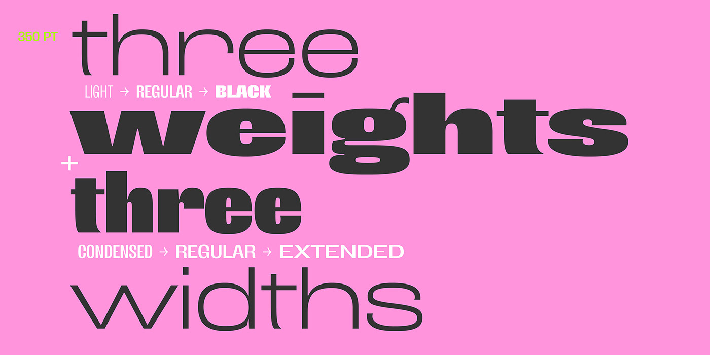
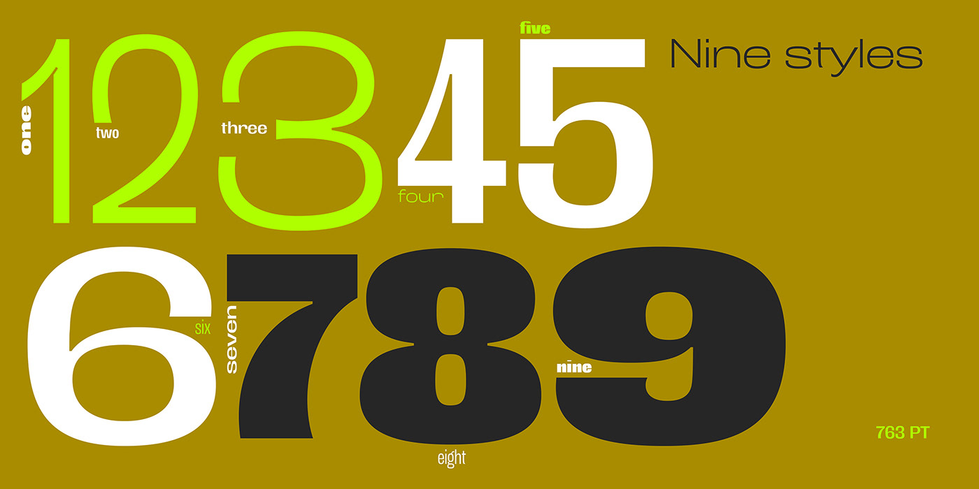
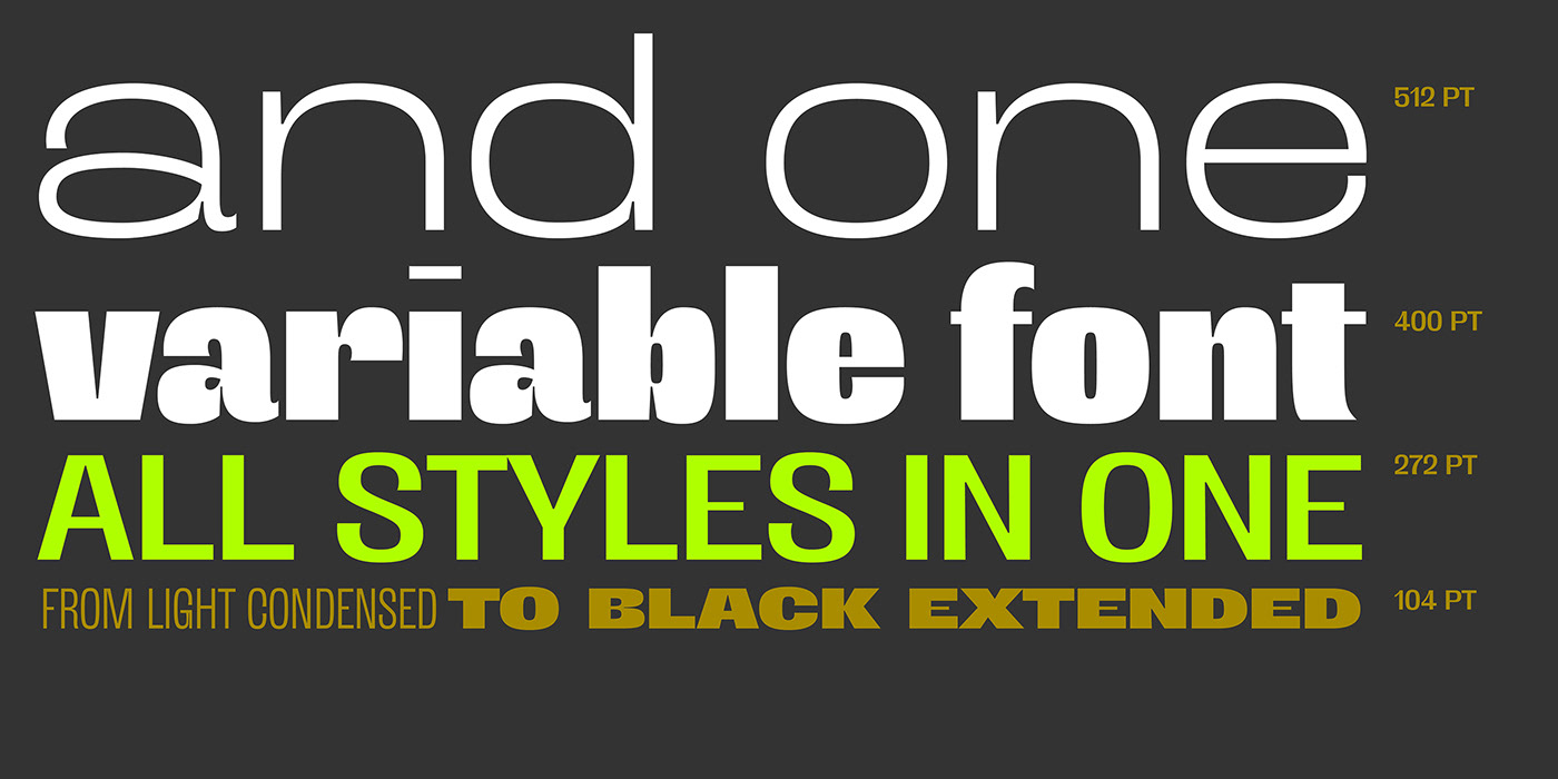
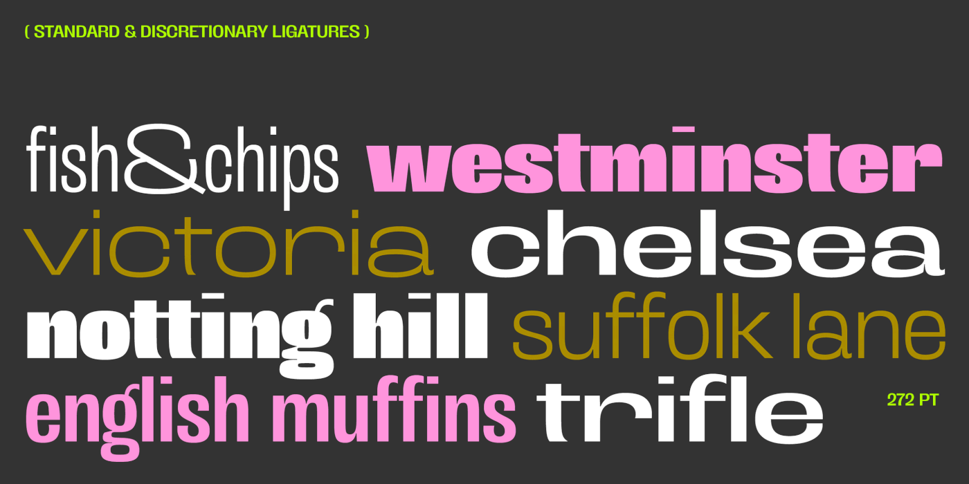
The typeface family includes a Latin Extended set, 3 weights and 3 widths, and a Variable Font to freely choose weights and proportions as needed.