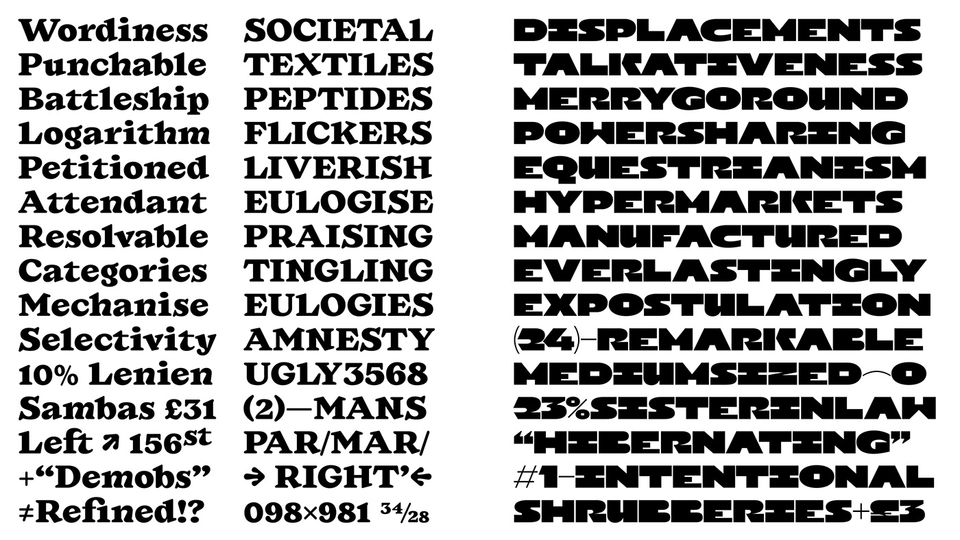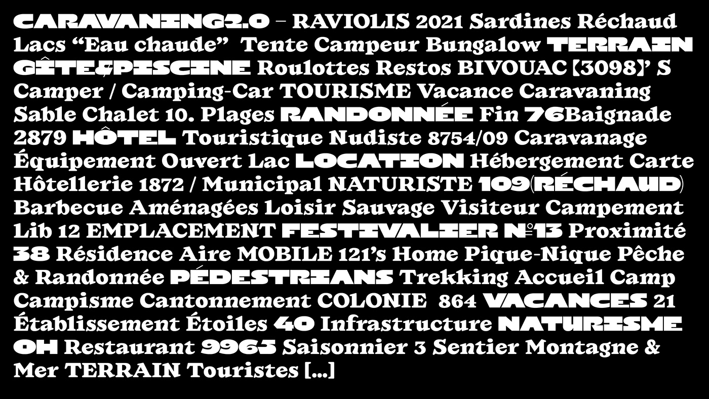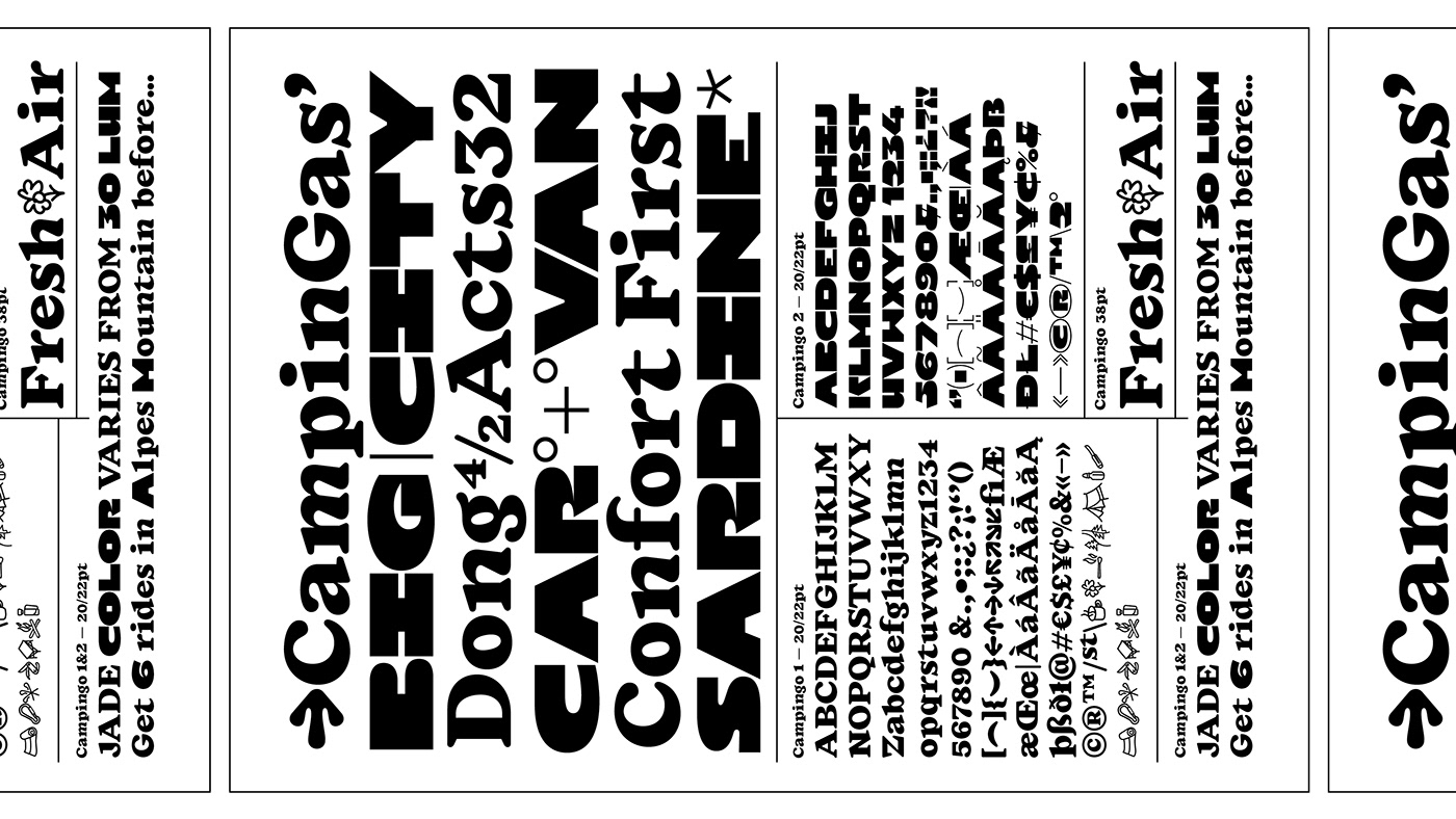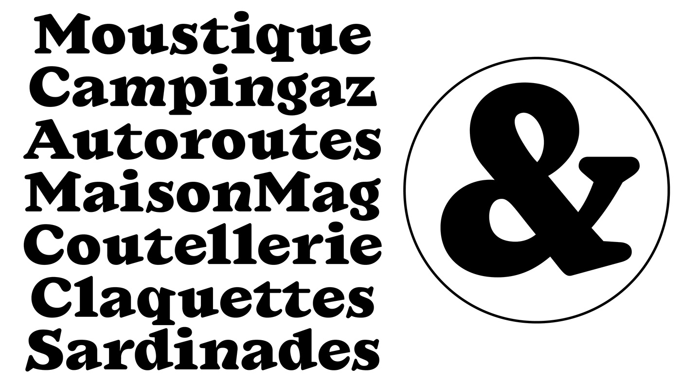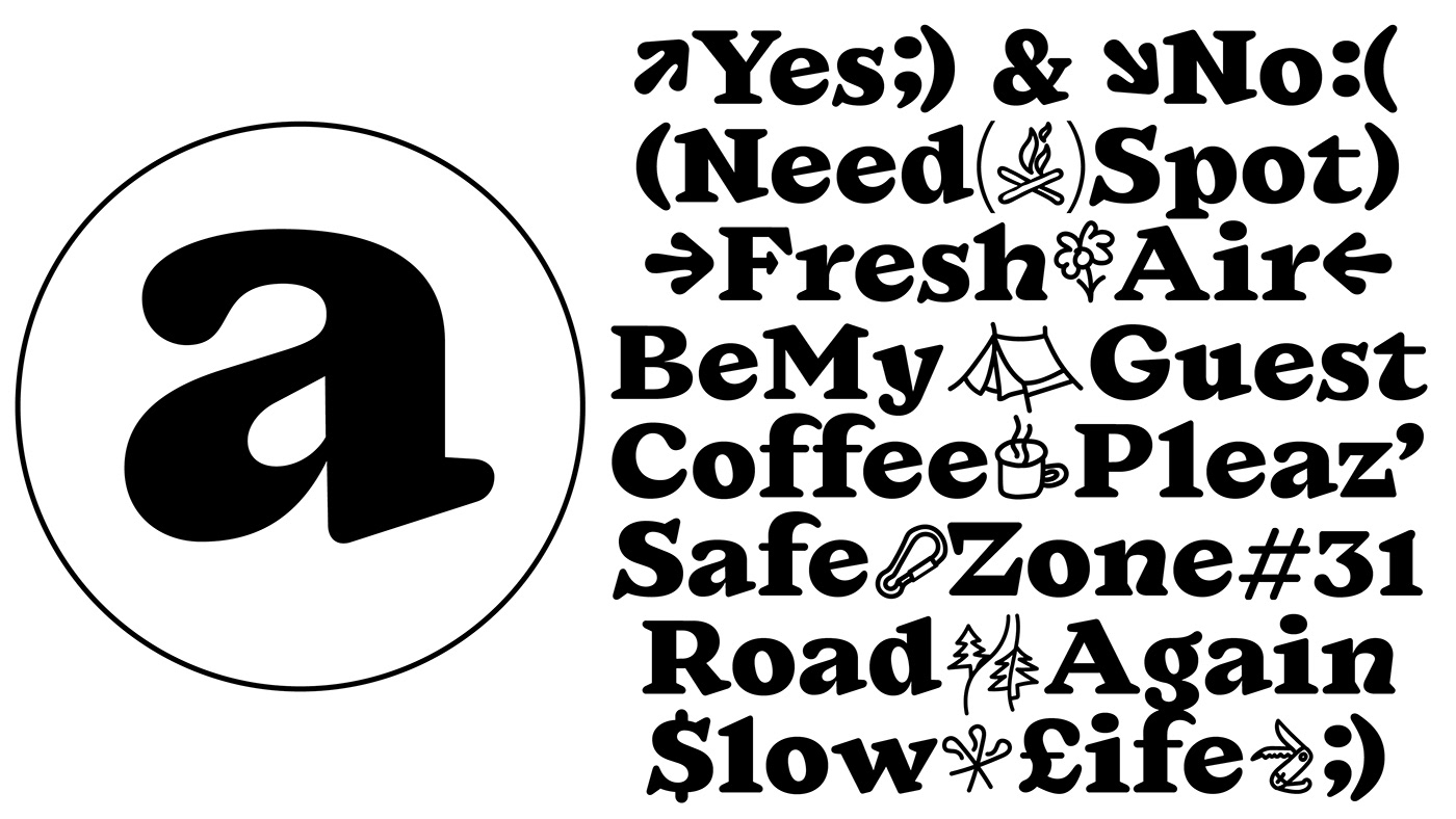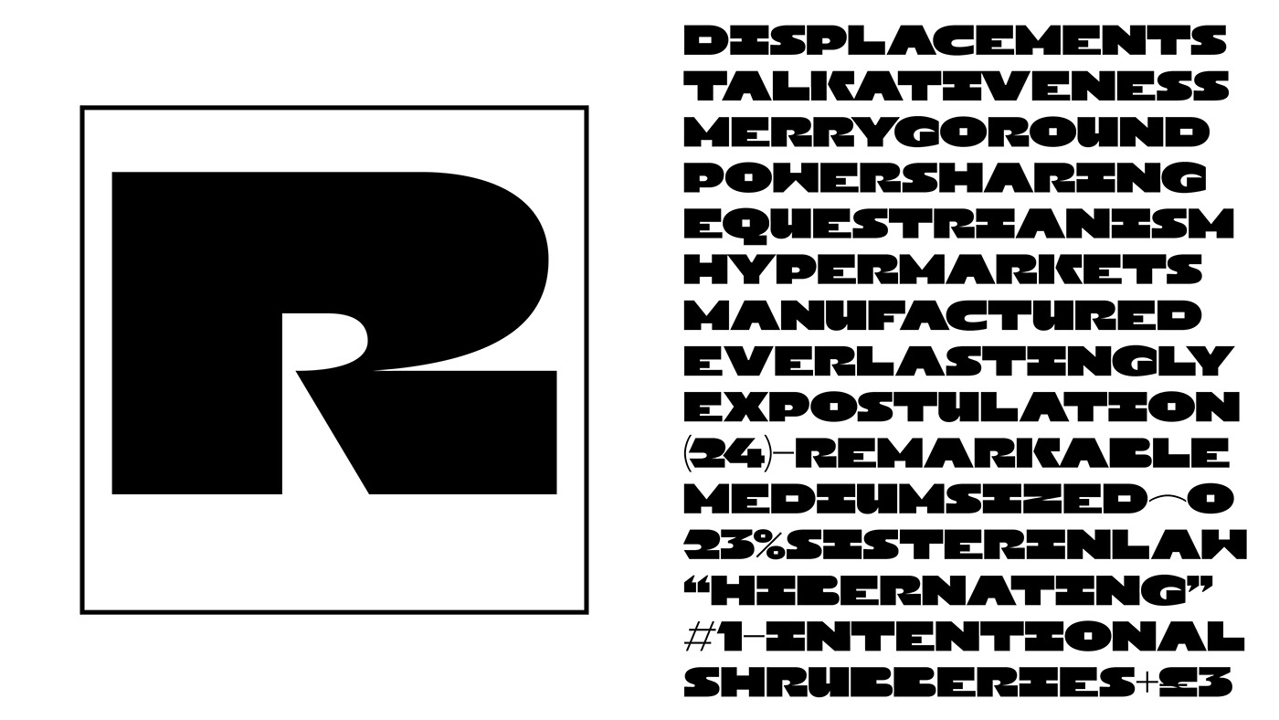
The Campingo typeface is inspired by camping and outdoor life. With on the one hand, and for main character, a design evoking comfort, openness and the organic, and on the other hand a play of uppercase, figures and punctuation with an architectural allure, evoking large cities and industry.
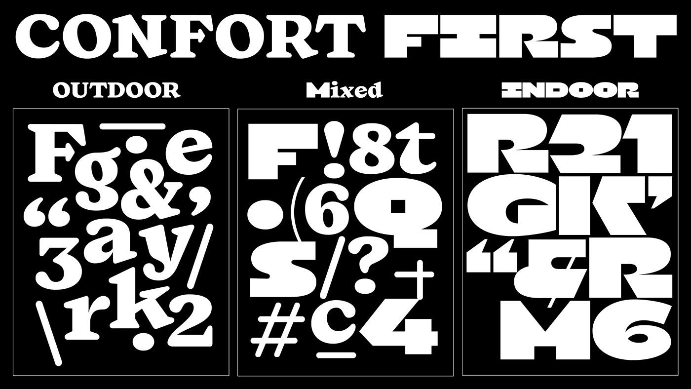
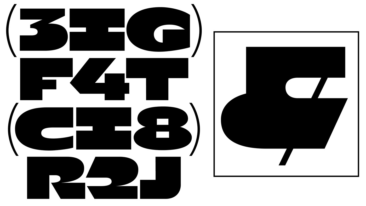
The design of the Campingo is deliberately bold and its counter-forms open. Some letters, j, y, g, present counter-forms inspired by well-being and yin-yang. Its x-height is very important and makes it a title character or short texts. In its "Indoor" stylistic set, Campingo is intentionally very wide and also bold, its counter-forms are very closed, contrasting with the default version.
The combination of the two versions provides a nice graphic effect and brings together my two notions of the House.