

Smartwines
_ Wine catalogue _
_ Wine catalogue _
The aim is to produce a highly informative catalogue that is clear to the customer and reinforces the idea of smartwine. That is to say, to know the characteristics of the wines and not to be guided by the price. The use of a visual language that avoids the more "luxurious" codes typical of the sector, in order to attract users interested in wine.

Concept
The proposal departs from the classic language of the sector with a palette of bright colours and a very clean and structured approach to the layout. Colour is a key element in the hierarchy of information, including iconography and coloured inserts that add information about pairing with each of the wines.
Design: Catalogue layout
Content structure
The catalogue content is divided into four sections: Introduction, Appellation of Origin, Wines and Wineries.

SECTION: Appellation of Origin
Colour
This is a defining element for the hierarchy of information.
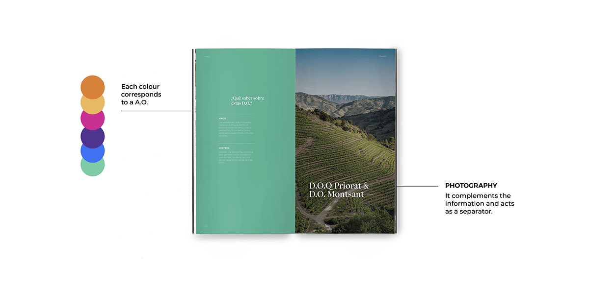
Each colour corresponds to a A.O.
This is a defining element for the hierarchy of information.
Each colour corresponds to a A.O.
Colour page
Contains information about the A.O. and the wines of the area.
Contains information about the A.O. and the wines of the area.
Photography
Always a main element, it complements the information and acts as a separator.
Always a main element, it complements the information and acts as a separator.
SECTION: Wines pages
Colour
The colour appears in certain elements to enhance the A.O. colour.
Photography
It is an important element in the composition as it is the main element.
It is an important element in the composition as it is the main element.
Iconography
It deals with the most general information about the wine.
*Insert
This adds information about the pairings for each of the wines.
This adds information about the pairings for each of the wines.


Design details
Singer binding is a type of binding with an exposed thread that provides a very striking result. I chosed a fuchsia pink thread which, combined with the black covers, gives punch to the piece.


Thanks!


