


Design & Concept: Studio Leichtfried and Zwupp
Text & Concept: Weisses Papier
Code: Studio Brighten
Photography: Marion Luttenberger
Text & Concept: Weisses Papier
Code: Studio Brighten
Photography: Marion Luttenberger
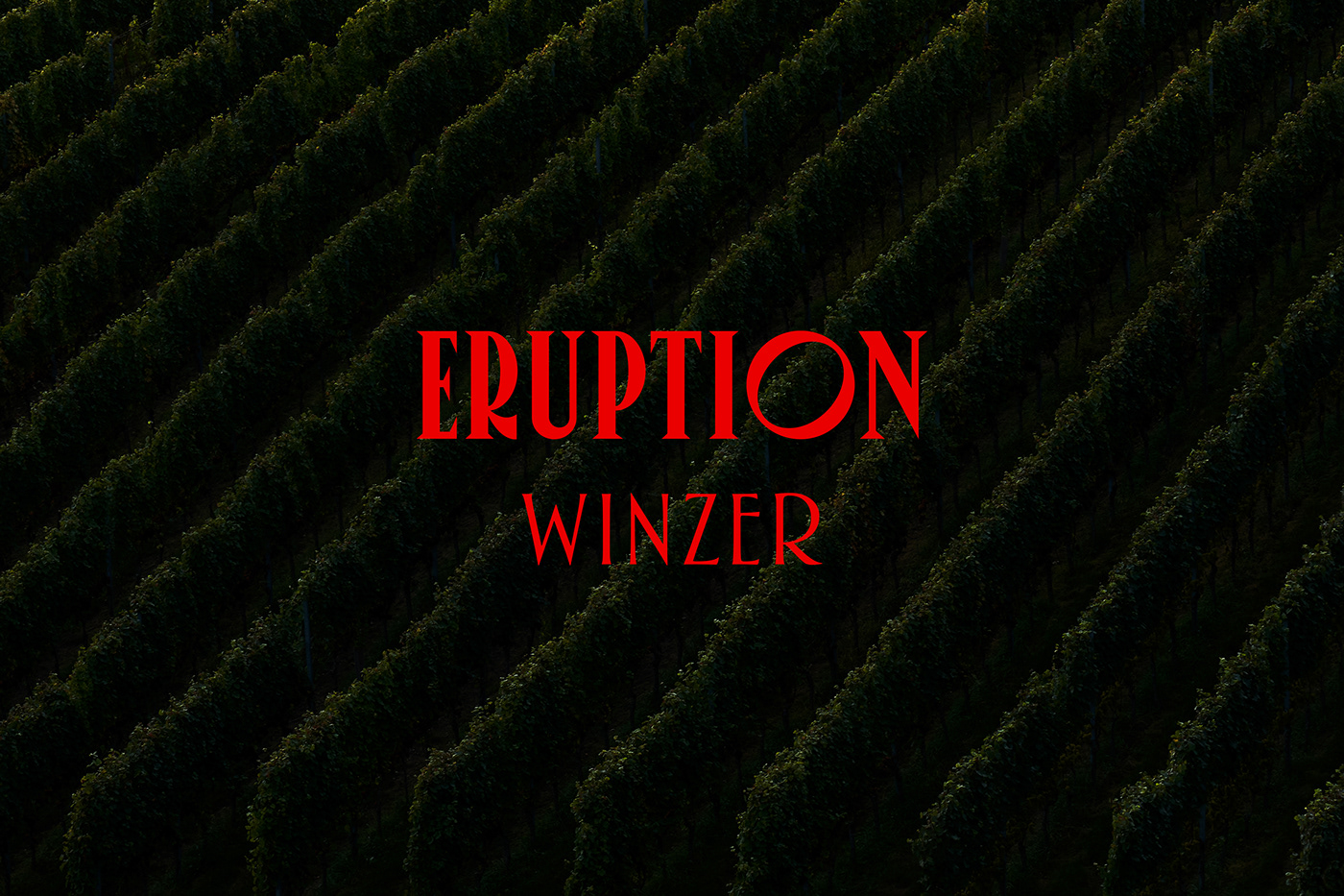
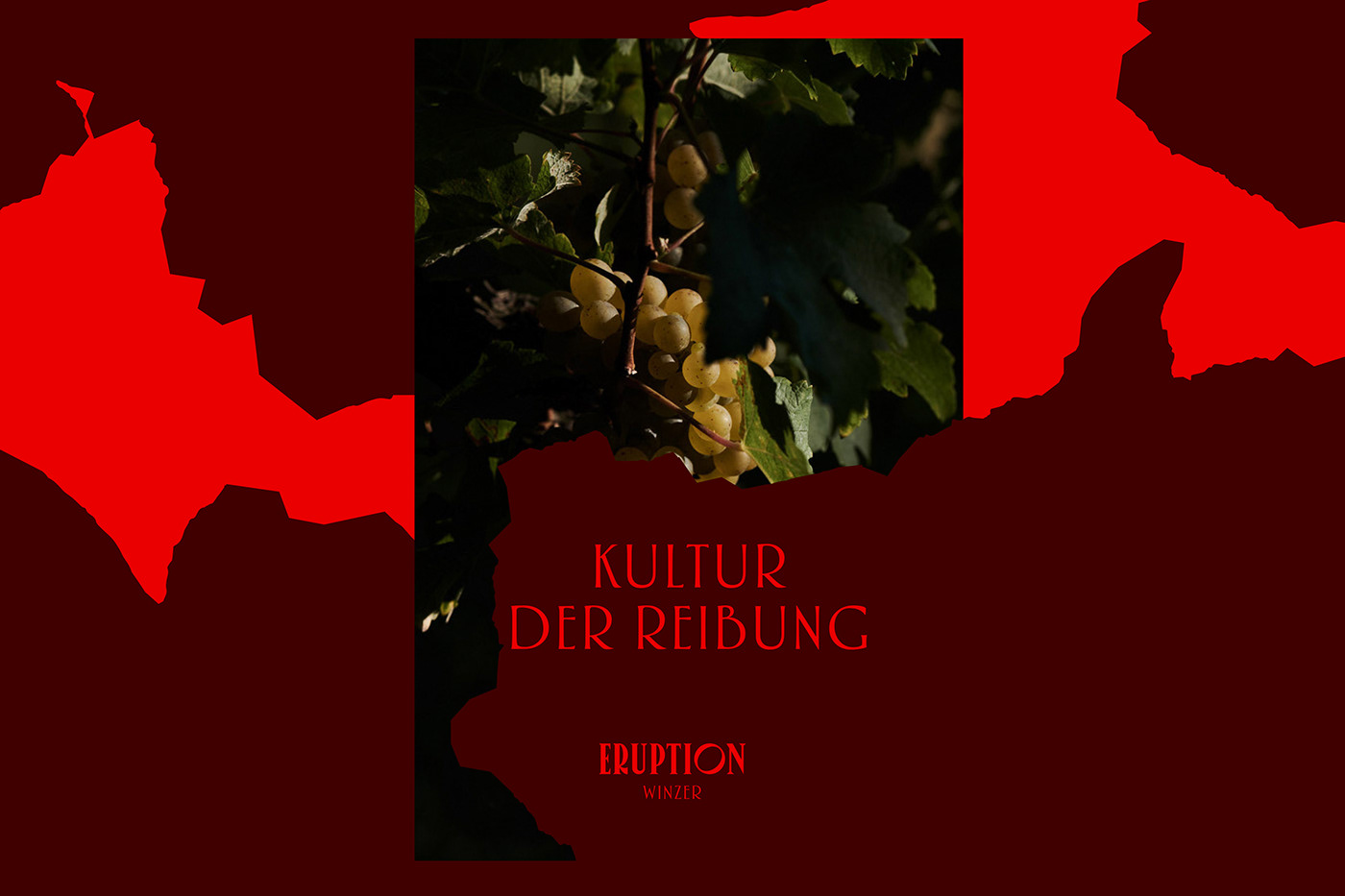
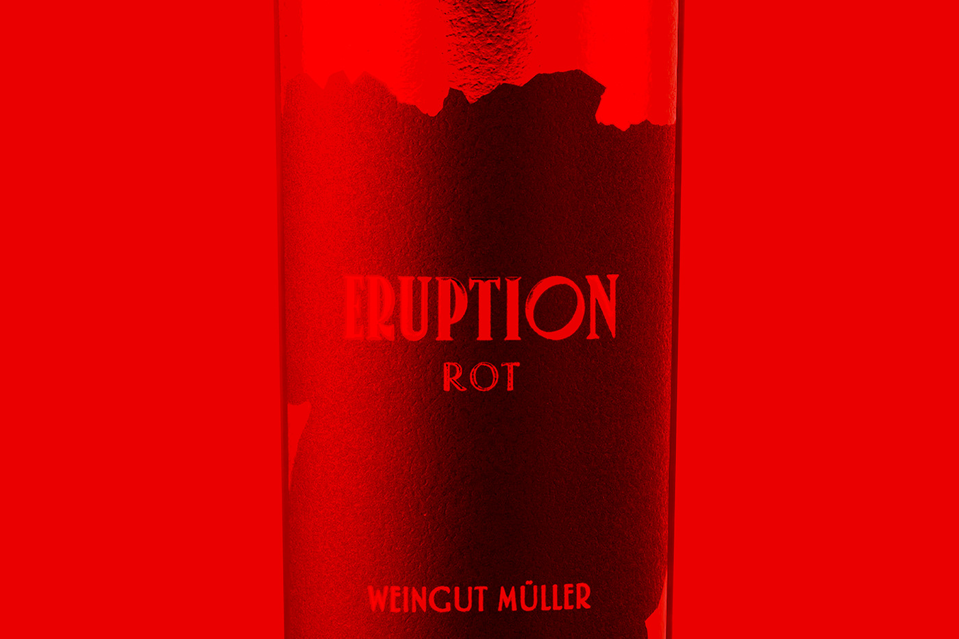
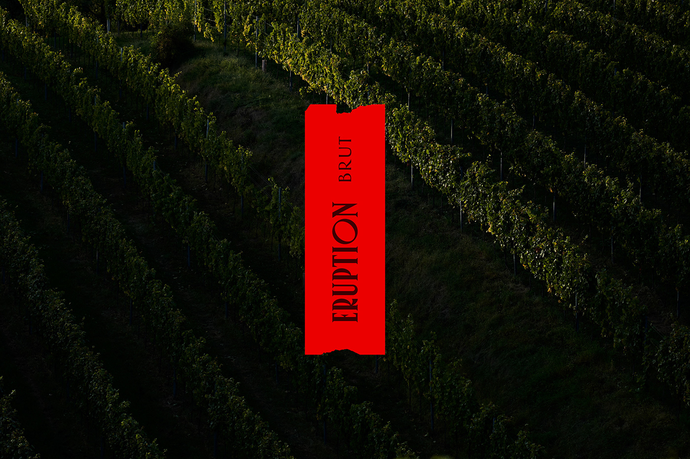
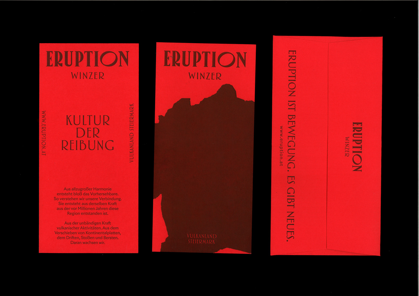
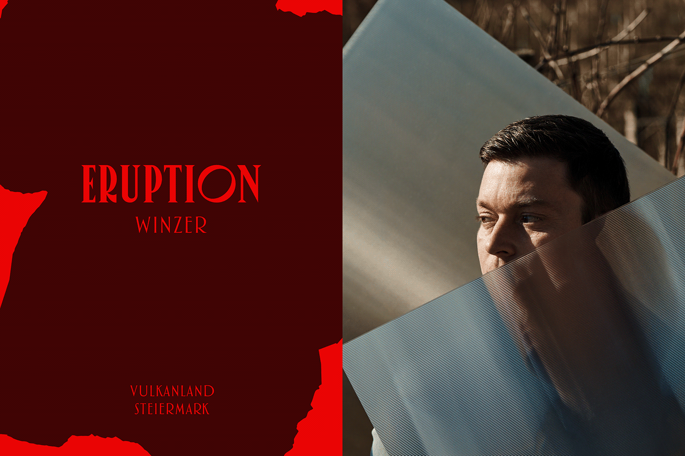
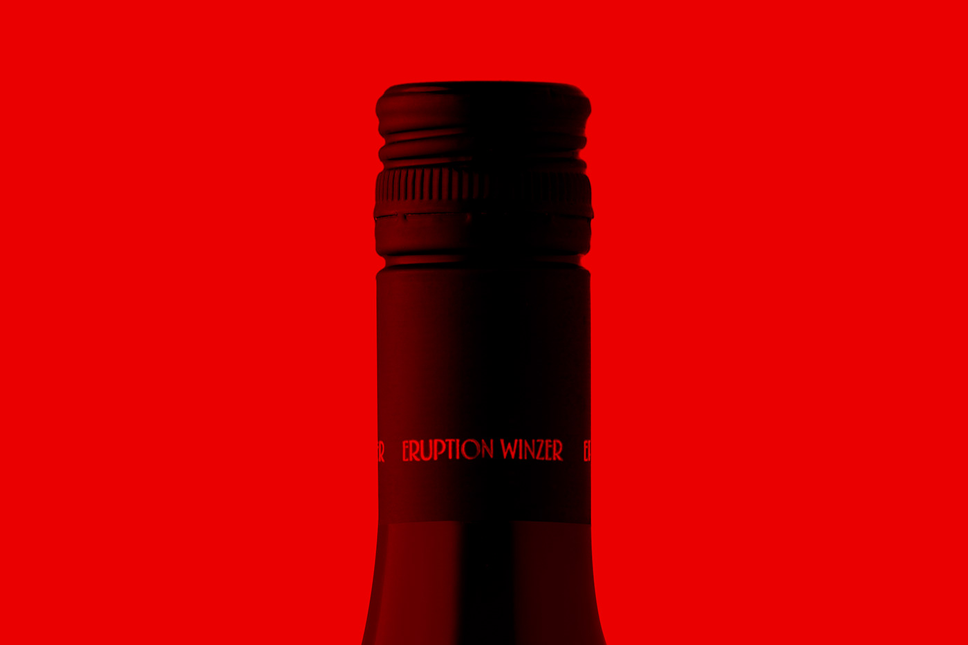
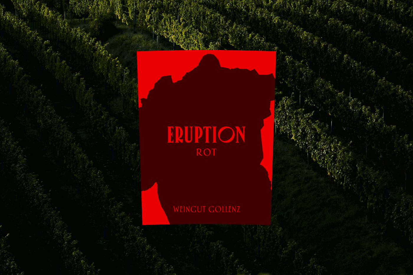
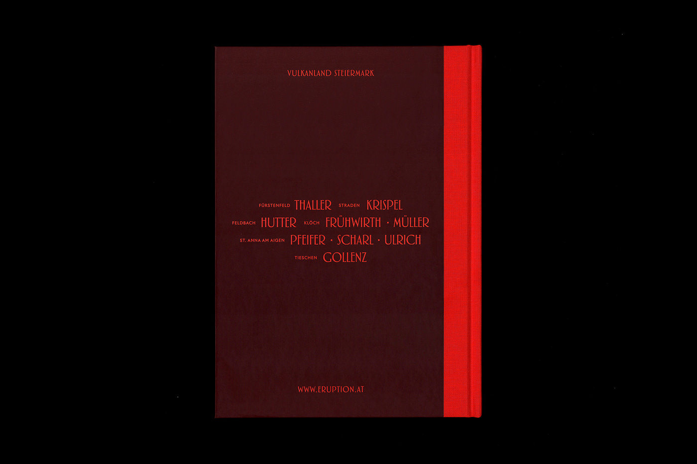
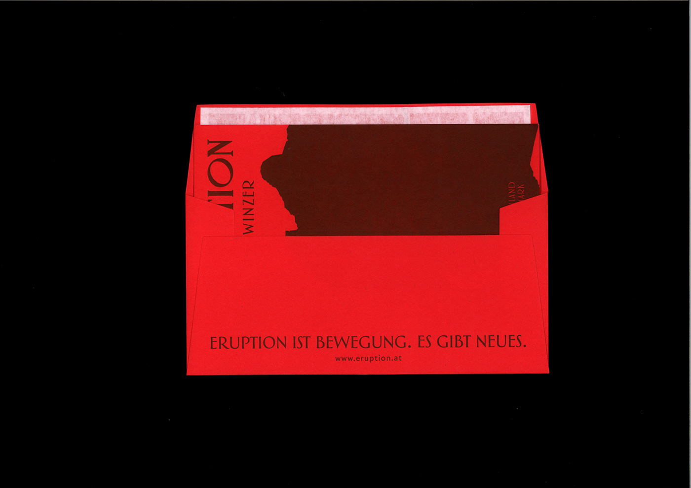
From too much harmony only the predictable emerges. The protagonists around the winemakers association Eruption therefore celebrate the friction between the elements and the honest exploration of the material they work with. Eruption was born from the same force that millions of years ago created the region where they make their wines. From volcanic activity, the shifting of continental plates, the drifting, bumping and bursting. An inspiration that is also reflected in the design, claim, corporate wording and photography of the association, and which is thus also an expression of that force of nature from which the special and thus the somewhat different arises.
Follow us on Instagram:


