


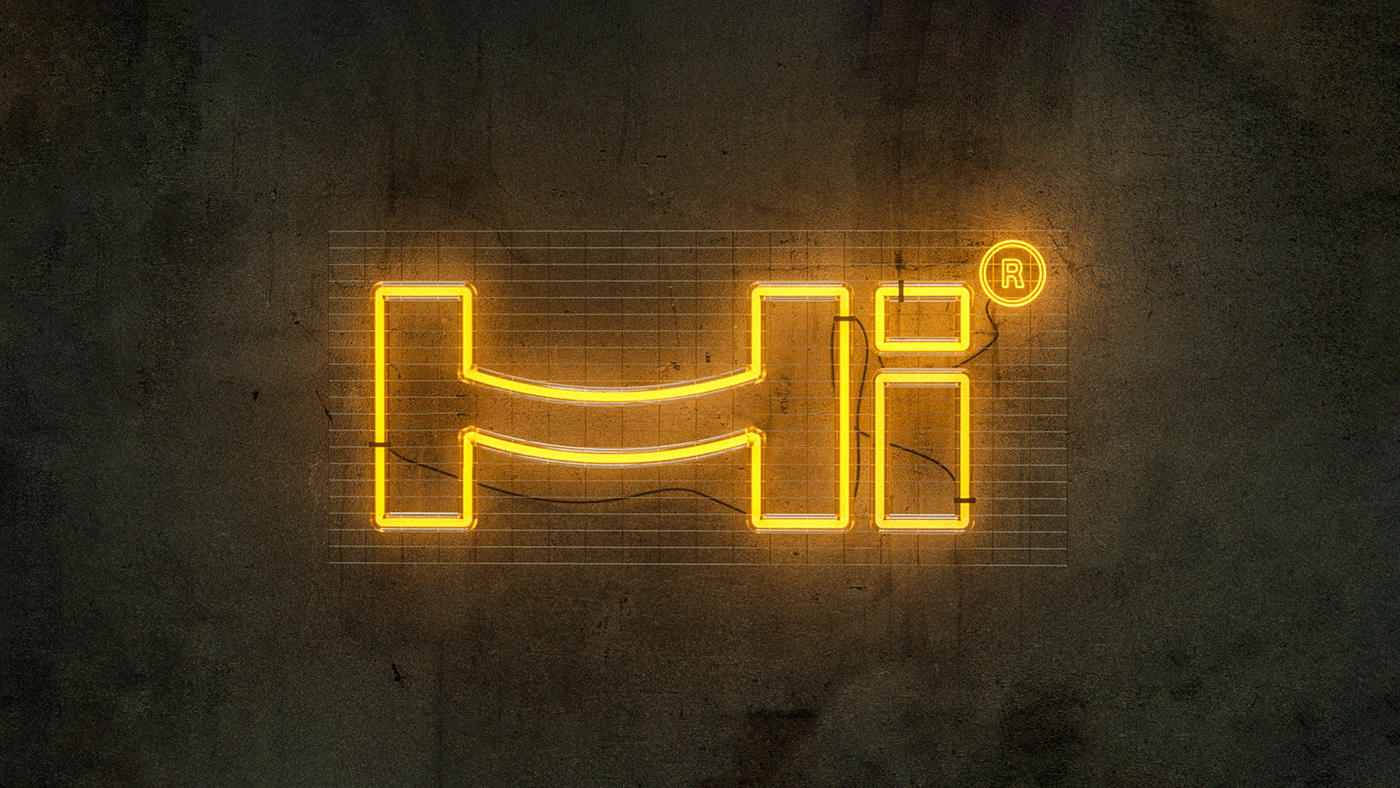


The word “HIVE” is clearly split into 2 parts “Hi + Ve”. And that was a part of our solution to create the new brand identity.
Hi, the greeting word, grows the feelings of inner peace and contentment and creates instant friendly emotions.
(+VE) which is the Abbreviation of the words POSITIVE, which supports our slogan (we talk in numbers), as it gives the impression that we always achieve good results.
Hi, the greeting word, grows the feelings of inner peace and contentment and creates instant friendly emotions.
(+VE) which is the Abbreviation of the words POSITIVE, which supports our slogan (we talk in numbers), as it gives the impression that we always achieve good results.
There are two reasons why we drew the letter H this way
- The dash in the letter H is drawn as a long radius curve, like a smile to emphasize the friendly vibes that we are sending through the logo.
- The two vertical lines and the curved dash take the figure of a bridge, as we are connecting the two main elements in the selling process: The buyer and the customer.
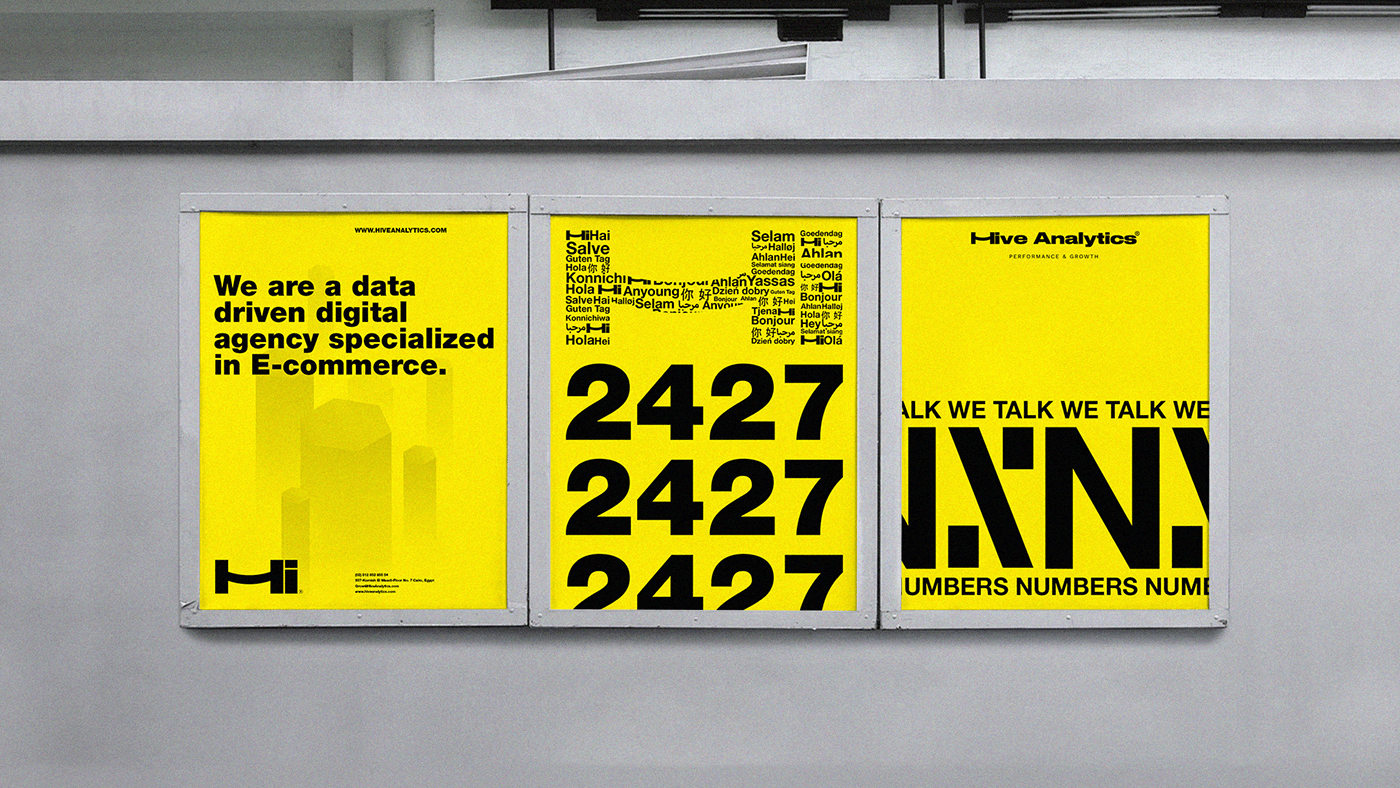
Simplicity is the main component of our work. We need everything to be simple enough to be remembered and recognized, yet all the messages are deep and full of feelings.
We used the bold font as it’s difficult to miss. Because people nowadays are always busy and have no patience, they can’t resist a word that is written with the black bold font as it gives a WOW factor to the sentence and the feeling of confidence. And because we love to play with words, we love to say this: “Bold emphasize Boldness”. And that is how we like the people to see the brand.


3D by: Mostafa Saied
Copywriting by: Sherif Ibrahim
Copywriting by: Sherif Ibrahim


