Splash®
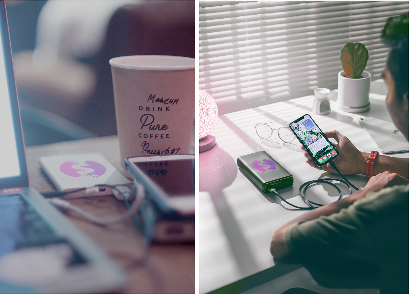
Splash is an innovative startup with huge potential, which is aimed to combine meeting the needs of modern people living in a fast world and draw our attention to the problem of ecology.The essence of the project: a network of powerbank sharing points.
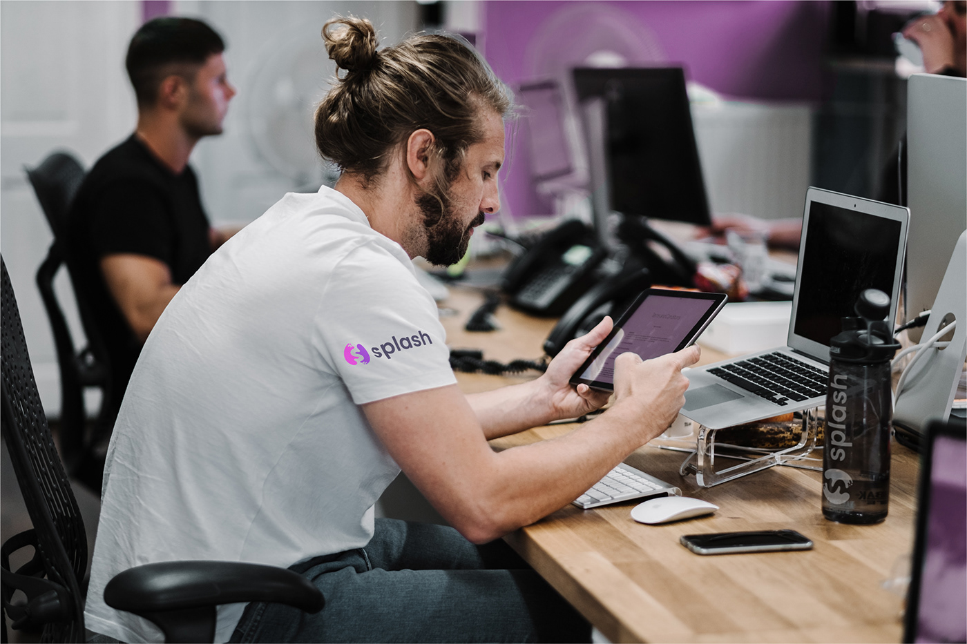
"We position ourselves as an energy management company, and not just a company engaged in renting out batteries. Our focus is on reducing the number of lithium ion batteries and energy supply to our users, also offering information about places where batteries are available, as well as promotions and location details."
Splash power sharing ®

The main task set by the customer was to create a brand that would be very different from opponents in the market. The customer asked us to get away from the "front row associations", such as wires, batteries and lightnings which are used by the most of the opposing brands.
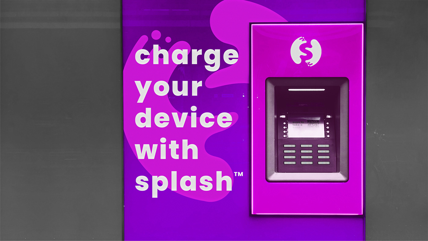
After analyzing the corporate styles of other companies engaged in powerbank sharing, I came to the conclusion that the best color solution would be to use pink and purple shades. These colors are often symbolized with the power of electricity, which only benefits brand awareness.
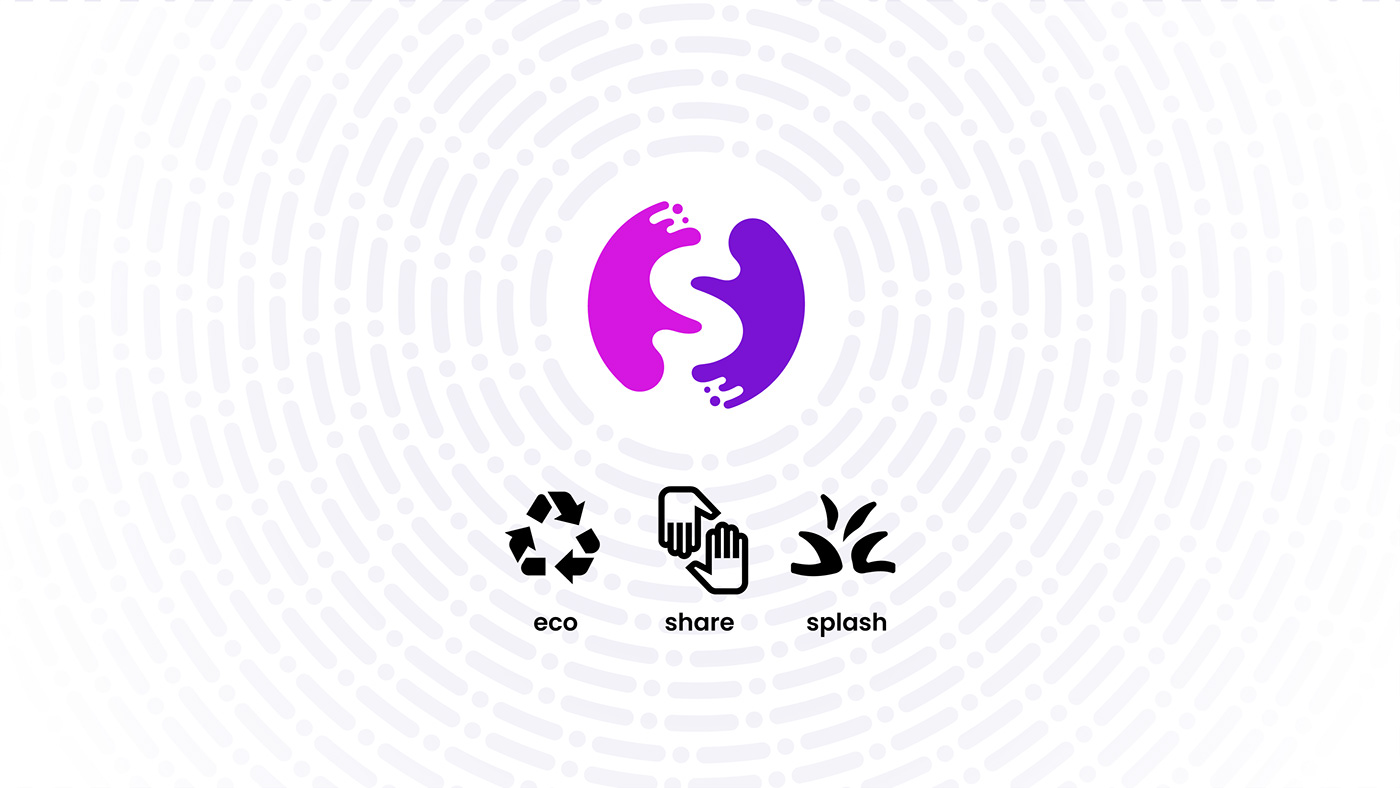
In order to convey the brand philosophy, I decided to focus the essence of the logo not on electricity, but on sharing and recycling. Fortunately, the symbols of these actions are very similar, because both speak about the cycle of something.
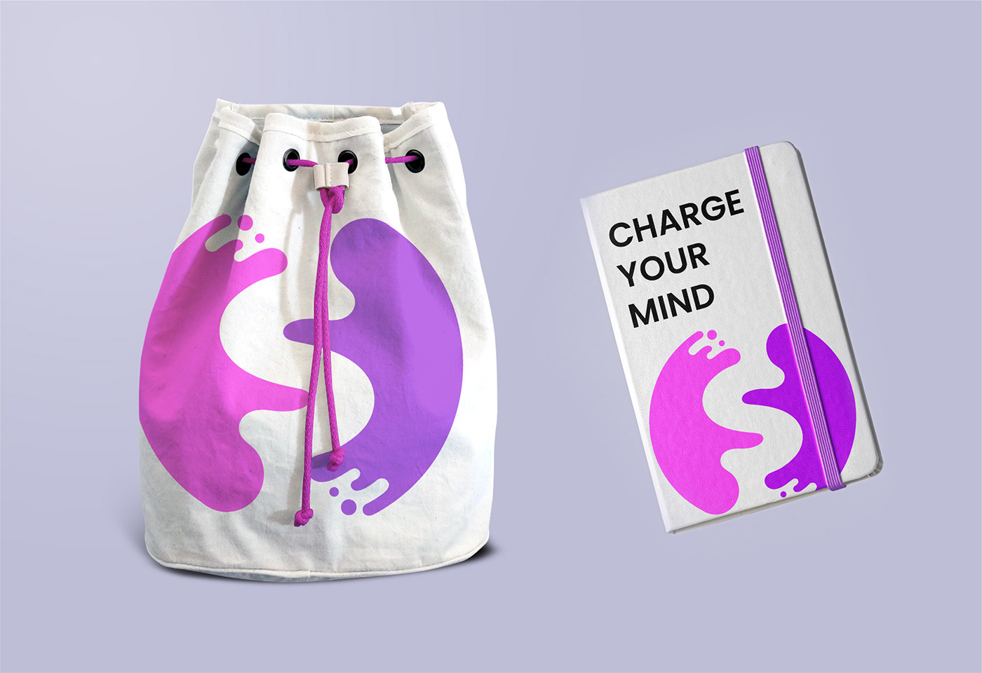
Thus, the logo turned out to consist of two stylized hands in a circle, which add up to the counterform of the letter "S". By adding drops on the ends of the hands to the symbol, I made a reference to the brand name - Splash, and added dynamism to the form, which also says a lot about the essence of the company - improving people's lives in a fast world.
