[br/pt] Licht - Velas Naturais
A Licht nasceu como uma proposta sustentável para a fabricação de velas, pois, comumente as velas são produzidas com parafina ou cera de soja e a produção desses insumos não é saudável para o meio ambiente. Como uma alternativa, a Licht fabrica velas aromáticas feitas exclusivamente de cera de abelha e também cera de carnaúba (árvore nativa brasileira).
A Licht nasceu como uma proposta sustentável para a fabricação de velas, pois, comumente as velas são produzidas com parafina ou cera de soja e a produção desses insumos não é saudável para o meio ambiente. Como uma alternativa, a Licht fabrica velas aromáticas feitas exclusivamente de cera de abelha e também cera de carnaúba (árvore nativa brasileira).
[en] Licht - Natural Candles
Licht emerges as a sustainable proposal for the manufacture of candles, as candles are commonly produced with paraffin or soy wax and the production of these inputs is not healthy for the environment. As an alternative, in Licht it manufactures aromatic candles made exclusively from beeswax and also carnauba wax.
Licht emerges as a sustainable proposal for the manufacture of candles, as candles are commonly produced with paraffin or soy wax and the production of these inputs is not healthy for the environment. As an alternative, in Licht it manufactures aromatic candles made exclusively from beeswax and also carnauba wax.

Conceito
A Luz é um elemento vital e está presente em todas as coisas, sua propagação faz com que consigamos ver, não apenas claro e escuro, mas também as cores. O fogo simboliza a vida, o conhecimento intuitivo, a iluminação, a paixão, o espírito.
O fogo que emana da vela é um símbolo regenerador e purificador, e o significado sobrenatural do fogo vai desde as almas errantes até o espírito divino.
Concept
Light is a vital element and is present in all things, its propagation allows us to see, not only light and dark, but also colors. Fire symbolizes life, intuitive knowledge, enlightenment, passion, spirit.The fire emanating from the candle is a regenerating and purifying symbol, and the supernatural meaning of fire ranges from wandering souls to the divine spirit.
Light is a vital element and is present in all things, its propagation allows us to see, not only light and dark, but also colors. Fire symbolizes life, intuitive knowledge, enlightenment, passion, spirit.The fire emanating from the candle is a regenerating and purifying symbol, and the supernatural meaning of fire ranges from wandering souls to the divine spirit.

Cores
Para escolha das cores principais de Licht foram analisadas as características principais da marca: Envolvimento, Equilíbrio, Sinergia e Inovação. A partir dessas características chegamos ao tom de verde que representa o equilíbrio entre as cores quentes e frias no círculo cromático assim como a harmonia entre corpo e espírito. Como contra-ponto ao verde, temos o creme e o amarelo que representam a luz e a inovação, trazendo contraste para a marca.
Para escolha das cores principais de Licht foram analisadas as características principais da marca: Envolvimento, Equilíbrio, Sinergia e Inovação. A partir dessas características chegamos ao tom de verde que representa o equilíbrio entre as cores quentes e frias no círculo cromático assim como a harmonia entre corpo e espírito. Como contra-ponto ao verde, temos o creme e o amarelo que representam a luz e a inovação, trazendo contraste para a marca.
Além das cores institucionais citadas acima fica livre a utilização de cores em tons pastéis para harmonização dos demais produtos da marca.
Colors
To choose the main colors of Licht, the main characteristics of the brand were analyzed: Engagement, Balance, Synergy and Innovation. From these characteristics, we arrive at the shade of green that represents the balance between the warm and cold colors in the chromatic circle, as well as the harmony between body and spirit. As a counterpoint to green, we have cream and yellow that represent light and innovation, bringing contrast to the brand.In addition to the institutional colors mentioned above, the use of pastel colors is free to harmonize the other brand's products.
Símbolo
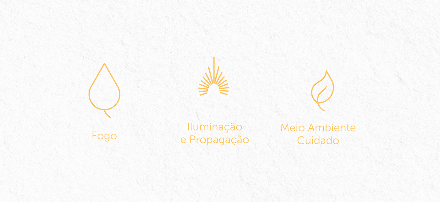
A partir dos atributos e conceitos apresentados o ícone foi desenvolvido para remeter aos 3 pilares principais da marca: Chama das velas (fogo), Iluminação e Propagação dos benefícios e aromas (raios), Preocupação com Meio Ambiente e cuidado com o ecossistema que está inserido (árvore). Esses pilares representam juntos o bem-estar e conforto que as velas naturais proporcionam e além disso também mostram o cuidado da Licht com a produção de cada aroma.
A partir dos atributos e conceitos apresentados o ícone foi desenvolvido para remeter aos 3 pilares principais da marca: Chama das velas (fogo), Iluminação e Propagação dos benefícios e aromas (raios), Preocupação com Meio Ambiente e cuidado com o ecossistema que está inserido (árvore). Esses pilares representam juntos o bem-estar e conforto que as velas naturais proporcionam e além disso também mostram o cuidado da Licht com a produção de cada aroma.
Symbol
From the attributes and concepts presented, the icon was developed to refer to the 3 main pillars of the brand: Flame of candles (fire), Lighting and Propagation of benefits and aromas (lightning), Concern for the Environment and care for the ecosystem that is inserted (tree). These pillars together represent the well-being and comfort that natural candles provide and, in addition, they also show Licht's care with the production of each scent.