Rauschen A / A / B
Rauschen A — B
Rauschen MAX

Rauschen A / B
Rauschen B

Rauschen A / B


Rauschen B


Rauschen B

About Rauschen
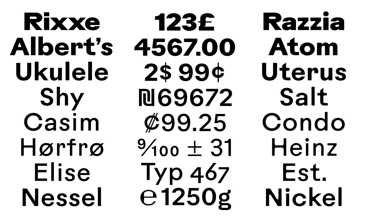
Rauschen went through three significant design phases searching for new expressions within the ridden to death genre of sans serif grotesque typefaces. The result is a family with two sub families (A + B) and a headline cut based on Max Bill’s study for a typeface for machines and humans (Rauschen Max).
1
Letters found on the poster by Leonetto Cappiello for “Contratto” were the starting point for clean geometric shapes with distinctive proportions.
2
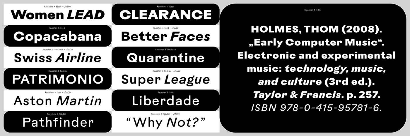
While working on this grotesk, I was asked by Dave Macklovitch from Chromeo to work on the typography of Rane Seventy’s A-Trak signature edition battle mixer. Rauschen was reworked and I added a color bleeding version (Rauschen B) to embrace all limitations which come with the printing technique: the design is back printed on Lexan sheets; then it is applied to the metal panel.
3
For the art catalogue raisonnée “Experience Implies Movement” by Vittorio Santoro, Rauschen was optimized in legibility and emphasized in proportions. A Regular Italic version was added and each family was expanded with weights from Regular to Black.
The result is a versatile and ultra sturdy typeface suitable for screen and print with maximum character.
1
Letters found on the poster by Leonetto Cappiello for “Contratto” were the starting point for clean geometric shapes with distinctive proportions.
2
While working on this grotesk, I was asked by Dave Macklovitch from Chromeo to work on the typography of Rane Seventy’s A-Trak signature edition battle mixer. Rauschen was reworked and I added a color bleeding version (Rauschen B) to embrace all limitations which come with the printing technique: the design is back printed on Lexan sheets; then it is applied to the metal panel.
3
For the art catalogue raisonnée “Experience Implies Movement” by Vittorio Santoro, Rauschen was optimized in legibility and emphasized in proportions. A Regular Italic version was added and each family was expanded with weights from Regular to Black.
The result is a versatile and ultra sturdy typeface suitable for screen and print with maximum character.


