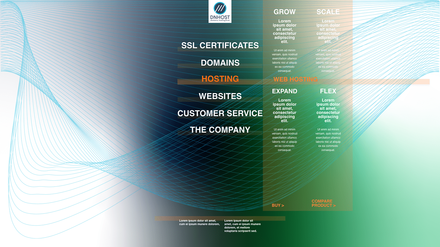
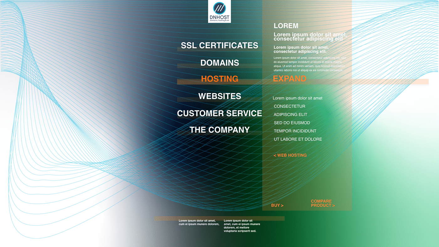
Accepting concentric navigation system as a central idea.
From perspective of change in code, I would turn main components to <div> with reference as suggested in Human interface Guidelines or Material Design recommendations, to so called burger menu or action menu. Divs mainly in order to make design responding not only to width of device, but also to allow simple adaptations, while thinking of smart watch or various alternative sizes of device.
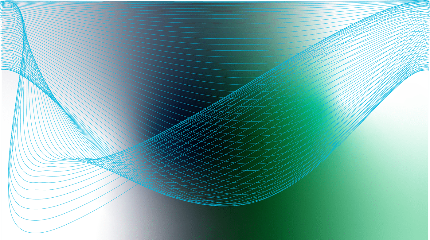
Language adoption, as solution for language accessibility. is represented by dummy lorem ipsum. What i intended to show off mainly is softer, less grid based, open and fluid design which allows more negative space to highlight particular choice of product. Hosting, as a knot of nods in web, is not so easy to visualise, but I at least introduced trend of restricted functional environment (centric axes) and idea of connection from screen to screen.
Selected example of product page is just an abstract obstacle mutual to every page of given design: distorted menu with too many data displayed on same page without focal point and lack of difference, very low sensation of brand, non distinctive, even precisely coded neat ...squares:)
Colours rely on scheme of logo colours and expand on it, but gradients are question of nowadays.
Please, see it just as a suggestion, not a completely functional prototype. Real prototype requires much more user research, particular persona and understanding of target client in context. I used Adobe XD, my favourite rough sketch tool.
Here is clicable xd prototype link: https://xd.adobe.com/view/a0508f16-7940-4687-ba24-92169ccf1a1d-f503/