motoprint
logo and visual style
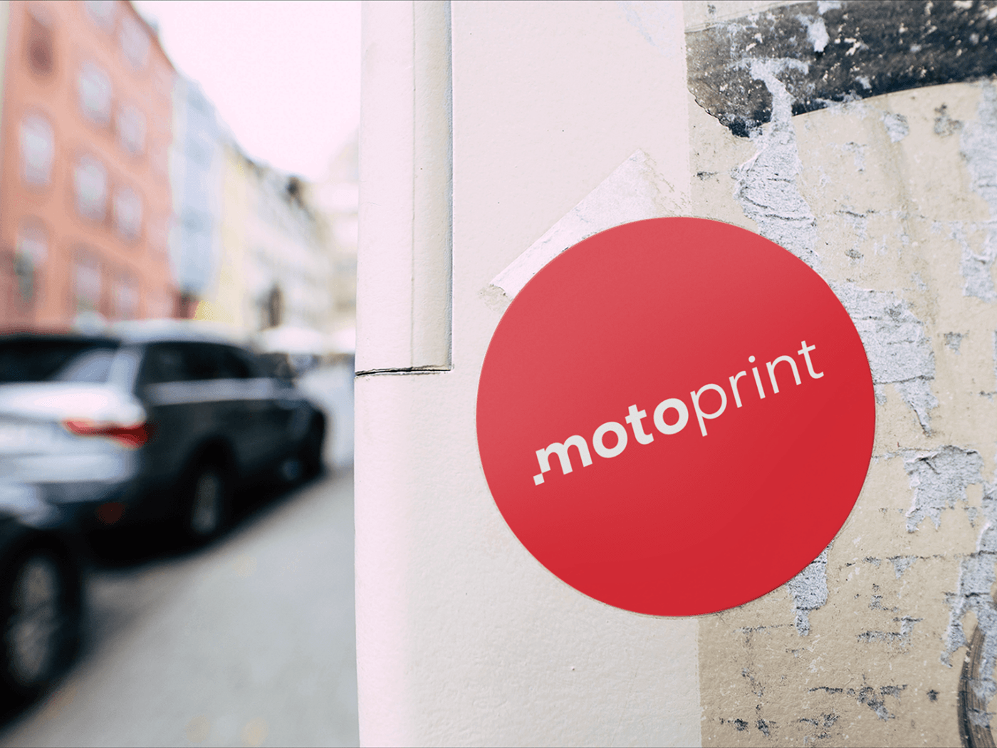
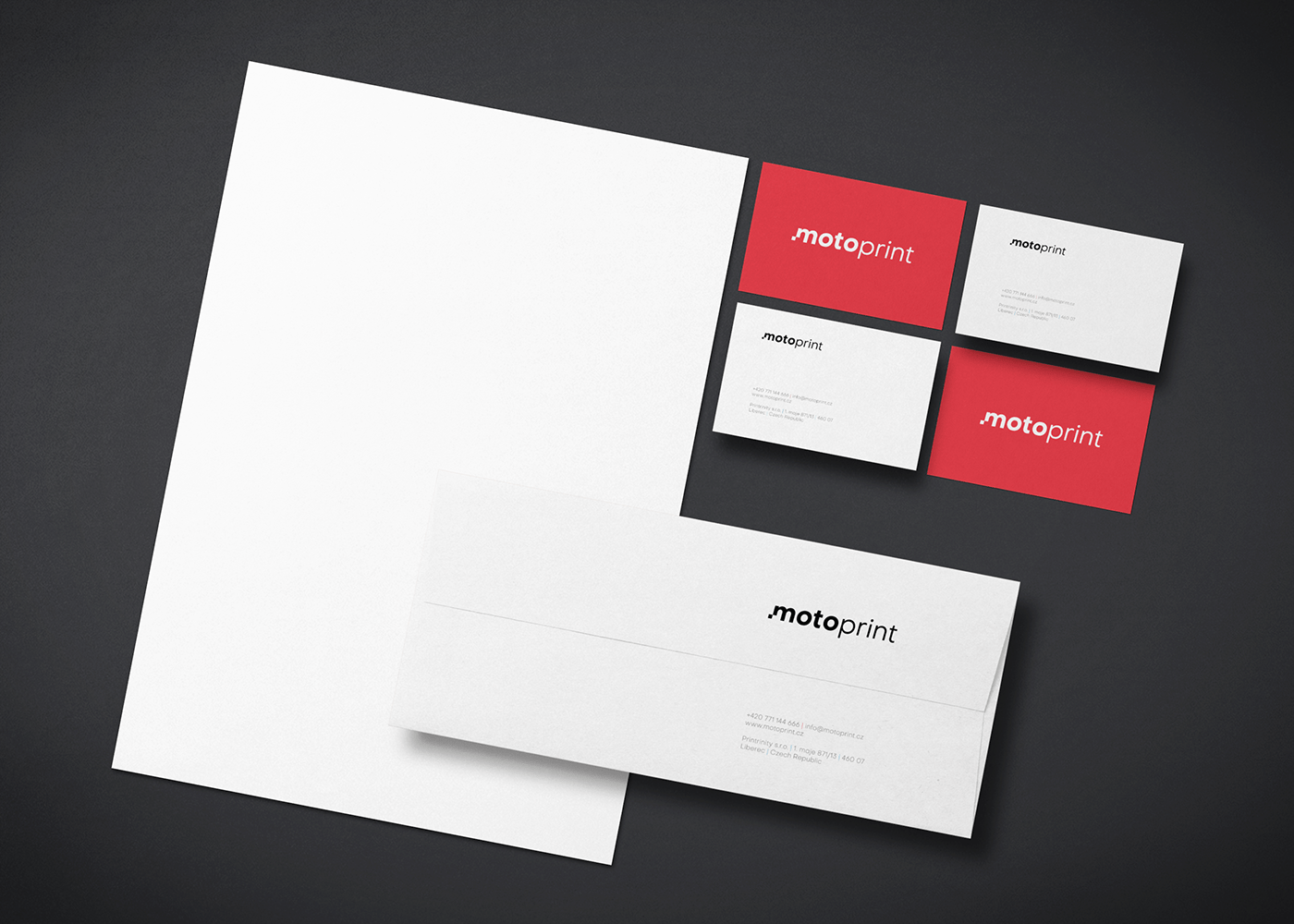
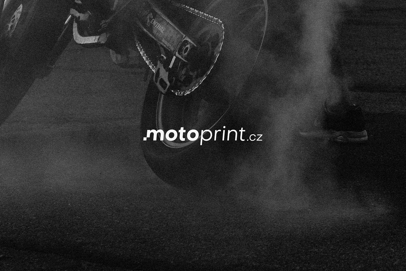
Motoprint produces motorcycle stickers with its own graphics, its visual style, but entrusted to me… as part of rebranding. For the logo and the whole visual style, I thoughtfully bet on the simplicity of a more aggressive red from the original two colors. It fits perfectly with bikers, radiating energy and strength. The target group of Motoprint customers are often MotoGP fans, so I chose the letter M with a checkerboard as the main symbol for a smooth passage to the finish. The logo font is beveled as an expression of aerodynamics.
"Among the many designs of various graphic artists, Bohuslav's design stands out for its sheer simplicity, but at the same time a well-thought-out concept. We need our ideas about the logo, at first it went in a completely different direction, we liked its design so much that it moved us in the view of the whole next strategy of the communication brand."
Petr Hovorka, CEO of Printrinity s.r.o.