

I’ve had the good fortune of illustrating a handful of covers for one of my favorite authors, Jake Burt, through Macmillan Children’s Publishing Group, with Associate Art Director Aurora Parlagreco. Each book I’m able to work on offers a unique opportunity to tackle different subject matter as I try to craft a cover which accurately captures the mood and tone of the incredible stories Mr. Burt creates. All that to say, when I was asked to create a cover for “The Ghoul of Windydown Vale”, I was ecstatic.
The title of the book alone was enough to draw me in and once I began reading, I knew there was a really fun opportunity to create a spooky, mysterious, moody illustration which would work hand in hand with the story itself.
If you’re interested in reading more about how this piece came to life, I’ve detailed the process below!
The Sketch
When I’m tasked with illustrating a book cover, my first step is to read the book, usually with a sketchbook in hand, so I can throw down any ideas or notes that hit while I’m reading. While reading, I’m paying particular attention to the overall mood and tone of the book as well as any relevant descriptions of characters, objects, or settings which are important to the story. I’m also paying attention to key scenes in the book that would make a good jumping off point for a cover.
The composition of a book cover illustration is critically important. I spend a lot of time trying to figure out how I want to handle the layout of the piece to make sure I can showcase important elements in a compelling way. I pay attention to creating spaces where titles & blocks of text can exist (to hopefully make the book designer’s job easier) and I look for opportunities to create framing elements which will draw the viewer’s eyes throughout the cover.
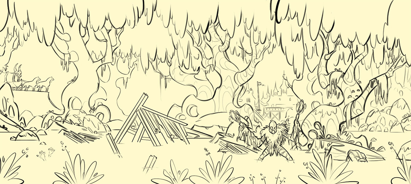
For “The Ghoul of WindyDown Vale”, I knew the cover was going to be a wraparound (which would include the front cover, back cover, and 2 end flaps). This was the perfect opportunity to create a sprawling scene, squeezing in hidden details into the swampy setting which serves as one of the primary locations in the book. I began thinking of the swamp as a character itself - one which would utilize trees, foliage, muck, and grime to hide all sorts of narrative elements and details readers would pick up once they began reading.
Side Note: While a book cover has a primary task of drawing new readers in, it also becomes a companion to readers as they delve further into the story. Every time they pick up the book or close it, they will see the illustration. This means there’s an opportunity to put things into the illustration which readers will see with new eyes once they’ve read different parts of the book. Look for small ways of incorporating these kinds of details in your book covers and you can create discovery moments for readers: they’ll read about something in the book and then realize, “That’s hidden on the cover!”
The Sketching Process
Typically when I do sketches, I work in Procreate on the iPad Pro using an Apple Pencil and I tend to jump in using only line work to explore ideas with quick sketches. This time, however, I wanted to try a different approach… Since the story itself was so moody and eerie, I wanted to work more with color and shape in my sketch to see if I could capture that tone.
These were the two directions I came up with:


I may have been a liiiiiitle overzealous in how far I took the sketches, but once I got started with these I didn’t want to stop. As I was exploring the sketch, I kept discovering more details to add in - details I wanted to make sure I remembered to place in the final illustration. The more I added, the more the world began to take shape.
I presented the concepts and we landed on a winner. I had a few revisions to make on the character design to make sure it was more in line with Mr. Burt’s creation. Here’s where the final sketch landed:
The Final Painting
One of the biggest challenges I find going from a color sketch to a final illustration is making sure the life and energy of that sketch is maintained all the way through to the end. Usually this isn’t as big a challenge if I’m sticking to line work on my sketches but with a color sketch, especially one as detailed as I created here, it can be a real challenge.
The solution?
I actually took the rough color version of the sketch and used that as the base for the final illustration. This means after I dropped the rough color sketch onto my final canvas size, I went into each element and tightened up the rendering to bring it to final form. It’s not an uncommon way of working, but it was definitely a new method to me (big thanks to my buddy Hethe Srodawa for his advice on how to manage this approach!)
Side Note: Never underestimate the value in chatting with other illustrators and artists about working method! This is something I constantly have to relearn - but I’m always amazed how different perspectives and approaches can benefit your process, even if your process is specific and unique.
With this kind of approach to the painting, I looked at it as if the entire rough color version is blurry and out of focus (undeveloped & unrefined) and my goal was to bring key elements of the piece into focus. This means I’m specifically rendering each piece I want viewers to see and leaving other elements (such as the distant background) purposefully obscured.
The result is a world which has lots of lost and found edges, depth of field, and lots of mood! Here’s a closer look at some of the details:
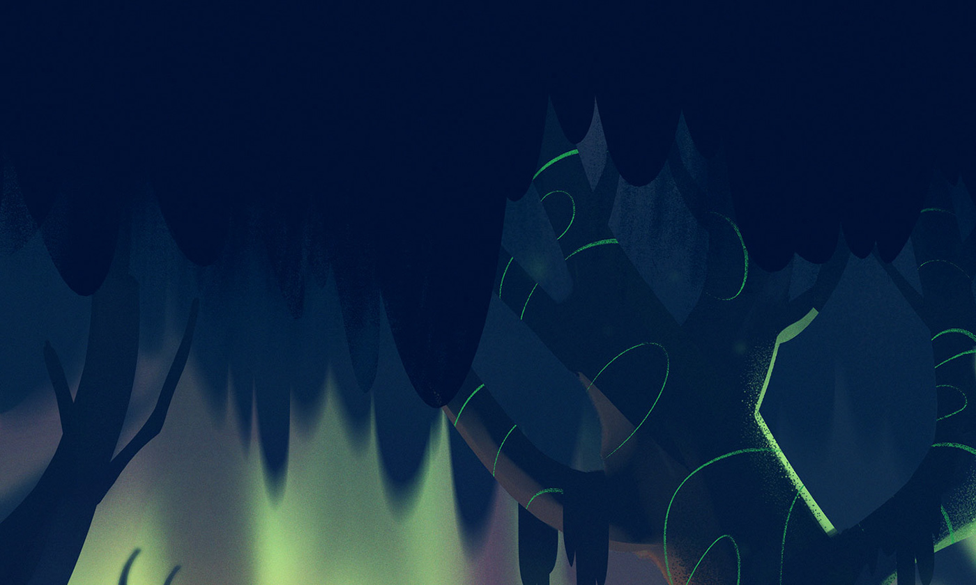


With these detail shots, you can see what I mean when I refer to the specific rendering vs leaving background elements more gestural. It creates a really fun effect and allows me to direct attention where I want it.
Once the illustration was completed, I sent it over to Aurora Parlagreco and her team and they added the type and title treatment to bring the cover to life:


Conclusion
Well if you’ve made it this far, I thank you for taking the time to read my ramblings on this craft I love so much. Big thanks to Jake Burt, Aurora Parlagreco, and all the folks at Macmillan who trusted me with this opportunity. I truly enjoyed working on this pieces and can’t wait to see it on the shelves. If you’re on the hunt for a good read, definitely check out any of Jake Burt’s books - you won’t be disappointed!

