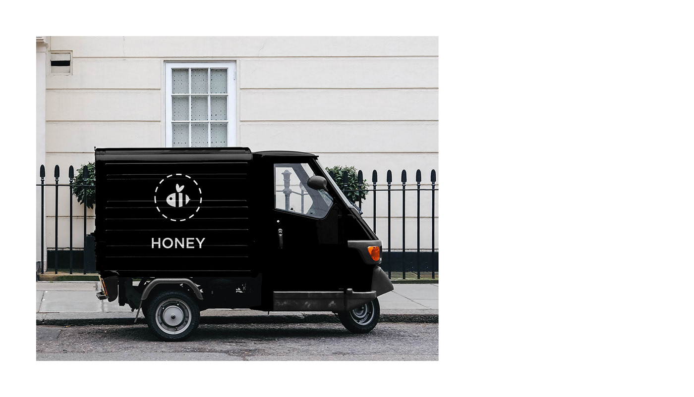
Honey is a concept identity I developed as a personal project during Covid-19 lockdown in Italy. The starting point is a logo I designed in 2014 for a contest I didn’t win, so I wanted to give it a new life.
The identity system is based on the black and white logo plus four colours inspired by different honey flavours: acacia, orange, eucalyptus and chestnut. The overall feeling is minimal and friendly to convey the idea of a quality product for everyday use.