
Website for the Inspiration Wild Cards
This is a project to create a website for the Inspiration Wild Cards, which were showcased in another Behance project page. The intention and plan for the website will be discussed at first, followed by the process of creating wireframes, a design concept, the website itself and mockups at the end.
Website Concept
The Inspiration Wild Cards are a tool for ideation and creativity. The website should serve as hub for all info and explanation around the tool, as source of all links to buy the set, and of course as advertisement to create interest. As it is a paper-based card deck, the website should showcase this somehow.
Hence, the briefing for the website is
- to make it simple, small and lightweight,
- to give the card set room, being the background for it and
- to showcase the physicality of the card set.
Of course, the website must be responsive to serve both mobile devices and desktop browsers. As the cards are available in English and German, a language switch is required. The extend of the website should be around 2 to 5 pages. The design of the pages of course should fit the design of the cards, maybe also using some elements like shapes or colors.
Wireframes
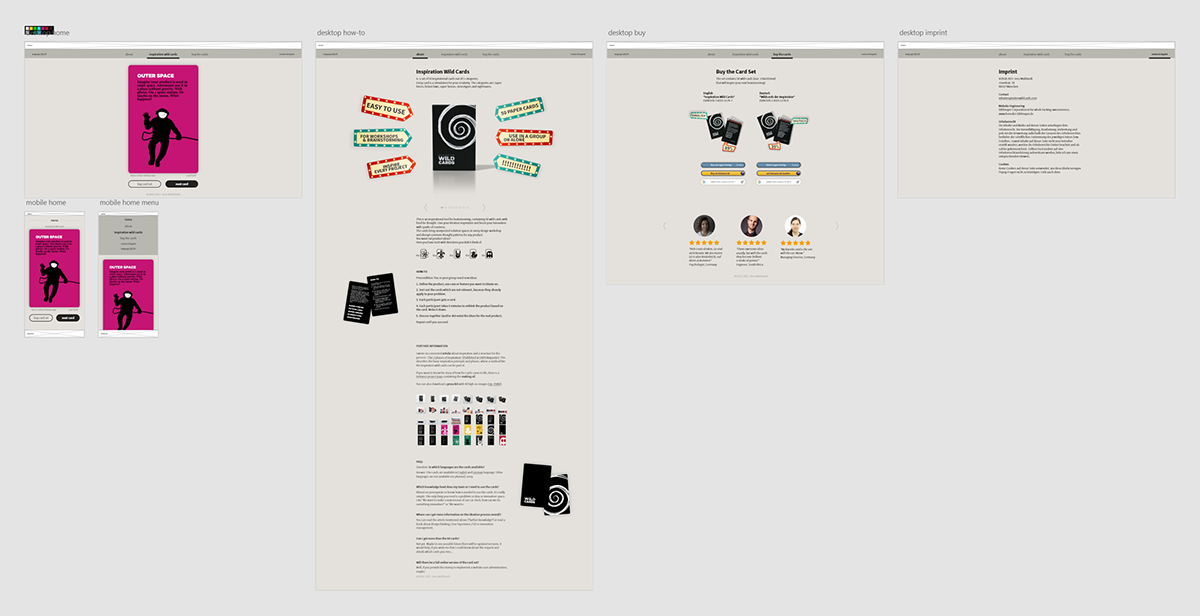
To bring the first ideas to life, wireframes were created - one set for mobile and one for desktop. The main idea is to have one of the wild cards in the home page (grey rectangles in the wireframe) and to go to the next card with one click/tap. From time to time there should be shown “this card is not available online” (red rectangle) - a cliffhanger and invitation to buy the paper card deck. Beside this, a second page “about” and a third page “buy the cards” with all links were wireframed. The page on the left side should be a intro or landing page, which was left out later on due to simplification. A contact/imprint page completed the set of wireframes.
With this, the basic structure of the website is set: a menu on the top of the desktop site, using a slide-out mechanism on mobile, no footer to keep it simple (except a copyright mark), a main page with the cards and 2 additional pages with information.

wireframes for the website, incorporating all necessary content and lining out the idea of the cards on the page, necessary information and layout parts for advertisement
Design
The cards with their strong colors and shape should stand out on the website, what means that the site itself must be calm and work more like a functional background. Hence, a flat design, simple shapes and a calm color palette was chosen.
The colors contain some of my personal favorite grey tones: The background is a flat surface in space grey (#E4E1DC), a warm medium-light grey tone. The advantage of this is, that the pure white of the cards stands out on this background. The header uses a darker cat grey (#B8B7B0). For the text colors, two blacks were chosen.

color palette for the website with some of my favorite greys: space grey, cat grey and bat black
The font is one of my favorite Google fonts: it's the Source Sans Pro font family, the first open-source font by Adobe. It's a very clean sans serif typeface with very nice weights, from which the light, the regular, the semibold and the bold style were used for the website, to give the text elements a balanced visual appearance.
The first version of the design contains an intro page, which is the attempt to make the website more fancy, playing with graphics and elements. But after testing, it became clear that this is without real function and value, so the text was put on the info page and the card page became the start. On this, there is a primary button to go to the next card, serving as call-to-action. The secondary button links to the buy page.

first draft of the design for the website, still with intro page (left out later on) - focus is the main page with the cards and the overall layout with menu, colors etc.
In the second iteration, a large info page is added. On this, basic explanations about the card deck, some pictures of the box, a how-to instruction, further information with some useful links and a FAQ section were added. Also a first version of the buy page is created, containing the description and all links for English and German. In this stage the web development environment was set up and the implementation of the card mechanism started, so that design and implementation ran in parallel.

second iteration of the design for the website, focusing on the info page and adding the buy and imprint pages
After testing the second version, the buy page felt a bit naked. So, colored buttons instead of text links as well as testimonials were added. In addition, fine tunings on the implementation like spacing and alignment as well as a refinement of the text in German and English took place.
final design for the website, adding fancy graphics and testimonials on the buy page and detailing all other elements
Web
The implementation of the website was done by Bene Bihlmaier and can be accessed via www.inspirationwildcards.com. For the site several frameworks and technologies were used, including the Next.js static site generation feature, the CSS framework Tailwind.css and Typescript, a JavaScript-like language. The website project with all its code is available on GitHub.
In terms of the sites, the most impressive feature is the card flip mechanism. This functionality turns a card around to uncover the content. Thereby, it imitates the real behavior: in a workshop participants can choose a category where they would like to have an inspiration card from, get the card and look at the content by their own.

Furthermore, the card also animated nicely to the end of the deck when pressing the next card button.

A hard nut to crack seemed to be the randomize functionality in combination with having the page rendered statically. In the end it was solved by lazy-loading only the card stack component using the Reacts Lazy Feature. As another adaption from real usage of the paper cards, users would shuffle their card deck before drawing a card. More complexity is added by requesting the black cover card to be always the first one when loading the website. Also, the additional text information below the cards needs to work dynamically, depending on the current card shown. All those requirements were realized super well and the result really feels like haptic paper cards in a online version.
Another stunning implementation is the language switch. When clicking on the language button on the left of the header, without a reload of the page and almost without any processing time, the language of the page is changed immediately; a very impressive realization.
All other elements are more or less standard components, like the responsiveness of the site, the header menu, content elements like the picture slider on the about page and so on.

main page for desktop with the cards and a call-to-action button to flip the cards, here: English version

the info page (only viewport shown, the content is much longer)

the buy page with all necessary links


screenshots of the mobile version with menu, info page, (main) card page, buy page and contact/imprint
Mockups
For several purposes it made sense to create some mockups to showcase the website. They're useful for social media posts, to be reused in advertisement or just as thumbnail pictures for this project page here. For the two on the left and right, the visual appearance is pushed by using some fancy background gradients, created with Affinity Designer. The website screenshots come along in the style of cards, fitting to the overall idea. By the way: the mockup on the right uses the Pantone colors of the year - still not sure how good they are, especially as gradient. The one on the middle with the simplified phone was created by using the Blue Mockup of Death.


different mockups to showcase the website in an advertising-like hero picture
After the first version of the website was released in January 2021, several features are on the list to be implemented in the future. The testimonials have to be confirmed with the respective persons, the card switch might get a swipe gesture for mobile, the images and text might get a polish, plus further ideas coming up in the future.
Update (with new features)
After a while, some missing features were designed, created and implemented on the website beside several text updates and bugfixes.
The first one are testimonials. They serve several purposes: they make the look more human by showing faces of customers and ambassadors. In addition, they proof the quality of the product and give the customer a good feeling for the purchase.
It took a while to collect them and get the approvals, of course all of them are real persons. The pictures of ambassadors are mixed with some anonymous text passages of reviews on amazon or LinkedIn.

testimonials make the website more human and give a proof for the product's quality
Another new feature of the website are animated pictures. GIFs are well known and still work fine for a lot of usages (like on this page). But a test on the website showed that the limitation of a 1-bit transparency is crucial to the quality. So, on the website inspirationwildcards.com they are implemented as "APNGs" or animated PNGs. It's an awesome format, supported by all modern browsers. They have 8 bit alpha channels, are saved as ".png", and systems not supporting animations just show the first frame. They have been created easily using the tools at https://ezgif.com/apng-maker.

animated PNGs or "APNGs" bring animated pictures with a superb quality to modern browsers
A third main new feature of the website are swipe gestures on the cards. They're implemented by adding event listeners that detect the start coordinates and end coordinates of a tap or click on a card - therewith you now can use your thumb on a mobile device to get to the next card.

swipe gestures improve the mobile experience
With these updates the website now feels more complete, more done. Of course, there are more ideas for the future. Especially to take situational photos in real workshops is on top of the todo list.


