An augmented reality application that uses image superposition over hand nails to change shape, color, art, and length. Developed in team collaboration with Jonajo Consulting.

Phase I ⎯ Understanding
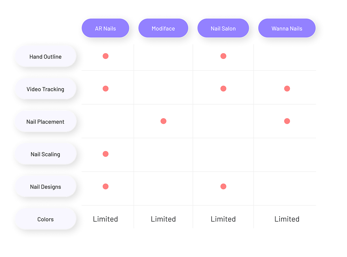
Competitors
To kick-start this project we did a benchmarking exercise or competitive analysis. The objective is to understand the strengths and weaknesses of possible competition in the industry. This was also a good start point to see the technological capabilities of augmented reality on applications that focus on nails.
Who are the users?
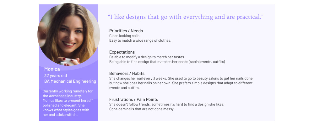
Before jumping on the design board we needed to understand who we are designing and building this application for. We created an open survey to filter down people with the following criteria:
- People that get their nails done either weekly or bi-weekly.
- People that use social media to find inspiration for nail designs.
After we created a small database of potential users we interviewed four to create our personas. First, we made a table summary of their responses in six different categories: frequency of nail upkeep, pain points, design preference, do they do it themselves or at a salon, inspiration source, and desired feature. With this table we made a dimension plotting to analyze clusters of possible personas.
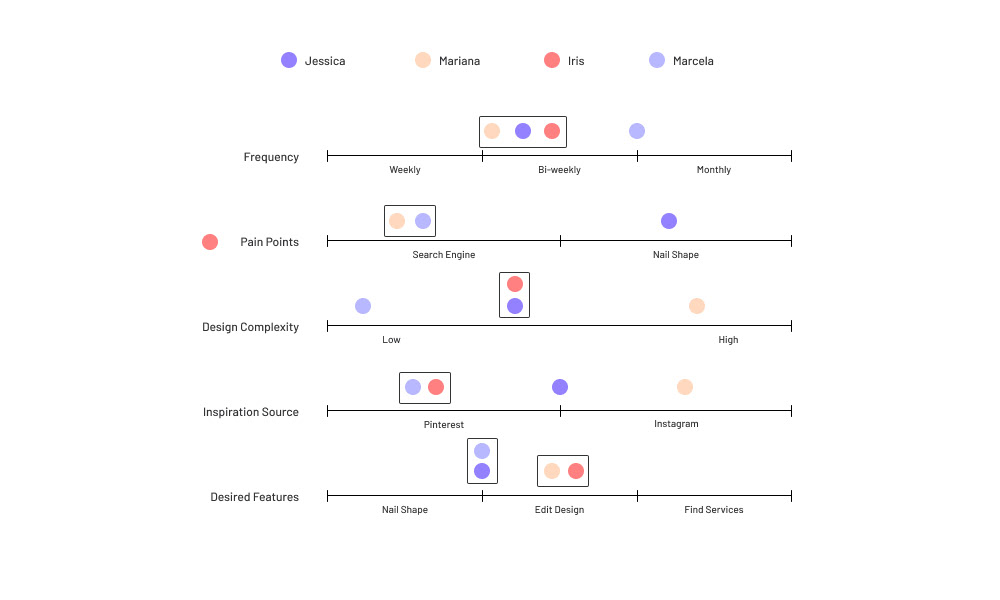
We found that all users have the same pain point: searching for specific nail designs is not easy. Users have different tastes in nail designs, if we want to attract users from this industry we must include both simple and complex options. The applications our users go-to for inspiration is Instagram and Pinterest, the latter being the primary source.
Users are very interested in changing the nail shape using augmented reality. As well as importing their designs or being able to edit an existing design.
Possible opportunities are to develop technology for uploading nail art that can be used inside the application with augmented reality. Linking their preferred social media channels to make sharing faster. Letting users upload photos of their own to save as a reference. Have an internal team analyzing the top photos uploaded by users to create nail designs inspired by those.

Phase 2 - Design
Information Architecture
After a brainstorming session on what features we wanted to include on our app that would spark our user's interest, we decided to focus on our augmented reality feature and an effective search engine.
For our AR we wanted to do more than change nail color, we want our users to be able to change their nail shape, nail length, and apply different complex nail designs. The goal is that the user will like what they see on the screen and later go to the salon to make it a reality.
The search engine would replace Pinterest as the go-to place to look for nail inspiration. Using the categories for our AR feature we can create a database with different categories that our users will enjoy navigating. Furthermore, we wanted to develop a feature that will allow them to make folders and save designs for future use.
Tree Test Analysis
After making the tree testing, we realized this method was not the most adequate for our application. Tree testing goal is to help the user find content, but our original goal was to find how the user interacts with the main hand scan feature. Even Though 50% of the test was completed. We need to make another test using low fidelity wireframing to see how the user will interact with our main feature.
Wireframes
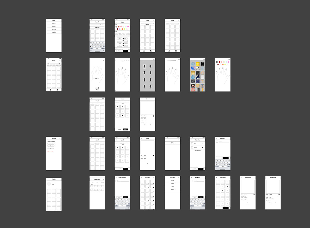
Using our Information Architecture as a guide, we created a set of low-fidelity wireframes for our tests. The goal was to set the skeleton of the app by showing the screens that users will be navigating.
Tests
We wanted to test if they could use filters on the search. If they can understand the concept of collections as folders by moving images or creating a new one. We also wanted to introduce the first stages of the AR filters and see if they could identify what they do.
We wanted to test if they could use filters on the search. If they can understand the concept of collections as folders by moving images or creating a new one. We also wanted to introduce the first stages of the AR filters and see if they could identify what they do.
Test #1
1. Task Name: Searching by color
The button “See more filters” wasn’t found by one of the testers. Let’s see if by adding contrast to the wireframe the success rate rises from 80% to 100%.
2. Task Name: Using Augmented Reality
The success rate of 100% due to similarities with popular apps, feedback from users was to add labels to the nail feature buttons.
3. Task Name: Using the Gallery
Out of 3, only one user found this with the straight forward path. The other users navigated to more than 13 screens, one got lost while the other succeeded after a second attempt.
We need to make the menu for "select" easy to find and the ability to switch between galleries (Snap/Liked/Collection) more straightforward.
We should change the landing page for the gallery.
4. Task Name: New Collection
One user got lost trying to create a new collection, our younger users managed to find the flow in 5 seconds.
We need to make the “add” new collection more noticeable for our mature persona.
5. Task Name: Hand Scanned Photos
100% success rate. They knew how to find the gallery they wanted at this point, being the last question they got a chance to get familiar with the app. I wonder what would happen if this question was at the beginning of the test.
We made an update to our wireframes based on the results of the test and created a second test. On this test, we wanted to learn about the intention of the user. We made tasks with multiple possible options as the correct answer followed by a question such as: Why did you select that filter? We wanted to test if the update to the gallery was efficient, we also changed our menu and wanted to see if this time it was easier to create a new collection and move images.
Test #2
1. Task Name: Apply filters to your hand
Nail AR feature success rate or 100%. Doesn’t need further updates, the user knows how to navigate, their favorite option to apply is “Color”.
2. Task Name: Your Photos
Success of 100% again, each user followed a different path but finished correctly. 4 out of 5 participants said the word “Snaps” resonates with their understanding that it’s a picture saved from the AR feature. I think we should keep the word. Maybe adding a ⓘ to the label to reinforce the meaning in case it's necessary.
3. Task Name: Filters on Search
One participant mentioned that they like all the filters, finding them useful to narrow down their choices faster. However, one participant got lost and couldn’t find the filters.
On the previous test, we had the same problem with a different person, and we decided to leave the option always visible, however, that still didn’t get a 100% success rate. On the new wireframe, we should make filters stand out more. Maybe suppress the visible category labels, I noticed that some users clicked on them first.
4. Task Name: New Collection
4 users found how to make a new collection without a problem, one of them mentioned that they were looking for a “+” icon, like on our previous test. One user got lost, this is similar to the previous test, where one user couldn't finish this task.
The location of the feature didn’t change on our second test. We removed the “+” and added a menu “...”, I think we should leave it as it is for now because the user that gave up the task finished task #5 and mentioned that “Now I think I have it 😀. It is already easier to use.” which means that after a couple of minutes using the app she got familiar with the navigation.
Feedback from the participant no. 5 who had a hard time finding “add new”: It was not easy for me to find. It would be a great idea to have a kind of ”go-to” button in the menu at the bottom of the screen. Here I could start and find everything. Then I always know where to start, and everything is placed in the same place.
While a “go-to” button sounds like a good idea, I think it would be the “...” dot menu on the top right corner. Let’s review the wireframes to make this button is constantly easy to find.
5. Task Name: Moving images
All users completed the task but we got feedback for an extra feature:
Long tap on one image triggers “selection” mode.
Conclusions
Keeping the word snap for photos taken with the AR feature. Consider adding a tooltip.
Remove quick filters or shortcut labels, since they create confusion.
Keeping navigation consistent. (Icons and menus on the same side).
Adding the ability to move a photo when you see the photo details.
Define for developers which screen allows hand gestures (swiping, scrolling).
Phase 3 - Most Viable Product
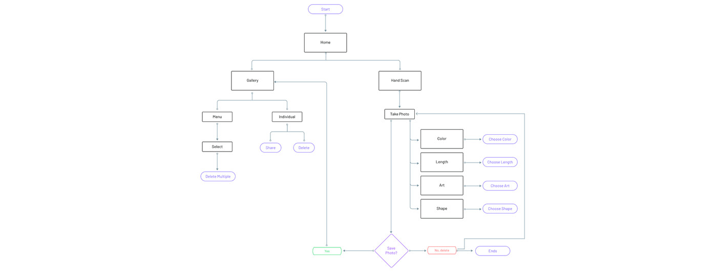
There is always a time when stakeholders and developers will ask for an MVP. After we did our wireframe testing it was decided that we will only focus on the augmented reality feature for our application. We reached a compromise to also allow the user to save their creations.
User flows
Next Step: User Interface, High Fidelity Prototype and Usability Testing
this is an ongoing project...
