Fabini
Client: Fabini
Designer: Michael Dolejš, Karla Gondeková
Cooperation: Kiduo (Filip Šimoník, Zuzana Vyhnánková Brečanová), WeAre (Jakub Dohnálek, Michael Šroubek)
Font: Reckless , Helvetica Now Display
Type: Brand, Web
Designer: Michael Dolejš, Karla Gondeková
Cooperation: Kiduo (Filip Šimoník, Zuzana Vyhnánková Brečanová), WeAre (Jakub Dohnálek, Michael Šroubek)
Font: Reckless , Helvetica Now Display
Type: Brand, Web
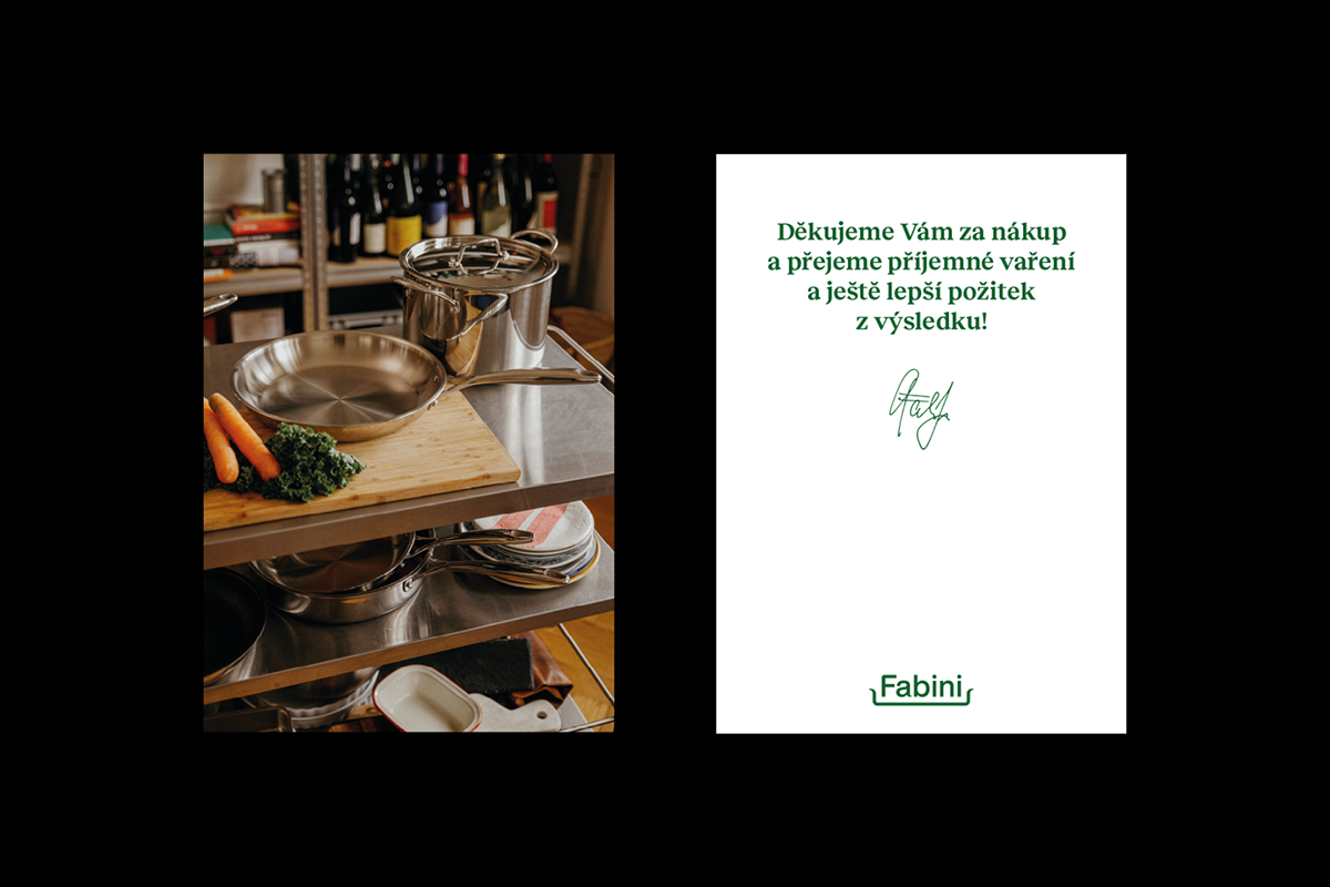
Fabini is a young but progressive brand operating in not a very progressive field of crockery making, hoping to attract both new and older customers who are looking for quality equipment for reasonable money. We were asked by Kiduo to help Jan along his journey and together with photographers from WeAre create a new visual identity that will better capture his ideas and point of view in the next chapter of his company.
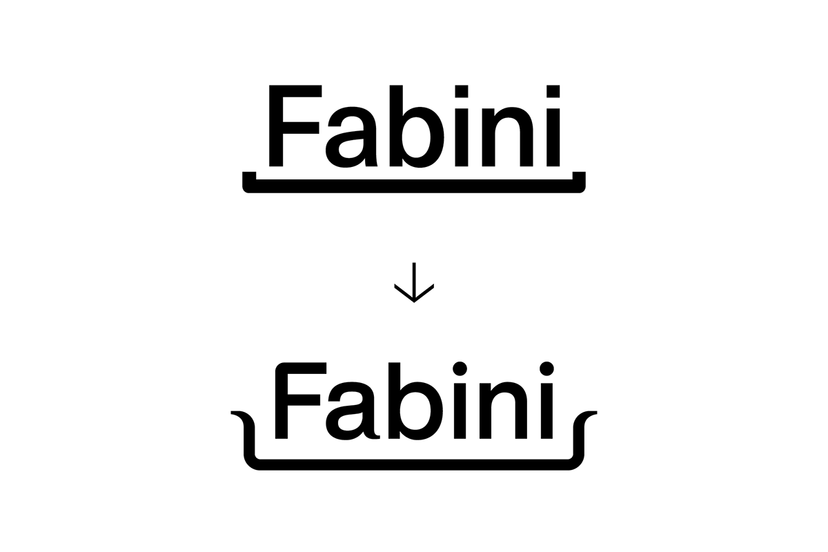
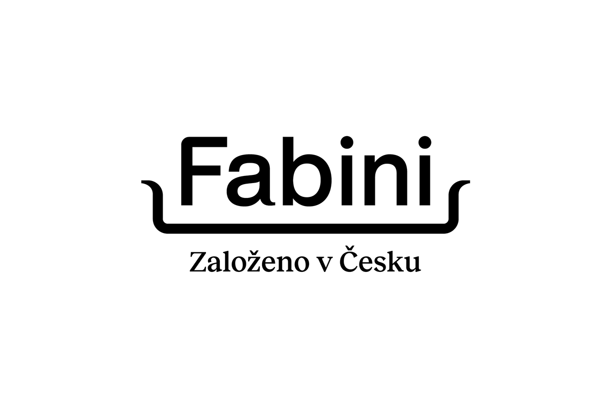
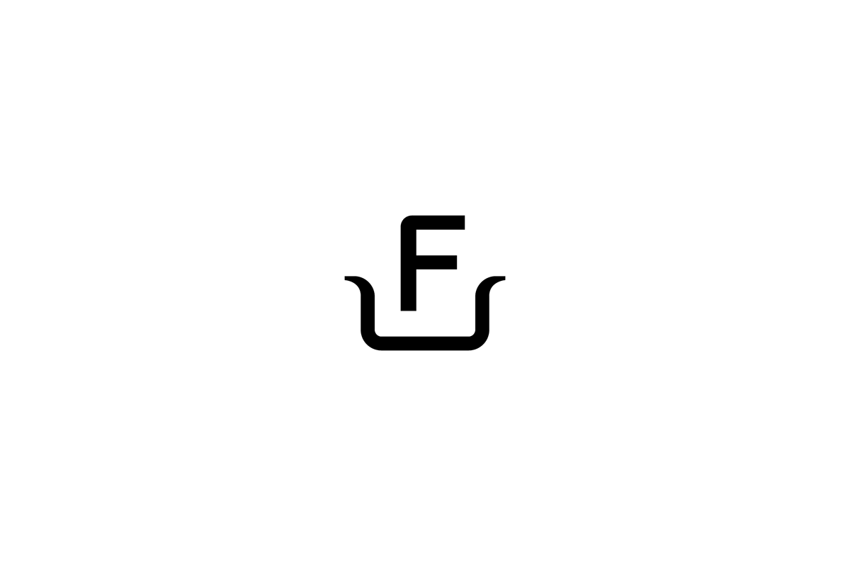
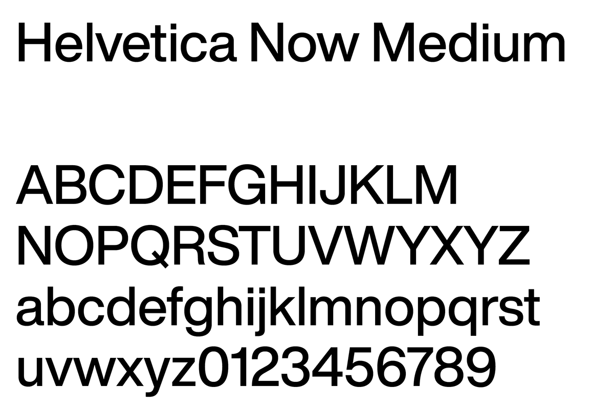
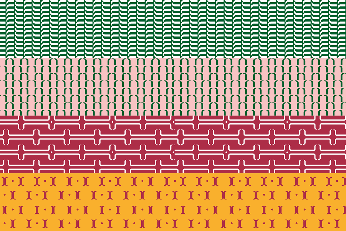
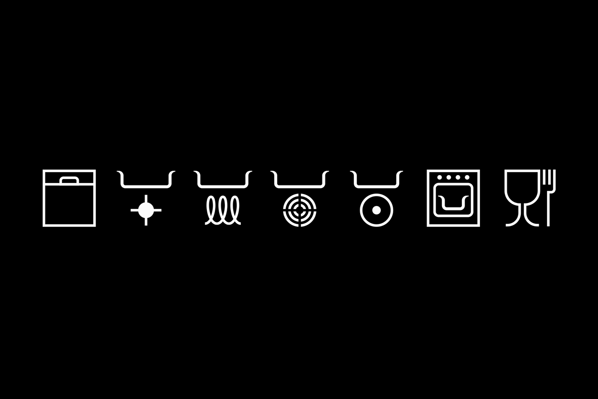
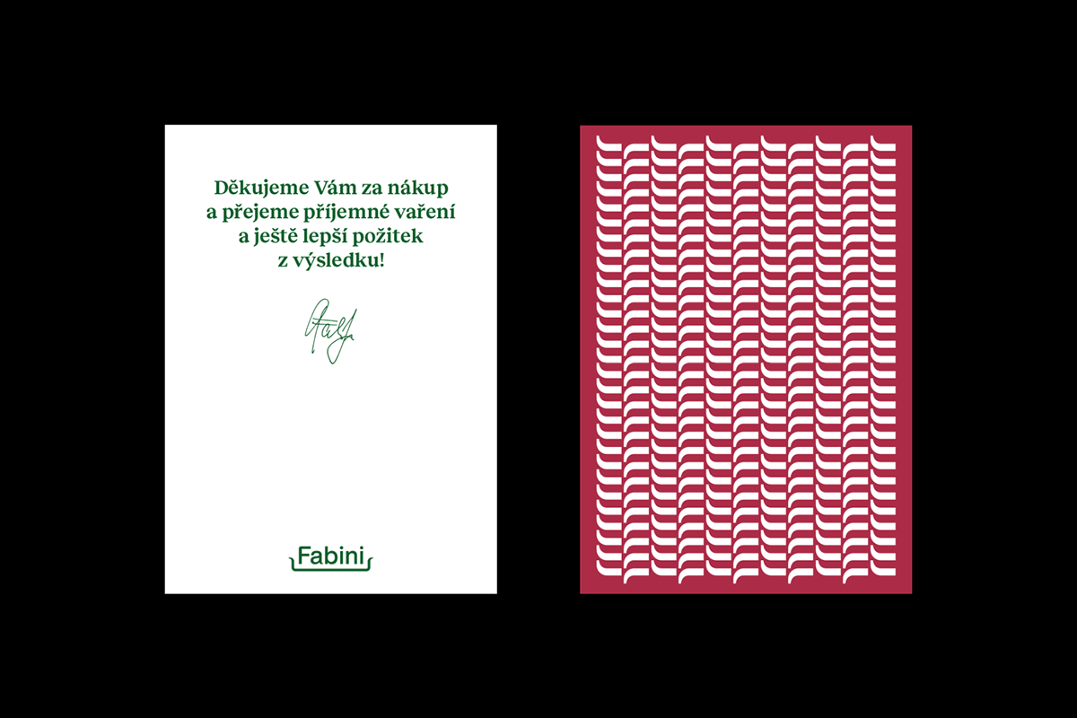
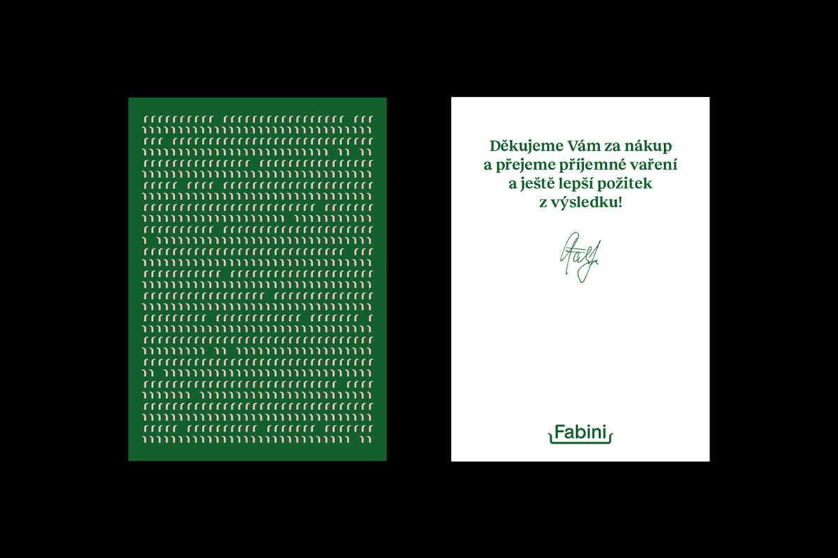
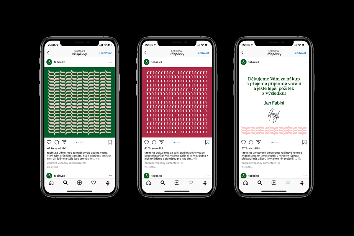
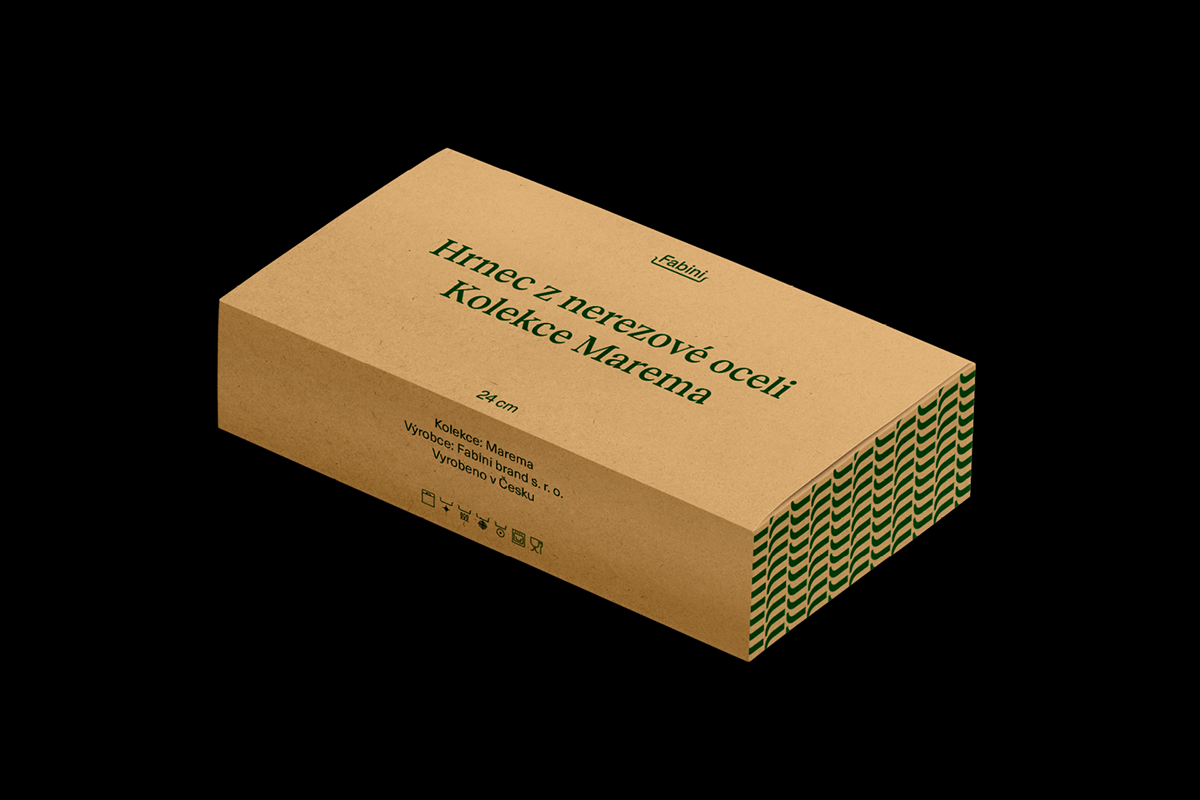
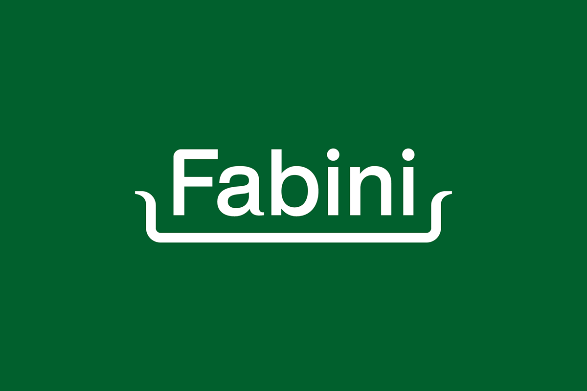
That meant an update to his current logotype, that is now more harmonically shaped, and more inspired by his pots and pans. It also features a signature curve in the underline which can be seen in various patterns used through the identity, packaging and even in pictograms. We also selected a new company typeface and picked new colours inspired by rustic Italy and it’s hot summers, where the newest collection of pots are being manufactured.
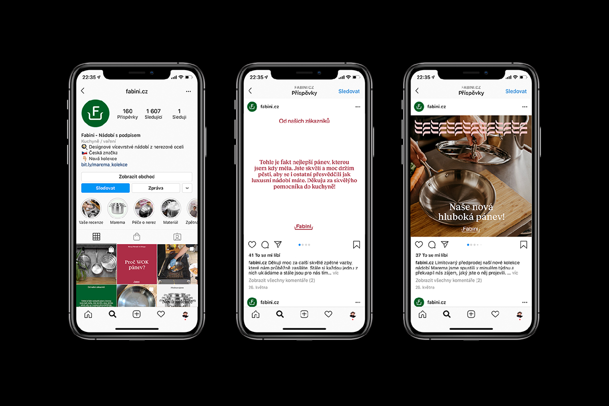
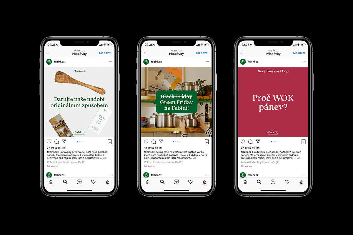
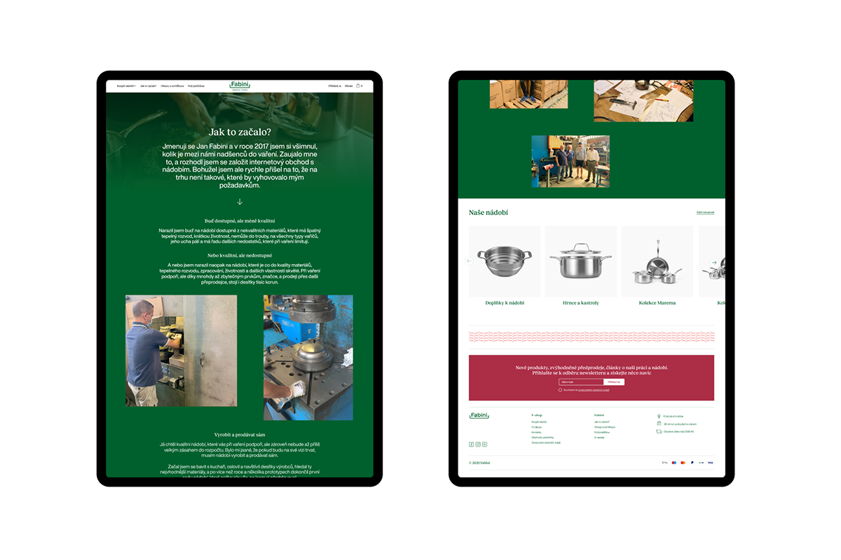
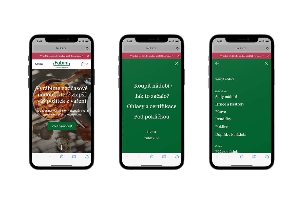
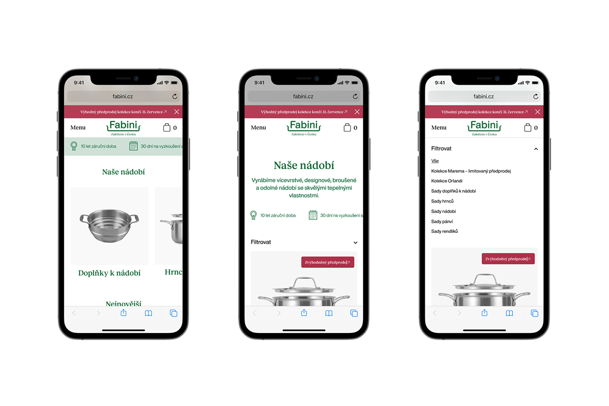
We also completely redesigned his company website to better reflect all these changes and better tell his original story. Who's gonna do the dishes now? Bon Appétit!
We also completely redesigned his company website to better reflect all these changes and better tell his original story. Who's gonna do the dishes now? Bon Appétit!