


This year I had the good fortune to work with the folks from Beekman 1802 on a set of illustrations for their limited edition “Twinkle Twinkle Little Farm” holiday packaging. The packaging afforded me the opportunity to illustrate 5 magical scenes capturing the heart and spirit of Beekman Farms - and each piece was printed on their gift sets offered through the Home Shopping Network.
Creating these pieces was a genuine treat for me, topped only by seeing them printed in person on foil paper around hand folded packaging. Seriously, the packaging quality of the Beekman Twinkle Twinkle collection is some of the best I’ve seen. Be sure to check out HSN’s page to grab these collectibles while they last!
And now, let’s dive into how these pieces were created…
Sketches
Once I received the brief from Beekman’s creative team, I jumped into Procreate using my iPad Pro & Apple Pencil to sketch out the basic composition for the pieces. At this point, we didn’t get into color as we were more interested in establishing the overall look and feel of the compositions for each piece.
I spent a lot of time pouring over the reference photos Beekman provided me to make sure I got the farm accurate for the 2 pieces which required accuracy. For the remaining 3 pieces, I was given license to create based purely on mood and feel - which I love doing (especially for Christmas themed pieces).


Flats
Once the sketches were completed, I jumped into creating the illustrations in black and white. Since these were going to be part of a collection, I wanted to make sure the color palette used for the series was uniform. My plan once I finished the black and white version of the pieces was to use Gradient Overlays on top of the pieces to uniformly apply color to the illustrations. I don’t always use this approach when creating a series of illustrations, but on some applications it works quite well (such as this one) and the results are a lot of fun.


Color
As mentioned above, when it was time to color this series of illustrations I opted to use a gradient overlay to uniformly apply the chosen color palette to each of the illustrations.
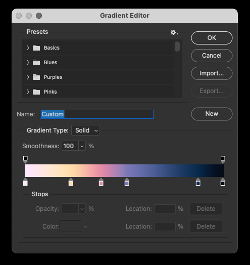
For those who are interested in seeing what this gradient looks like, here’s a shot of the Gradient Editor in Photoshop. This a fun method of applying color, though it can be tricky if there are specific areas of the illustration you want to color a certain way. So long as your values are correct in the black and white illustration, the Gradient overlay can yield results such as the ones you see below:
As I mentioned, you should really see about getting your hands on the packaging these pieces were applied to. The foil packaging these were printed on really makes the illustrations sing. Here are a handful of detail shots showing how I apply my textures (using pressures sensitive brushes in PS using a cintiq):


Huge thanks to the folks at Beekman for giving me the opportunity to collaborate with them on this project. It was a lot of fun to work on and seeing the product first hand was exciting for me and my family.
Stay well, everyone!


