Certain brands are synonymous with certain cities and in my city, this is one of them. The Windmill Roadhouse is an icon of the East London food scene, being around longer than most have even been alive.
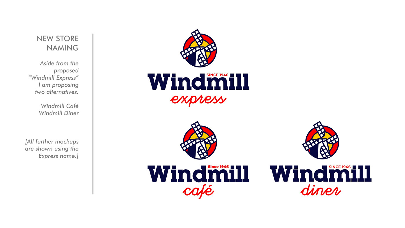
After being a single-destination outlet for six decades, they made the bold move to open a second outlet in a more affluent area in the hopes of serving a broader clientele. I had the opportunity to bid on a proposal for the new store, with a rebrand of the original offerings on the cards as a second phase.
After being a single-destination outlet for six decades, they made the bold move to open a second outlet in a more affluent area in the hopes of serving a broader clientele. I had the opportunity to bid on a proposal for the new store, with a rebrand of the original offerings on the cards as a second phase.
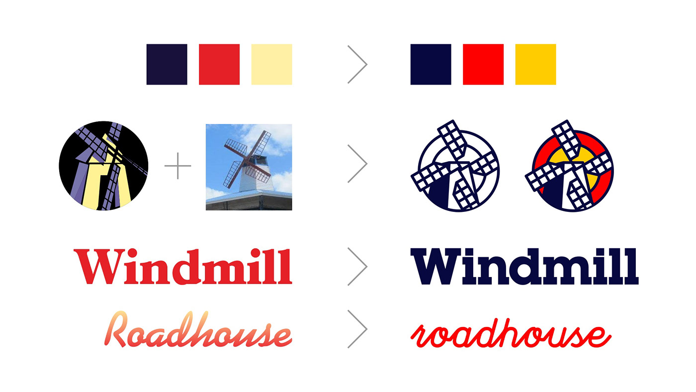
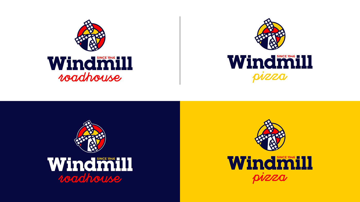
With so much heritage behind the brand, I wanted to stay true to their roots, with some subtle upgrades to bring the brand in line with current trends, with a focus on being digitally optimised.
I set about tweaking the colour saturations to create a more vivid logo that could stand comfortably alongside it's fellow fast-food competitors. I simplified the logomark, updated the fonts and attempted to unify the new store with the existing outlet's offerings.
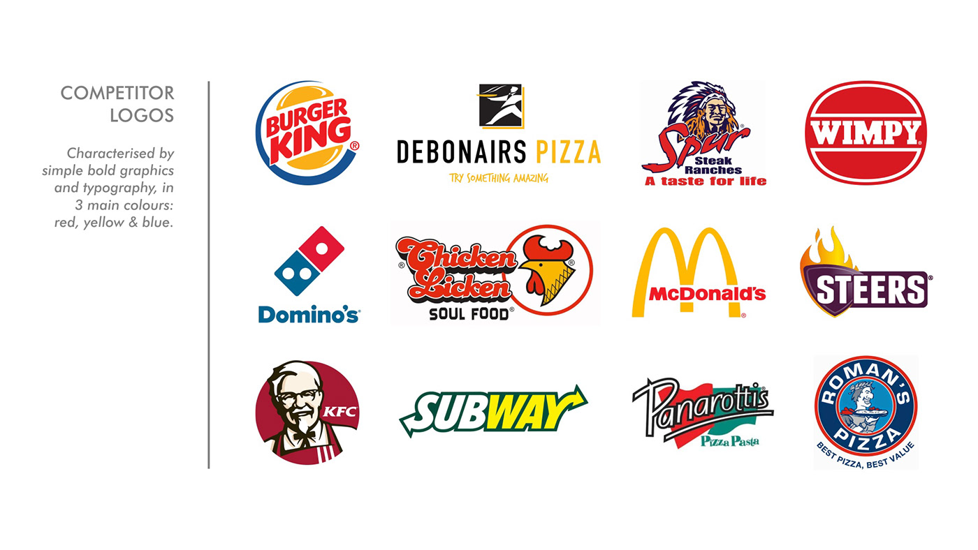
I created a striking visual language with a strong focus on iconography and bold typography, creating an instantly recognisable look and feel.
Sadly, the proposal was rejected in favour of another.


Thanks for viewing!

